Sunday, 26 October 2014

Tomb Of Dracula #9 - Marvel Comics

TOMB OF DRACULA No. 9, June 1973
If vampires actually existed and had nightmares then it would be easy to imagine that the Lord of the Damned’s precarious situation during the first few pages of Issue Nine of “Tomb of Dracula” would be at the top of their list. For this “midnight excursion” by Marv Wolfman places a semi-conscious recuperating supervillain in the enclosed back room of a church with little in the way of fixtures except a large “cursed crucifix!” Unsurprisingly Dracula is far from happy with this particular turn in his undead fortunes. However he is unable to exact any kind of lasting revenge upon the citizens of Littlepool for the entirety of the book due to the ill effects from having previously been struck by a poisoned dart.

Indeed The Lord of all the Undead has seldom been seen in such a poor weakened condition and the Brooklyn-born comic book writer takes full advantage of this unusual state of affairs in “Death From The Sea!” No longer able to simply fly to safety or rely upon his great inhuman strength and savagery, Dracula instead has to use his wits and cunning to buy himself sufficient time to identify a hapless victim and regain his potency. As a result the 1973 Shazam Award-winner places the blood-drinker in the amusingly absurd situation of first being offered a room for the night in a church and then in the uncomfortable position where he must calm the concerns of the local townsfolk by recounting to them the adventure which led him to their minster’s doorstep.

This three-page flashback sequence is very well written with the Lord of the Damned explaining away his ghoulish attacks upon innocent travellers by referring to them as operations and blood transfusions. To the people of Littlepool this clearly comes across as a reasonable tale of ill-luck by a stranger in poor health. But to the reader, who has seen the true tale of Dracula’s exploits via the illustrations of Gene Colan, it is clear that the Lord of Vampires is at his manipulative best.

Unfortunately the Will Eisner Comic Book Hall of Famer is not quite on top of his game throughout these twenty pages with the majority of his pencil work appearing workmanlike at best. There’s a definite lack of detail to many of the panels’ characters and a rather simplistic, almost rushed feel to the artwork. Certainly the illustrations lack the signature-style of fluid figure drawing and extensive use of shadows for which the Silver Age comic book artist is best known for.

However much of this criticism may actually be down to inker Vince Colletta, who despite being one of Jack “King” Kirby’s frequent collaborators during the Fifties and Sixties, does not seem to have had such a positive influence upon Colan’s work as the title’s regular contributor Tom Palmer did. Indeed the Italian inker was replaced by Jack Abel in the following issue after publisher Stan Lee felt he had taken unacceptable shortcuts on the inking. Later Colan himself would go on record as saying that Coletta "didn't take his time with my stuff."
Story: Marv Wolfman, Art: Gene Colan, and Inking: Vince Colletta

Saturday, 25 October 2014

Superman #35 [The New 52] - DC Comics

SUPERMAN No. 35, December 2014
Completest collectors of Issue 35 of “Superman” must have found themselves leaving their local comic store with a serious stash of books under their arm, as “DC Comics” have decided to publish a number of alternative covers for this particular edition. None of ‘The New 52’ illustrations are particularly eye-catching or well-drawn but at least the Monsters of the Month variant by Jason Pearson ties into the company’s seasonal re-imagining of their characters as Halloween creatures. Though I am rather uncertain as to why the American comic book artist has decided to portray the Man of Steel as a Cenobite. 

Chapter Four of “The Men of Tomorrow” will also be one of any comic book collector’s swiftest reads, as writer Geoff Johns’ word count drops sharply for large portion of this issue. Indeed eight of the twenty-three pages within the comic contain six or less words and that is not including a series of panel sequences dotted throughout the storyline where the Chief Creative Officer at DC Comics plumbs for just the occasional spattering of dialogue. 

As a result vast swathes of the action could be both easily and quickly overlooked by an impatient casual reader with such an act being both unsurprising and forgivable given the somewhat lacklustre artwork of John Romita Junior. Workmanlike and competent, there isn’t anything especially wrong with the American artist’s illustrations as such. In fact coupled with the rather splendid colouring of Laura Martin the book’s panels are rather pleasing to the eye.

But an edition with so little within it to actually read, with the exception of a somewhat wordy opening and ending, must rely upon the quality and detail of its artwork to enthral and captivate. Unfortunately any such scrutiny by the reader of Romita Junior’s drawing will do nothing but alienate the audience as square-nosed, outrageously long-limbed and one-dimensional silhouette-like figures abound. 

However not all is lost for the son of one of the foremost Spider-Man artists since the Sixties. A proportion of the action takes place during a torrential downpour, and this lashing weather really works in Romita Junior’s favour, affording the artist plenty of opportunities to produce his infamous line hatchings. Of particular note is his double-page spread of Superman and Ulysses lifting an enormous cargo vessel out of the ocean, with water pouring over the two super-strong heroes.

Sadly, despite a clear Jack “King” Kirby ‘Galactus’ influence, the artist’s final double-page illustration, depicting Ulysses opening a space rift to his “better world” is less than impressive and ends the issue on something of a wasted opportunity.
Numerous covers to "SUPERMAN" Issue 35 by John Romita Junior and Mike McKone

Thursday, 23 October 2014

Judge Dredd The Early Years #2 - Eagle Comics

JUDGE DREDD THE EARLY YEARS No. 2, March 1986
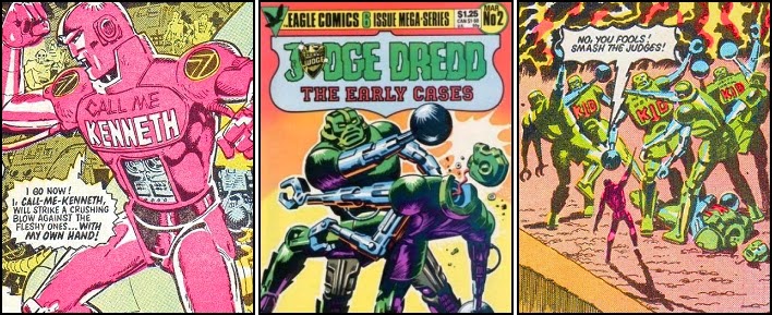
There is little doubt that British illustrator Ron Turner could produce some simply stunning drawings, as his artwork on the “The Daleks” serial for the weekly comic “TV Century 21” attests. But the cover to Issue Two” of “Judge Dredd The Early Years”, depicting two giant Heavy Metal Kid industrial robots fighting one another, is a competent piece of work at best. Indeed one could almost be uncharitable and suggest that it is easy to see why the comic book artist abandoned doing cover illustrations in the mid-1960’s and turned to producing ‘paint-by-number’ paintings instead. However this would be mightily unfair as the illustration would actually appear to be a ‘blow up’ of a far smaller picture, minus the kneeling judges, found within the issue. This therefore seems an odd choice of cover art by the publishing company, as there are far larger and frankly, better penciled, drawings spread throughout the book’s pages.

The story choices for this anthology would also appear to be a little bizarre, although all are written by Judge Dredd co-creator John Wagner; albeit “Death Hotel” is credited to one of his pseudonyms Robert Flynn. The conclusion of the multi-issue ‘event’ ‘The Robot Wars’ is an obvious inclusion but following on from its epilogue are arguably three of the Mega-City One lawman’s least memorable early adventures. Admittedly “Dreams That Money Can buy”, “The Wreath-Killer” and “Death Hotel” are all taken from 1977 issues of the British science fiction comic book “2000 A.D.” but none of them pre-date Call-Me-Kenneth’s robot revolution and none are even printed in chronological order.

So where are the very earliest adventures of Judge Joe Dredd? Why is his first ever story, fighting the judge killer Whitey, not included in a collection of republished early stories? 

Admittedly this edition does include some interesting examples of 'primitive' Judge Dredd artwork, with Mike McMahon’s ‘goldfish bowl’ shaped judge’s helmet clearly taken as ‘gospel’ by fellow artists Ron Turner and Ian Gibson. But surely this book would be a great opportunity to show case Massimo Belardinelli’s interpretation of the future lawman, complete with the (censored) revealing of Dredd’s face, or possibly the excellent pencil work shown in “Krong” by co-creator Carlos Ezquerra? Devoted followers might even hanker for the early work of John Cooper, whose five–page treatment of ‘Muggers Moon’, despite not being published in “2000 A.D” until issue 19, was actually the first Judge Dredd story commissioned.
"JUDGE DREDD THE EARLY YEARS" No. 2 reprints stories from "2000 A.D." issues 15-17, 24, 26 & 32

Wednesday, 22 October 2014

G.I. Zombie #1 [The New 52] - DC Comics

G.I. ZOMBIE No. 1, September 2014 
If ever there was a genuine case of hoping a comic book title was going to be ‘third time lucky’ it must surely be “DC Comics” agreeing to print “G.I. Zombie” as an ongoing series. For ‘the soldier hungry for war… and some brains too’ would never have seen the light of day if the American comic book publisher had not first cancelled “The Unknown Soldier” in May 2010 and then it’s re-imagining, ‘The New 52’ title “G.I. Combat” in December 2012. Perhaps even more miraculous however is that the company have also given the reins entirely over to Jimmy Palmiotti and Justin Gray; the back-up feature co-writers on the most recent series during its seven-issue run.

Fortunately there are a fair few differences between the contents of this title and its immediate predecessor. To begin with, despite the fact the comic carries the “Star-Spangled War Stories” logo on its cover, the horror/war story inside focuses solely upon the exploits of Sergeant Jared Kabe and his new partner. There’s none of the rotating cast and jockeying of creative teams which readers experienced when the title’s forerunner tried to depict the exploits of “The War That Time Forgot”, “The Unknown Soldier” and “The Haunted Tank” all within a single edition. G.I. Zombie is also an entirely new character, with a very fresh supporting cast and plenty of questions to be resolved by writers in future issues.

As a result this first issue doesn’t play out like a simple rehash of a past Unknown Soldier story. It is very different in content. Very different indeed and worthy of the Rated T+ warning on the front cover as the title character is literally tortured to death; well as dead as a living animated corpse can get anyway. Lastly this book is not about some super-heroic soldier simply rushing from one battlefield to another, wreaking havoc upon the enemy and implausibly turning the tide of the fight against all the odds. “G.I. Zombie” is all about fighting the enemy within, the subversive homeland terrorist, and the undercover lengths some modern day soldiers and secret agents need to resort to in order to keep their comrades and the larger national population safe.

Sadly the artwork of Scott Hampton is not good. Not good at all, especially when compared to the atmospheric main cover art by Canadian cartoonist Darwyn Cooke. The pale, single-tone colouring, also by Hampton, does not help matters either, as combined they make each drawing appear featureless, bland and (no pun intended) lifeless. There’s a real lack of detail to the penciling, with each figure simply being drawn with a striking black silhouette but no actual detail except for eyes, nose and mouth. Very lacklustre, very bare and disappointingly very unimpressive.
The variant cover art of "G.I. ZOMBIE" No. 1 by Howard Porter

Tuesday, 21 October 2014

The Thing #4 - Marvel Comics

THE THING No. 4, April 2006
Every now and then writers seem to think it would be a good idea to produce a storyline based upon the everyday exploits of super-heroes; a kind of ‘behind-the-scenes’ exposé on the ordinary lives of extraordinary people if you will. Issue Four of “The Thing” is one such attempt by Dan Slott, but rather than show us a simple ‘day in the life of Ben Grimm’, the American comic book writer also throws in some of the daily doings of his Fantastic Four team-mates as well as the Inhuman teleporter Lockjaw.

This inevitably results in the reader catching sight of a marital argument between Sue and Reed Richards and the sexual aspirations of Johnny Storm. Unfortunately this means there is nothing new here at all, and these ‘insightful everyday situations’ which gave so much character to Marvel’s foremost super-hero family during the time of Stan Lee and Jack “King” Kirby, have long since worn out their welcome. The treatment of the Human Torch’s character is particularly cringe-worthy, with Hothead displaying a staggering amount of immaturity as he spends the entire issue feverishly trying to reconstruct a female celebrity’s telephone number from a burnt piece of paper.


Fortunately the inclusion of Lockjaw, escort to the Royal Family of the Inhumans, does breathe some freshness into the proceedings. There’s some great scenes set within the City of Attilan depicting Karnak, Gorgon, Triton, Medusa and Black Bolt ‘at rest’, as well as some action towards the end of the book which demonstrates just how formidable an opponent the alien bulldog-like being actually is.


Even so, the sheer banality of this comic book’s main storyline would cause this issue to become a particularly unmemorable edition if not for the superb artwork by Andrea Divito. The Italian comic book artist brings some stunning expressions to the face of the Inhuman with his “Hmph!” at an unhelpful Watcher being a particular ‘laugh-out-loud’ illustration. The beast’s sudden awakening of Triton, who moments before had been sound asleep within his water tank, is also drawn with great mirth.


As a result “Paws & Fast-Forward” is a fun readable experience with a slightly sickly sweet final message about money not necessarily buying happiness. And whilst there is perhaps one too many drawings of Lockjaw going “Hurr Hurh Huhh” whilst energetically humping Ben Grimm’s leg, there’s plenty of visual treats stored within the pages for the reader to enjoy.
Writer: Dan Slott, Penciler: Andrea Divito and Inker: Laura Villari

Monday, 20 October 2014

The Flash #3 [The New 52] - DC Comics

THE FLASH No. 3, January 2012
Midway down the second page of Issue Three of “The Flash” is the line “I didn’t get a manual with my powers.” But if this comic book’s opening is anything it is a reader’s guide to the formidable super-powers of Barry Allen’s Scarlet Speedster; at least as far as the creative writing team of Francis Manapul and Brian Buccellatop are concerned. And what a wish-list of extraordinary abilities it is too.

The Flash is fast, so fast in fact that he can run on water without sinking, he can create and direct vortexes using his hands, and he has the ability to vibrate through solid objects. He can also make other objects similarly oscillate in order for them too to pass through dense matter, and actually demonstrates this incredible power by shaking a large airliner so fast it safely passes straight through a motorway bridge and comes to a shuddering halt alongside Central City docks. Oh… he can go invisible as well apparently. Clearly he’s learnt a few extra tricks since ‘The New 52’ started…

Unfortunately for this issue however Filipino-Canadian artist Manapaul  hasn’t. The (already overly expensive) variant cover by Jim Lee, Scott Williams and Alex Sinclair is a beautiful illustration containing both a cracking drawing of The Flash and some gorgeously vibrant colouring. Manapul’s version pales in comparison, with a muted purple and white theme which simply makes the drawing appear half-hearted and unfinished.

His interior artwork is equally as lacklustre and uninspiring, though Buccellato should take some of the responsibility for the depressingly drab colour choices. I’m also unconvinced by some of the pair’s decisions regarding the arrangement of the panels on various pages. The multiple windows within a single page showing Allen’s brain tapping into the Speedforce has been seen before, and much more convincingly too.

But apart from showing how clever they are, I can’t work out the reasoning behind the first page’s airliner shaped montage comprising of an ‘over the shoulder’ view of the plane’s cockpit as it crashes towards the freeway bridge. Especially when the entire drawing is partially buried as a result of the title “Flash” being emblazoned down the illustration’s length in a rather rude choice of orange. The ghastly font used to spell out "DC Comics proudly presents..." makes the entire page appear amateurish at best.
The variant cover art of "THE FLASH" No. 3 by Jim Lee, Scott Williams and Alex Sinclair

Sunday, 19 October 2014

Batman: Battle For The Cowl #1 - DC Comics

BATMAN: BATTLE FOR THE COWL No. 1, May 2009
Batman is no more... and this time Bruce Wayne hasn’t just had his back broken by Bane. The man is actually dead, having been killed by Darkseid during the “DC Comics” event “Final Crisis”… or rather he’s dead for the duration of this three-issue aftermath mini-series anyway.

Dick Grayson, heir apparent to the Mantle of the Bat doesn’t want it, and that’s probably just as well seeing as he’s soundly bested in the sparring ring by his elderly butler, Alfred Pennyworth, midway through this issue. Tim Drake, the third and arguably best Boy Wonder, is simply too young to become the Dark Knight, and Bruce’s son, Damian Wayne, well he’s just a psychopathic brat.

However all is not lost, despite the mass riots and rise in crime in Gotham City, as a mysterious individual has decided to don the cape and cowl for themselves instead. Throw in the largest Rogue’s Gallery this side of the Joker, as well as more Bat-allies than you can throw a handful of bat-a-rangs at, and you’ve got a seriously action-packed thrill-ride of a storyline.

Unfortunately writer Tony S. Daniel’s artwork isn’t quite up to task of depicting all this excitement, and it’s clear the American comic book author and artist should probably have stuck to just coming up with the dialogue and plot for this mini-series. That isn’t to say his illustrations, nicely inked by Sandu Florea and colored by Ian Hannin aren’t competent. They’re just infuriatingly inconsistent. Daniel’s depiction of Robin and Squire chasing after three clown-masked criminals through a ruined building is superbly penciled, with plenty of detail and shadows providing some excellent atmosphere. But this is then followed by a series of panels showing Batman’s Network in action, where characters such as Nightwing, Batwoman and Batwing appear to have been hastily pulled straight out of an aspiring artist’s sketchbook; they’re all straight lines, inanimate and seemingly lifeless.

Things get worse towards the end of the book as Nightwing and Damian Wayne are literally blown out of the sky and into another derelict building. Long-limbed is an understatement as the artist struggles to illustrate the gliding duo both being shelled mid-flight and then staggering away from a team of masked gunmen without them anatomically resembling spider monkeys.

Fortunately the final full-page panel of the ‘new’ Batman, crashing in upon the armed criminals, pistols discharging shell after shell is very well drawn and definitely ends the first issue of “Batman: Battle For The Cowl” on a high note.
The Main Cover for "BATMAN: BATTLE FOR THE COWL" No. 1 by artist Tony Daniel