Sunday, 31 May 2015

Uber #4 - Avatar Press

UBER No. 4, July 2013
Writer Kieron Gillen’s comparison to his narrative of "Uber" Issue Four with that of “the archetypal sports movie. In short: underdog tries to get ready for the big fight” doesn’t really do the breath-taking scope of this periodical's storyline total justice. For a start not many sports personalities prepare for their disciplines by letting a Churchill tank fire at them from point blank range like His Majesty’s Human Patrick O’Connor does… Nor do they watch helplessly as one of their fellow team-mates literally tears their body apart through the strain of lifting an automobile up above their heads.

However this horror-war comic does indeed spend the vast majority of its twenty-two pages building up the reader’s anticipation for the inevitable confrontation between the United States ‘super-airman’ and one of Germany’s “seemingly unstoppable… human battleships.” The British author also does a good job of establishing just what is going to be at stake when the two juggernauts go toe-to-toe… nothing less than the survival of Paris, if not the French continent itself. Something which makes the British government’s drive to better empower “the delightfully burly H.M.H.” all the more tense and desperate. This really is a race against time crammed full of suspense as scientist Stephanie’s “attempt to create enough Ubers” to stand against the German onslaught suffers occasional delays and setbacks. Whilst Markus, Werner and Klaudia make their bloody presence very much felt in the Romanian oil fields, East Prussia and upon the banks of the River Rhine.

But despite the grand scope of his tale, Gillen also manages to push along several sub-plots without intruding too much upon the ‘main event’. In fact many of them, such as Alan Turning’s arrival at Bletchley Park as Head of Cryptography, Winston Churchill’s observations that his country’s best option is simply “to let them bash the living hell out of us until they run out fuel”, and an edgy General Guderian’s obvious fear that “the Allies could have Panzermensch by now” actually help elevate the book’s apprehensive atmosphere.

Artist Caanan White is equally on form, packing his personalities with plenty of pathos and detailed facial expressions as each character, be they German or British, effectively ‘wears their heart on their sleeve’. Alongside colorist Michael Dipascale, the African-American penciller also provides a delightfully subtle “clock on the issue” in the form of Stephanie’s hair; illustrating the passage of time by changing its colour from bleached blonde to “a natural redhead”.
The variant cover art of "UBER" No. 4 by Caanan White

Saturday, 30 May 2015

The Amazing Spider-Man #18 - Marvel Comics

THE AMAZING SPIDER-MAN No. 18, July 2015
Ever since his first appearance in Issue Fifteen of “Amazing Fantasy”, published in August 1962, the spectacular Spider-Man has constantly fought to overcome great adversity and overwhelming odds both in his normal everyday life and as a costumed crime-fighter. But rarely, even as an adolescent acclimatising to his enhanced strength and wall-crawling, has Stan Lee’s co-creation ever appeared as inept and anaemic a would-be rescuer as he does in “Trade Secrets”.

To make matters worse the owner of Parker Industries isn’t even struggling against one of his main rivals, such as Venom or the Green Goblin. But instead simply facing a battlesuit-wearing saboteur known as The Ghost; an inventive super-hacker who was originally an old foe of Iron Man in the Late Eighties and somebody who “when it comes to a fair fight… [is] pretty weak.”

Such a disappointingly inept portrayal of so iconic a “Marvel Worldwide” character by writer Dan Slott is hard to comprehend or explain, especially when it occurs within the super-hero’s own comic book. Yet not only does the American author depict Spider-Man receiving a sound thrashing at the hands of the Dark Avenger, pinning the former photographer beneath tonnes of fallen masonry in the process. He adds ‘salt to the wound’ by having a trio of Parker’s “amazing friends” Miss Marconi, Living Brain and “ex-super villain” Clayton Cole easily rescue him and capture The Ghost within the space of a handful of panels.

Dishearteningly the wall-crawler is equally as ineffective in the comic’s secondary tale “Nothing Left To Lose”. This six-page conclusion to the Black Cat’s supposedly solo sub-plot “Reposessession” pointlessly places Parker in danger as Felicia Hardy burns down both her old penthouse apartment and all the possessions the cat burglar accumulated during her criminal career. Unable to extinguish the blaze, nor capture the violently erratic female felon, Spider-Man simply settles upon saving Aunt May, Jay Jameson and Regina Venderkamp by swinging them to safety before the fire takes hold.

However just why Slott has the trio of supporting cast members in so a precarious position in the first place is bewildering. Even if the writer, along with regular collaborator Christos Gage, are fashioning “almost a completely different” Black Cat to the anti-hero created by Marv Wolfman, they surely can't have decided to turn the popular thief into so cold-hearted a killer that she would purposely douse two innocent geriatrics with gasoline and set them alight whilst they’re tied to chairs simply because they bought an ornament which Hardy had once stolen?   

Despite such reservations regarding this comic’s disappointing narrative, it is still a rather action-packed adventure and artist Humberto Ramos is more than up to the challenge of providing page after page of dynamic energy-filled illustrations. In fact the Mexican penciller’s drawings of a slightly awkward, long-limbed Spider-Man are the real highlight of this book, alongside the Will Eisner Comic Industry Award nominee’s wonderfully sinister depiction of The Ghost.
The regular cover art of "THE AMAZING SPIDER-MAN" No. 18 by Humberto Ramos

Friday, 29 May 2015

Tomb Of Dracula #2 - Marvel Comics

TOMB OF DRACULA No. 2, May 1972
Plotted by Gerry Conway at a time when the Brooklyn-born writer was by his own admission performing “at a level that was actually beyond me”, Issue Two of “Tomb Of Dracula” is arguably heavily influenced by the “Hammer Picture” fright flicks which enjoyed such popularity with movie-goers in the Fifties and Sixties. Indeed “The Fear Within!” could quite easily have been a comic book adaption of one of the British film company’s movies so similar is the magazine’s narrative to the once “lucrative Hammer formula”.

But whereas the London-based producer enjoyed “huge box office success” with its early vampire films, it is doubtful that this twenty-one page storyline would have garnered too much praise had it appeared on celluloid. Being far more akin in quality to the critically panned “The Satanic Rites of Dracula” than the 1958 box-office breaking release of Terence Fisher’s “Dracula”.

Admittedly there isn’t actually that much wrong with this response by “Marvel Comics Group” to the Comics Code Authority’s relaxation of its rules regarding horror periodicals, except perhaps the cover’s rather comedic subheading “Who Stole My Coffin?”. But Conway’s plot of an Englishman stealing the Count’s casket and fleeing the Carpathians with it to “balmy London” is a little fatuous and silly. Especially when it results in the Lord of Vampires paying Clifton Graves’ “fog-wrapped city” a visit, dressed in all the foppish trappings of a gentleman such as walking cane and fedora.

The storyline also struggles to purvey any genuine sense of horror despite starting dramatically enough with the latest owner of “the old count’s castle” discovering the vampire’s tomb amidst the fortification’s crumbling ruins. This is predominantly caused by the New Yorker’s incarnation of Dracula appearing to be a much more action-orientated villain than the secretive terrifyingly intense ‘big screen’ version established by actor Christopher Lee. Something which results in the Transylvanian nobleman preferring to duke it out with a bar-room lout in a packed public house than simply stalk the shadows as an unseen killer.  

Fortunately artist Gene Colan’s illustrations are engaging enough, if a little rough and undisciplined in places, such as Graves’ staking of his beloved Jeanie. But something has clearly gone awry with the colouring of Dracula’s flesh a third of the way through the issue as the vampire remains as white-skinned as ever despite Van Harbou relieving the Count of his “unearthly pallor” early on in the adventure.
Story: Gerry Conway, Art: Gene Colan, and Inking: Vince Colletta

Thursday, 28 May 2015

Moon Knight #11 - Marvel Comics

MOON KNIGHT No. 11, March 2015
Any casual comic book collector purchasing Issue Eleven of “Moon Knight” simply because of the savagely brutal Declan Shalvey and Jordie Bellaire cover illustration, which depicts a cornered Mister Knight battering a heavily-armed mob of SWAT officers, will be in for something of a surprise once they open the magazine. For Brian Woods’ tale “Rendered” is a far cry from the gratuitously violent storyline promised by the title’s front page and proves instead to be a much slower, somewhat thoughtful insight into the daily dreary routine experienced by a super-hero incarcerated within a top secret high security penal facility.

However despite the narrative’s almost complete absence of action, this periodical does contain plenty of puzzling intrigue for both the reader and the former ‘Fist of Khonsu’ to ponder, as together they contemplate just where the unmasked vigilante is being detained and how he is going to escape. Indeed the American writer’s ability to create a sinisterly sterile atmosphere, complete with bland, featureless face-masked security goons, psychologists, nurses and even caterers ensures that what potentially could have been a dull lack-lustre issue about the regimental routine of prison life is instead a gripping, even thrilling tale; one which becomes increasingly tense as the ex-mercenary’s probing and eventual flight merely raises more questions as to the motivation behind his illegal captivity then provides answers.

Equally as compelling, though secondary to this comic’s main plot, is prisoner Spector’s deteriorating relationship with his spiritual sponsor Khonsu. Wood’s portrayal of the Egyptian deity as a goading, sarcastic, almost churlish former benefactor is an interesting new take on the moon god and demonstrates just how successfully Doctor Warsame has manipulated events to become the divine being’s “better prospect.” Not only has the psychopathic physician fooled the crime-fighter’s captors into believing Moon Knight has “breached [the] One World Trade Centre”, “attacked a visiting delegation at the United Nation’s building” and blown up the ‘good’ doctor’s own home. But Elisa has also seemingly managed to convince Khonsu that she is a far worthier candidate to do his work.

Such a sedentary script is understandably therefore heavily reliant upon the comic’s page composition to give its proceedings some much needed pace. Fortunately Greg Smallwood rises to this challenge admirably, imbuing several sequences with fast-paced energy by depicting them through a succession of small square-sized panels; sometimes even populating a single sheet with as many as fifteen of these micro-images.

The Kansas-based artist’s pencilling is also consistently impressive throughout the book, with a bruised Spector’s plethora of facial expressions and furtive sideways glances really helping to show that despite the prisoner’s apparent submission, the captive is clearly mentally taking note of his surroundings and calculating an escape plan.
Writer: Brian Wood, Artist: Greg Smallwood, and Color Art: Jordie Bellaire

Wednesday, 27 May 2015

Batman #18 [The New 52] - DC Comics

BATMAN No. 18, May 2013
Dishearteningly in many ways the Dark Knight depicted within the twenty eight pages of Issue Eighteen of “Batman” is a decidedly unlikeable and unheroic character. Admittedly the man is understandably upset at the “much-publicized comic book death” of his young son, Damian. But even so writer Scott Snyder has still arguably created a much more aggressively violent and savagely unchivalrous Caped Crusader than has been published before.

Clearly both angry and in emotional turmoil as a result of his sudden loss, it is not unsurprising that the grieving father takes his anguish out upon the criminal element of Gotham City. And as such this magazine’s panels depicting Bob Kane's co-creation mowing down fleeing thugs in the batmobile, ripping them by the hair from fast moving motorcars or cracking the windows of their submersibles with a giant mallet is entirely understandable, and even possibly acceptable behaviour.

But to have Batman viciously erupt into such a fit of ferocious rage that without warning he breaks an adolescent girl’s nose is taking his Homeric despair a little too far. Most especially when the so-called philanthropist’s victim is teenager Harper Row, a “possible new female Robin” who had literally just saved him from the jaws of a pack of drug-crazed “genetically modified” fighting dogs and doubtless a painful drawn-out death.

Indeed it can’t even been argued that ‘the Bat’ inadvertently struck out at the city’s electrical grid worker by mistake during the heat of the battle. For the bloodthirsty canines have already fled the alleyway and their owner been beaten unconscious when the decidedly Dark(er) Knight turns to his defenceless would-be-rescuer and asks “Why don’t you block this?” before sending her reeling through a wooden fence.

Perhaps most alarming of all however, is that Snyder has actually gone on record as describing this edition as one with which the New Yorker wanted to demonstrate just how much “somebody can still look at Batman… and see this figure that’s incredibly inspiring”. Just how does assaulting the character that “represents a very young generation in Gotham” encourage “the poorer section” of the City “to be inspired by a character like Batman”?

Bizarrely this messed-up mixed message by the American author’s narrative is seemingly reinforced by the odd decision to utilise the skills of two separate artists and split the comic’s storyline into two chapters. Andy Kubert’s pencilling is impressive, especially when drawing a wide-eyed manic-looking costumed vigilante breaking heads and cracking skulls. The sheer wear and tear detailed into the significantly battered bat-suit is incredible and really emphasises for just how long Bruce Wayne has been pursuing his crime-fighting activities without respite.

Far less successful is Alex Maleev’s work, which in comparison to his colleague’s pictures, appear roughly sketched and lack any dynamism whatsoever. True, the Bulgarian’s script is a far more sedentary affair than that of The Kubert School graduate. But that doesn’t entirely account as to why the Russ Manning Award-winner’s illustrations are far less impactive or exciting.
The variant cover art of "BATMAN" No. 18 by Andy Kubert and Brad Anderson

Tuesday, 26 May 2015

Darth Vader #4 - Marvel Comics

DARTH VADER No. 4, June 2015
Despite some incredibly strong distribution figures, with this title’s fourth instalment alone selling 123,394 copies in April 2015, many fans of the Dark Lord of the Sith would argue that disappointingly Kieron Gillen’s interpretation of Darth Vader is almost unrecognisable from that portrayed by David Prowse in the original “Star Wars” motion picture trilogy. Much of this disillusionment stems from the fact that publishers “Marvel Worldwide” have seen fit to allow the former Jedi to be saddled with both two droids, who are worryingly similar to Artoo and Threepio in all but their murderous motives, and a young smart-mouthed female sidekick; none of which, it could be argued, would ever have shared any screen time with George Lucas' menacing movie 'monster'.

The British writer’s narrative in “Book I, Part IV" of "Vader” is also extremely questionable as the ‘galactic gang’ land on Geonosis in order “to steal a robot womb factory off a homicidally broody alien queen.” Such an audacious action-packed adventure admittedly provides its fair share of drama and frantic fast-paced fun. But such ‘high octane’ antics would surely be far more suitable if the central character was a rebel scoundrel such as Han Solo or even an apprentice Jedi like Luke Skywalker. As it is, Darth’s black armoured presence simply jars the sensibilities as the central focus of Gillen’s swashbuckling soiree.

Unfortunately the former journalist’s script does not get any better once events have quietened down and the Sith Lord starts to manufacture his “private off-the-grid” loyal droid army. Indeed the storyline's logic actually seems to get worse as Doctor Aphra matter-of-factly acknowledges that Vader must now execute her as “whatever you’re planning next. You don’t need me anymore.” Such a meek, almost willing, submission to her extinction is utterly unbelievable, especially as the rogue archaeologist has previously been depicted as such a spunky person with an insane zest for life. Certainly the savvy droid technician wouldn’t just turn her back on her would-be-killer and request he put his “lightsaber right through the neck. No warning. Nice and quick.”

Bizarrely even after the Emperor’s apprentice informs Aphra that for now he has no such intention, the seemingly suicidal space-farer warns him that she is “a walking, talking stupid risk” and is willing to die so he can “win” as “this is for a higher cause.” Such an implausibly preposterous attitude to her demise dishearteningly destroys any credibility Gillen had developed with the criminal’s personality and ruins what potentially could have been an interesting if not tense relationship between the seriously dour Sith Lord and his flighty risk-taking servant.

Artist Salvador Larroca clearly excels at drawing black clad figures, as the Valencia-born illustrator’s pencilling of both Darth Vader and the homicidal protocol droid Triple-Zero are simply stunning throughout this book. Sadly however, the Spaniard’s sketches involving a doe-eyed Doctor Aphra are far less appealing and rather detract from this comic’s overall high quality visual finish.
The variant cover art of "DARTH VADER" No. 4 by Salvador Larroca

Monday, 25 May 2015

The Unbeatable Squirrel Girl #2 - Marvel Comics

THE UNBEATABLE SQUIRREL GIRL No. 2, April 2015
It is clear that “Marvel Worldwide” were somewhat underwhelmed by the 41,693 circulation figure for this title’s debut issue and the scathing criticism both its narrative and artwork received from some quarters. Why else would they resort to publishing this second edition with a supposedly witty endorsement on its regular front cover by Dan Slott; the writer on “The Amazing Spider-Man” and someone who himself has courted controversy as to the quality of his storylines? Unsurprisingly however such a ‘nutty’ testimonial did little to halt the swiftly evaporating buyer’s base for this rather quirky take on Will Murray’s furry prehensile tailed co-creation, and only 24,621 of Doreen Green’s most loyal fans purchased the comic.

Ryan North’s arguably juvenile approach to storytelling must share some of the blame for such a lack-lustre dwindling sales figure. The first ten pages of Issue Two of “The Unbeatable Squirrel Girl” documents little else but the young mutant’s visit to her college campus’ “booths for clubs” orientation event and the super-hero’s frivolous flirtation with fellow student Tomas Lara-Perez, someone she once spoke to “for two seconds!”

Admittedly the Canadian author’s rather zany comical writing style is certainly unique, innovative and novel. But it takes more than the inclusion of squirrels sneaking into observatories to spy upon fast-approaching spaceships, “the Squirrel-A-Gig” gyrocopter, a suit of Iron-squirrel armour and a direly droll “Deadpool’s Guide To Super Villain Super Accessories card 2 of 1622” to make such a bizarrely silly tale engaging and entertainingly immersive.

Fortunately the occasional songwriter’s work does change for the better once the former Great Lakes Avenger becomes aware of the imminent threat of Galactus and she realises she has only got two hours to stop the colossal alien ‘Devourer Of Worlds’. But just why the buck-toothed heroine’s utterly illogical response to such a planet wide threat is to break into Stark Tower and steal the billionaire inventor’s Iron Man technology is an entirely different matter. Such an absurdly clunky plot development does however provide some ‘screen time’ for a few of the founding Avenger’s classic suits including the inventor’s original heavy all-grey creation.

Perhaps the biggest barrier to this title’s success though is the bold highly stylised cartoony artwork of Erica Henderson, which, along with North’s script, rather tiringly tries to ‘squeeze a smile’ out of every panel. Whether such illustrations are terrifically bad or not is a matter of much debate, but the depiction of the acrobatic super-agile crime-fighter’s physique as that of a chubby, hamster-cheeked adolescent is most definitely an acquired taste.
The variant cover art of "THE UNBEATABLE SQUIRREL GIRL" No. 2 by Joe Quinones

Sunday, 24 May 2015

V-Wars #1 - IDW Publishing

V-WARS No. 1, June 2014
Any of the 10,460 collectors who bought this official ‘opening’ instalment of “V-Wars” in April 2014 thinking it was going to contain a slow steady exploration of the sudden overt (re)creation of vampires within modern-day society were most definitely in for a sharp sudden shock as a result of Jonathan Maberry’s brutally pacy narrative. For this issue dives straight in at the deep end, quickly continuing the dramatically bloody events of the title’s Free Comic Book Day edition and burying any opportunity for a peaceful solution to the epidemic within the space of a few pages.

Indeed, although the storyline continues to closely follow the exploits of Presidential advisor Luther Swann, it does so in a world already ravaged by a violent vicious all-out battle between mankind and the blood-drinking “terrorists”. As such there simply is no room for the reader to breathe as events quickly carry the “official vampire expert” into a war zone along with the rest of his combat squad.

For the ‘Doc’ is now to “Saddle up with the troops”, “stop trying to find ways to prevent a war” and instead “help us find a weakness that will end it.” What then follows is an absolute bloodbath as Gunnery Sergeant Nestor ‘Big Dog’ Wilcox leads his team into some wonderfully ferocious and gory firefights, chock full of buckets of blood, gruesome mutilations and even the occasional profanity.

Thankfully this carousel of horror does momentarily let up when Swann discovers that the "Blood" responsible for ‘popping' the Speaker of the House and starting the planet-wide genocide, was actually a human who “was following orders” because “a lot of very important and very dangerous people wanted this war to happen.” Such an incredibly valuable secret however was never going to be revealed to the general populace so soon into this series and so unsurprisingly within the space of a single panel the hitman, along with his thumb drive of damning data, is torn asunder by a hail of bullets.

All of this captivating carnage and grandiose blood-letting is marvellously drawn by Alan Robinson. The Chilean artist not only taps into the various mythological species of vampires to help populate Maberry’s new-found fanged world. But also manages to incorporate into his illustrations many a nod to other popular sources of horror. Such as Swann’s murderous little girl’s face mask and mental institution cell both replicating those of the psychopathic killer Hannibal Lecter in the 1991 motion picture “The Silence Of The Lambs”.
The variant cover art of "V-WARS" No. 1 by Tony Vargas

Saturday, 23 May 2015

Daredevil #8 - Marvel Comics

DAREDEVIL No. 8, November 2014
Whilst the titular character himself may be celebrating “50 years without fear”, there’s an awful lot of sinister shenanigans stored within the twenty-pages of Issue Eight of “Daredevil”. In fact the suggestion Mark Waid’s storyline is going to be full of spine-tingling chills actually starts with the comic’s especially creepy cover with artist Chris Samnee undoubtedly paying homage to the 1960 horror flick “Children Of The Damned”.

Straight from the opening panels, which depict a bleary-eyed child waking during the night to find himself being watched by a group of ghoulish shadowy figures, it is clear that this narrative is going to be made from the stuff youngsters hope they won’t dream about. But it also swiftly taps in to the nightmares of doting parents as well, when the boy’s desperate mother fails to save her darling from the clutches of some sinister-faced purple-hued infants and despairingly plummets to a ghastly death from the rooftop of her apartment block… Much to the obvious delight and amusement of the immediately dislikeable super-villain Purple Man.

Arguably such an intensely dark and disturbing tale, which later sees Doctor Zebediah Killgrave meet a suitably horrifying end at the hands of his very own offspring, would be too depressing a read for many without some ‘break in the storm clouds’. But that shouldn’t necessarily mean that the Eisner Award-winning writer needs to interrupt the book’s quite alarming atmosphere with a jarringly bright and humorous scene set on board Matt Murdock’s (potential) in-laws’ yacht. Indeed this whimsical distraction, complete with squeaking dolphin, is farcical nonsense at best and disappointingly destroys any immersion the book’s dramatic opening created. Fortunately things eventually get ‘back on track’ once the shining sun sets and Daredevil starts patrolling the night-time skyline of San Francisco.  

Chris Samnee’s pencilling is extremely strong throughout this comic, especially when colorist Matthew Wilson is able to apply an impressively moody purple tone to the proceedings. The pain and terror in young Jamie’s eyes and face as he’s abducted is worryingly compelling and proves a great contrast to the American artist’s far more placid unblinking portrayal of the child once he has ‘joined’ the rest of Purple Man’s protégées.
Storytellers: Mark Waid & Chris Samnee, and Colorist: Matthew Wilson

Friday, 22 May 2015

Master Of Kung Fu #1 - Marvel Comics

MASTER OF KUNG FU No. 1, July 2015
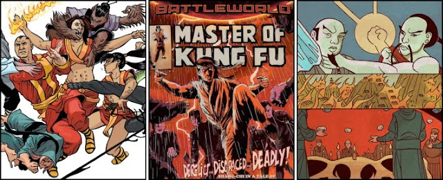
Openly ‘boasting’ upon its splendid Francesco Francavilla front cover that it contains “Shang-Chi in a tale of Kung Fu madness and mastery” this “Secret Wars” tie-in title certainly provides “Marvel Worldwide” comic book collectors with an interesting “wide range of reimagined characters”. Indeed this ‘warped’ world of K’un-Lun, where the whiskered martial arts expert is both a wanted murderer and ‘down and out’ drunkard, is initially a disorientating topsy-turvy read.

However having navigated Haden Blackman’s wonderfully written opening, which despite his insistence on using the odd profanity is a mesmerizingly good narration chronicling the creation of the kingdom’s ‘thirteen chambered trial by combat’, these once familiar people and their ‘all-new’ alternate personalities soon settle into the customary age old conflict of hero verses villain. Thus, having established the ‘reinvented’ Shang-Chi as a park vagrant and somewhat soiled son of the evil Emperor Zheng Zu, the former “Batwoman” co-writer swiftly introduces the inebriated warrior’s obvious arch-rival, the belligerent Razor Fist; who in this incarnation “can chop off a man’s head with his bare hands.”

Such a classic confrontation, especially with a disconcertingly different Typhoid “Typhus” Mary additionally thrown into the mix, should always result in a memorably violent fist-fight… And Blackman’s storyline certainly does not disappoint as an overconfident and arrogant tyrannical ruler’s bodyguard, as well as his two formidable female companions, are soundly thrashed by a humorous smart-mouthed Shang-Chi over the course of the next few pages; “I am sorry, legendary Razor Fist. I truly meant to let you hit me. But I am so drunk I can’t even control my own reflexes.”

Less successful, though still mildly entertaining, are some of the other more recognisable inhabitants of this “Battleworld”, many of whom seem to have banded together to create a somewhat ineffective oriental version of the Morlocks. Thus a bald Kitty Pryde, Caliban, Callisto, Wolfsbane and Fing Fang Foom-like Lockheed the Dragon, all make contributions to the story with varying degrees of success.

Any action-orientated title, full of karate chops, kicks and agile gymnastics will arguably ‘live or die’ depending upon the quality of its artwork. Fortunately Dalibor Talajic’s pencilling is certainly competent, for the majority of his illustrations at least, with the Croatian’s fresh interpretation of a quite different Shang-Chi proving to be especially well-drawn. However several panels suffer from the artist’s somewhat sketchy simplistic style and habit of using blank featureless backgrounds, most notably those featuring Shadowcat and the other “undesirables”.
The variant cover art of "MASTER OF KUNG FU" No. 1 by Butch Guice

Thursday, 21 May 2015

Strange Tales #153 - Marvel Comics

STRANGE TALES No. 153, February 1967
The influence of the mid-Sixties superspy craze, itself inspired by the “James Bond” movies and “The Man From U.N.C.L.E.” American television series, is abundantly clear throughout this comic’s lead feature “The Hiding Place!” Indeed Roy Thomas would seem to have tried to cram within the narrative’s twelve-pages as many secret agent gimmicks and gadgets as the ‘seldom-surpassed scriptwriter’ could think of. Why else would a newspaper which suddenly crackles into a two-way communications monitor, a flying car, an identity changing machine and even a ‘magni-force repulsing saucer’ all feature within this short action-packed tale?

Admittedly such corny, pulp fiction-based references as Agent ‘O’, “the ultimate hiding place”, “the Hydra-piller” and “the new space warp missile” come across as being somewhat unsophisticated hokey. But such innocent contrivances are easily forgotten as the fast-paced storyline rushes from a catastrophic car chase to a furious firefight within the space of few pages as Hydra once again attempt to infiltrate the Supreme Headquarters International Espionage Law-Enforcement Division (S.H.I.E.L.D.), and all attention is focussed upon the exploits of Colonel Nick Fury and his stalwart companion Dum Dum.

Dishearteningly such a tensely frantic tale surprisingly suffers from some regrettably lack-lustre artwork. With many of the figures, most notably that of the Director of S.H.I.E.L.D., all appearing to have rectangular-shaped one-dimensional heads. Something which starkly contrasts to the rest of their body’s dynamic animation. Such a criticism is doubling disappointing when the “seldom-lacking layouts” have been sketched by the legendary Jack Kirby, and the “seldom-rivalled rendering” completed by innovative illustrator Jim Steranko.

Arguably even more relentlessly intense however is this comic’s Doctor Strange adventure, “Alone, Against The Mindless Ones!” A “stupefying story by spellbinding Stan Lee” which hurls the Master of the Mystic Arts into a brutal ten-page long no-holds barred battle against “the most brutal man-beasts in all the cosmos!”

Fans of the Sorcerer Supreme will doubtless have been delighted with the iconic writer’s inclusion of the Cloak of Levitation, the Eye of Agamotto and the former neurosurgeon’s curse “by the Hoggoth’s Hoary Hosts”. But probably less happy with the clunky nonsensical plot which sees the Earth’s primary protector against magical and mystical threats foolishly investigate a blinding beam of supernatural light rather than simply fly over an army of Mindless Ones and reach safety. Indeed the Will Eisner Award Hall of Famer’s storyline defies logic on several occasions for the sake of a few more thrilling pages, as Strange first allows himself to be beaten half-senseless by "his inhuman attackers" in order to recover "his former strength" and then later "hypnotically take(s) the form of a mindless one"? 

Equally as perplexing are the “inconceivable illustration(s) by mystical Marie Severin”, which though packing plenty of punch (literally) sadly lack any sort of consistent quality; appearing impressively reminiscent of the good Doctor's creator Steve Ditko one moment and then amateurishly misshapen in the next.
Scripting: Roy Thomas, Layouts: Jack Kirby, and Rendering: Jim Steranko

Wednesday, 20 May 2015

Zombies Vs. Robots #5 - IDW Publishing

ZOMBIES VS. ROBOTS No. 5, May 2015
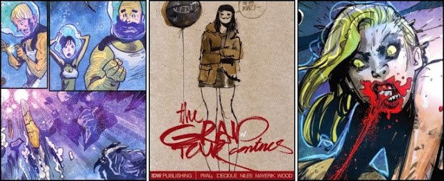
There is an awful lot going on inside “Issue Five” of “Zombies Verses Robots”, and whilst the majority of this anthology’s storylines are engaging zed-killing fun, the plot to Chris Ryall’s lead feature “Inherit The Earth” is arguably by far one of the most fantastical post-apocalyptic adventures ever imagined with homicidal human personas inhabiting robotic killing machines and astronauts being assaulted by Mermen deep under water. Throw in a long abandoned Grecian island once inhabited by Amazons, a zombie Minotaur and the living corpse of a naked female with a penchant for ‘popping’ men’s eyeballs with her teeth, and it’s reasonably clear that the innovative Californian writer is probably taking his role as Chief Creative Officer for “IDW Publishing” a little too far.

Such a ludicrously insane narrative however, does still contain some outrageously entertaining moments, and despite being utterly absurd, the ten-page tale is undoubtedly a fun read… Especially when the bombastic King Neptune is eaten alive by his own giant killer squid, following the multi-limbed sea-beast’s displeasure at having a zombie chomp into one of its tentacles. The American Editor-In-Chief also provides a most welcome return to this comic book title's basic premise, by having Warbot 7-G gun down a horde of hungry zombies within the story’s final few panels.

Disappointingly Anthony Diecidue’s pencilling fails to be as appealing as his illustrations are grisly and gory. Indeed the Los Angeles-based artist’s scratchy style is dishearteningly indistinct and makes it confusingly unclear as to whether the dead astronaut Cesar has bitten the Merman’s pet monster or one of the other of the ghouls depicted populating the sea-people’s aquarium.

A far simpler more straightforward plot is that of “Tales Of ZVR”. Having been saved from a group of ravenous walking cadavers by a half-dormant war robot, Ashley Wood’s unnamed boy makes his way to “The Dark Docklands” and there encounters a mysterious female and her “floating deathbot ball.” The Australian’s distinctive sketches are as depressingly bleak as they are abrasive-looking. But Minzy’s hut, precariously perched upon the back of a prone giant robot is wonderfully drawn.

Concluding this issue with a suitably grim and bloody zed-killing fun-fest is Steve Niles’ “The Orphan”. Whilst lacking the naïve charm of Wood’s aforementioned two-pager, Rosemary’s attachment to Bot-Bot nonetheless provides an endearing element to an initially somewhat tepid tale of searching for fruit tree seeds in the wasteland. Fortunately the walking dead soon turn up, albeit these mind-controlled zombies are more akin to Terry Nation’s Robomen than George A. Romero's flesh hungry corpses. But for a few pages at least artist Val Mayerik’s wonderfully dynamic panels portray the fiends being either torn apart with gunfire, battered by the large robot’s fists or extravagantly blown to pieces by a mini-rocket.
The regular cover art of "ZOMBIES VS. ROBOTS" No. 5 by Ashley Wood

Tuesday, 19 May 2015

Batman #17 [The New 52] - DC Comics

BATMAN No. 17, April 2013
This conclusion to the twenty-three issue cross-title story-arc, “Death Of The Family”, and the third best-selling comic of February 2013 having sold a staggering 150,684 copies, owes more than a fleeting nod of acknowledgement to ‘slasher horror flick’ director Tobe Hooper. Whether it be a dazed, chair-bound Batman groggily waking to see a hand-puppet made from the bones of a dead animal, or a ‘Leatherfaced’ Joker proudly revealing to the Dark Knight that he’s sat at a macabre meal beset with flies and ghoulish gourmets, the similarities between Scott Snyder’s script and the 1974 “Bryanston Pictures” distributed film “The Texas Chain Saw Massacre” are claustrophobically close. Indeed one could argue that the only thing missing from this thirty-one page parody of the Texan movie-maker’s best known production is a chainsaw and perhaps a wizened semi-mummified relative sat at the end of the dinner table in a rocking chair.

As such “The Punchline” will doubtless appeal to many a horror fan. But such a sinisterly sickening storyline is perhaps just a little too dark, grotesque and unfunny for a caper involving the Clown Prince of Crime. Especially when it is revealed part way through the narrative that the crimefighter’s arch-nemesis has supposedly hacked off the faces of the rest of the Bat family, Bruce Wayne’s young son included, and promptly has the bloody skin served to them on ice as an appetiser. As the Joker himself says “That’s not… funny.”

Such a villainous plan is admittedly diabolical and shocking but it is also disgustingly disconcerting, and thus arguably unworthy of being printed within the pages of “DC Comics” premier comic book title; at least one supposedly being aimed at attracting an adolescent audience. Fortunately, the green-haired ‘faceless’ clown has actually done no such thing, and when Batman finally comes to his friends’ aid their mutilation is revealed to be all part of “a twisted joke.”

What then follows is far more typical of Jerry Robinson’s co-creation, as the Joker spends a couple of pages duking it out with his “old friend”, toe to toe, in the catacombs of a cave. There’s even the obligatory madcap scene of the psychopathic murderer somehow managing to lay his hands upon both a huge axe and then later his infamous signature crowbar. Sadly the climax to this ‘dance’ is bitterly disappointing as the homicidal maniac throws himself into an abyss rather than hear his cowled foe whisper to him “who you really are under there.”

Greg Capullo would also seem to be somewhat ‘out of sorts’ with his artwork during this troubling tale of facial disfigurement, grinning butlers and double-headed kittens. The New Yorker’s pencils are outstanding, albeit grisly, when depicting the plot’s two main adversaries. But just as soon as the bandages are removed from the Bat family members' heads, his illustrations take a discernible turn for the worse. Most notably when drawing the flawlessly fresh-faced Nightwing, Red Robin and Damian Wayne.
The variant cover art of "BATMAN" No. 17 by Tony S. Daniel

Monday, 18 May 2015

Ant-Man #2 - Marvel Comics

ANT-MAN No. 2, April 2015
The popularity of Scott Lang is arguably an enigma of the Marvel Universe. On the one hand the electronics expert is supposedly a reformed thief who has put “his somewhat sordid past” behind him, a super-hero who has the ability to significantly shrink in size and communicate with insects, and a doting loving father who will do simply anything to remain part of his teenage daughter’s life. But on the other this supposedly honourable and well-principled ex-con is undoubtedly one of life’s biggest losers, an admittedly well-meaning but ultimately unthinking and selfish crime-fighter who, as Nick Spencer demonstrates in Issue Two of “Ant-Man”, can’t even be trusted not to steal a pile of bank notes given half a chance.

Such a scathing attack upon the former Avenger’s appeal may seem somewhat harsh given that this titular character’s debut actually outsold such popular titles as “The Walking Dead” by “Image Comics” and “Justice League” by “DC Comics” in January 2015, thanks to an impressive circulation figure of 73,370 copies. But such 'casual curiosity' for a new book on the comic stands did not last long with only 40,192 purchasing this following edition; presumably as a result of many first-time buyers finding the dishonest, manipulative and ungrateful security advisor disagreeable and unlikeable.

“Welcome To Miami” certainly does little to make Lang any more affable an astonishing hero. Indeed this periodical’s storyline of Ant-Man purposely deactivating the security systems of “The First Capital Bank of Miami” in order to compel them to grant him a loan, demonstrates just how completely unreliable and untrustworthy the man is. It is little wonder that the financiers’ initial reaction to the charlatan's tampering is a strong belief he is actually “robbing the bank!”

Worse it is entirely as a result of Scott’s reckless behaviour that the Midasbot is released from the vault. If he hadn’t broken into the depository’s data network and spent two hours criminally scrambling phone networks and unlocking security features then there would have been no need for a superhero to leap to the rescue and save countless lives in the first place… Nor for the treasury’s guard to die having been seemingly turned into a Nazi Gold statue through ‘atomic power and alchemy!’

Lang’s final fall from grace at the end of the comic, where he pockets a load of money because he thought the bank had declined his loan, does not show Ant-Man as the sort of flawed hero the likes of which Stan Lee once wrote about in the Sixties and Seventies. Instead Spencer’s script simply makes this second incumbent of Hank Pym’s costume come across as someone with no different a moral compass to those robbers and muggers ‘Ant-Man Security Solutions” will presumably detain.

Less unappealing, though only marginally so, is Ramon Rosanas artwork. The Spanish penciller’s pages are crammed full of fast-paced panels which really help invigorate a comic that is predominantly based within the dialogue-heavy boardroom of a bank. But with the exception of the fantastically over the top supervillain the Grizzly, the illustrator’s actual drawings are rather stiff-looking and wooden-like in their movement. Something which quickly makes the numerous picture frames somewhat suffocating and offputtingly overpowering.
The variant cover art of "ANT-MAN" No. 2 by Andy Park

Sunday, 17 May 2015

V-Wars #0 - IDW Publishing

V-WARS No. 0, May 2014
Based upon Jonathan Maberry’s prose anthology of “a world where an ancient virus has brought the vampire population back”, this comic book adaption of “V-Wars” thoroughly warrants its “suggested for mature readers” cover warning. For the American author’s version of a Nosferatu is far more akin to one of the brain-hungry zombies conjured up by filmmaker George A. Romero than the civilised blood drinkers depicted by the likes of writer Anne Rice. Indeed these unnatural predators have seldom been shown as such aggressive and ferocious ‘creatures of the night’, throwing petrol bombs, blazing away with automatic weapons and ripping the limbs off of hapless victims all in order to momentarily abate their “unstoppable hunger.”

As introductory issues go therefore this "Free Comic Book Day" first printing is an action-packed gore-fest, even if it does disappointingly conclude after just twelve-pages. Straight from the start the multiple Bram Stoker Award-winner hurls the reader into the middle of a grotesquely ugly firefight between Special Operations field team Victor 8 and a truly fearsome horde of rioting vampires. Cars are casually overturned by the demonic creatures, assault rifles flatten the Undead with swathes of lead, and a Charlie Chu-Chu Chicken restaurant proves a deadly trap for at least one special forces soldier within the space of just a couple of heartbeats.

Besides giving it to any bibliophile with ‘both barrels’, Maberry’s storytelling technique of events following closely in the footsteps of Presidential advisor Luther Swann, Ph.D. is equally as inspired. The genuine horror captured within the man’s haunted eyes and the mild-mannered academic’s eventual breakdown into committing an unspeakably violent act himself, really helps drive home just how utterly terrifying a place the modern day world has become in just 212 days thanks to the triggering of long dormant genes found within our junk DNA.

Alan Robinson’s artwork stunningly captures all the tension and dynamic action of the plot with a detailed but clean style which proves infinitely more pleasing than that of cover artist Kevin Eastman. The Chilean illustrator appears especially adept at conveying his character’s thoughts on their troubled faces, and his wonderfully animated ghoulish-looking vampires hold more than a passing resemblance to the drawings of noted “Preacher” sketcher Steve Dillon.
Origin of Communication: Jonathan Maberry, and Visual Reference: Alan Robinson

Saturday, 16 May 2015

B.P.R.D. War On Frogs #1 - Dark Horse Comics

B.P.R.D. WAR ON FROGS No. 1, June 2008
The first of a four-issue limited series which concentrates upon various members of the Bureau for Paranormal Research and Defense in their war against the frog monsters of Sadu-Hem. This particular one-shot focuses upon the character of Roger the Homunculus and formed part of “Dark Horse Comics” lead-in to the release of the “Universal Pictures” motion picture “Hellboy II: The Golden Army”.

Whether you agree with the publisher’s exploitation of the (then) imminent movie’s publicity or not is fortunately somewhat immaterial though. As despite containing a decidedly straightforward rather action-orientated storyline, “Number 44 in a Series” appears to be a remarkably thought-provoking tale, without hint or trace of having been rushed into publication simply to ‘piggy-back’ upon any increased public interest in Mike Mignola’s characters. Indeed John Arcudi’s use of the unusually large artificial “little man” made from herbs and blood as the emotional engine for ironically, a very human story of family devotion and love, shows just how much deliberation must have gone into the Italian-born American’s writing. Certainly if nothing else the former “Doom Patrol” author evidently conducted some extensive research into the background of this comic book series, undeniably tapping into the very first “Hellboy” mini-series for his Cavendish Hall based narrative.

Whether this means Issue One of “War On Frogs” is something of an epilogue to the fourteen year-old “Hellboy: Seed Of Destruction” is debatable. What is clear though is that as soon as the authoritative figure of Roger appears to take charge of the B.P.R.D. field team the reader’s attention is never allowed to stray from his side. Whether the alchemist’s construction is swimming through underground tunnels, exploring dank dark caverns populated with distressed family heirlooms and dead bodies, or wrestling with giant upright frogs and their tentacle-like tongues, all attention is entirely focused upon the homunculus’ actions and thoughts.

Such a confining restrictive storytelling technique could easily have suffocated the life from this dramatic animated tale. Instead it really helps Arcudi emphasise just how increasingly demoralised and regretful the B.P.R.D. agent becomes when he realises that the former Cavendish brothers hadn’t actually been hurting anyone, and the only reason they became murderously violent was because he had sought them out and trespassed upon the Frogs' grief and guilt; "who exactly were they bothering in the first place?"

Somewhat disturbing however is that seminal Seventies artist Herb Trimpe actually provides the illustrations for this magazine as guest penciller. Best known for his terrific quality output on “The Incredible Hulk” by “Marvel Comics Group”, the New Yorker’s drawings are completely unrecognisable as a result of Guy Davis’ heavy distinctive-looking inking. In fact rather sadly, if the Inkpot Award-winner’s name wasn’t so clearly credited on the book’s cover, many readers would doubtless believe the pictures were solely the work of just Davis.
Story: John Arcudi, Pencils: Herb Trimpe, and Inks: Guy Davis

Friday, 15 May 2015

Marvel Two-In-One #35 - Marvel Comics

MARVEL TWO-IN-ONE No. 35, January 1978
Straight from this book’s spectacular Ernie Chan cover depicting Skull the Slayer and Ben Grimm battling a party of African warriors and a ferocious dinosaur, “Marvel Comics Group” editor Marv Wolfman seems to have been determined to deliver a no-nonsense highly enjoyable action-packed read to this title’s audience. Admittedly the Brooklyn-born writer’s story starts off with a somewhat clunky awkwardly written one-page preamble which swiftly establishes that the United States Air Force have ‘recruited’ the Thing to fly their “sleek, experimental R-37 supersonic “Bird of Prey” in order to “penetrate the Bermuda Triangle” and locate a missing jet plane. But such a considerably contrived set of kooky circumstances is easily forgivable when it means that within the space of a few panels, the former test pilot’s aircraft is trapped within the jaws of “an overgrown canary” and shockingly transported back in time to the age of prehistoric monsters, or rather “roughly one quarter of a billion years before they invented television”.

Having abrasively pulled one of the founding members of the Fantastic Four into his version of ‘Jurassic Park’, the Shazam Award-winner wastes absolutely no time in preparing the ground for the unlikely team-up of The Thing with his very own co-creation, Jim Scully, a Vietnam veteran whose alien Scorpion power belt grants him super-strength. Indeed Wolfman’s introduction of the herculean adventurer proves to be just as much a breathless non-stop escapade as that of Aunt Petunia’s blue-eyed nephew as he wastes no time prevaricating over the fact that “Enter: Skull the Slayer And Exit: The Thing!” directly follows on from the events published in the eighth and final edition of “Skull The Slayer”. But instead prefers to bring the reader up to date as to how that cancelled comic book ended by way of some concise scribbled footnotes found within the margin.

As a result just as soon as Ben Grimm’s battered ‘oarless craft’ comes to land, the rock-like human mutate is bashing “bad guys” and together with Scully, thwarting the machinations of the power-mad Jaguar Priest. Rather impressively such pulse-pounding all-action antics then continues unabated for a further eleven pages as the phenomenally strong duo wrestle a giant pterodactyl to the ground and attempt to fend off a hungry Tyrannosaurus Rex with a few well-aimed punches. 

Uncharitably, such a propensity for preposterous predicaments does occasionally sway Nostalgic Marv’s storyline a little close to all-out farce, especially when despite being able to previously ‘lay out a carnivorous theropod with one little clobber’ The Thing ends up running for his life away from one. But so sudden a conclusion to such a titanic 'classic' confrontation would have deprived the reader of some truly glib comments by a back-peddling Benjamin; “Er, anyone got an army hidin’ in the bushes somewhere?”

As one would expect from so notable a guest artist as Ernie Chan, the pencilling within Issue Thirty Five of “Marvel Two-In-One” is wonderfully dynamic and crammed full of both energy and life. Of particular note are the amazingly animated dinosaurs the Filipino-American comic book artist conjures up, with the baleful red-eyed Tyrannosaurus proving to be especially impressive, if a little unrealistically agile. In fact it is hard to imagine Skull the Slayer’s own magazine selling as poorly as it did if the predominantly ‘Swords and sorcery’ illustrator had drawn it.
Writer/Editor: Marv Wolfman, Pencils: Ernie Chan and Colorist: Michele Wolfman