Saturday, 31 January 2015

Batman: Battle For The Cowl #2 - DC Comics

BATMAN: BATTLE FOR THE COWL No. 2, June 2009
Anyone familiar with the major 1993 Batman story arc “Knightfall” or ‘Knightsaga’ will appreciate just how terrifying a psychotic Dark Knight can actually be. For Jean-Paul Valley’s murderously unstable caped crusader is a genuinely scary prospect for not only Gotham City’s criminal Underworld and general public but for the title’s readership as well. 

With “Army Of One” writer Tony S. Daniel conjures up an equally dangerous and unbalanced incarnation of Batman, this time sporting a metallic medieval-looking face-guard, hand-grenade belt and an ammunition ribbon the Punisher would be proud of. None of this bodes well for all the ‘bat-allies’ of The Network as the momentarily mysterious vigilante, swiftly revealed to be the former Robin, Jason Todd, dispatches first Damian Wayne, his mentor’s son, and then later Tim Drake; cold-blooded killer indeed

However any reader thinking that it was just going to be the once dead now resurrected protegy of Bruce Wayne who was going to use lethal force without a moment’s thought would be badly mistaken. This is a violent comic book with the likes of Two-Face, Jane Doe, Firefly, Adam Bomb, the Black Mask and Victor Zsasz all ending someone’s life in some gruesome manner, whether it be a simply shooting or explosion, or cutting off some hapless police officer’s face. Even the Penguin is depicted by Daniel at his homicidal best, crushing the life out of tiny bird with his gloved hands.

Fortunately not every character is portrayed as some sort of lunatic, as the American writer provides both a quick glimpse of the ‘nicer side’ to the anti-heroine Catwoman, and shows just what Batman may have become if Tim Drake permanently donned the cape and cowl; albeit this is a fleeting look as the issue ends with a laughing Todd sticking a cruel-looking bat-blade deep in his rival’s chest.

Having penned this enjoyable gore-fest Tony Daniel is also responsible for the book’s artwork and for most of the issue this is equally as well done as the writing. As an artist he does seemingly struggle to draw consistently as his pencilling of an early confrontation between Nightwing, Robin and the deranged Batman is quite appalling in parts. Yet by the edition’s conclusion Daniel sketches six successive pages of fantastic fisticuffs between Todd and Drake, which are wonderfully animated with swirling capes, hefty punches and spilt blood.
The regular cover art of "BATMAN: BATTLE FOR THE COWL" No. 2 by Tony S. Daniel

Friday, 30 January 2015

The Twilight Zone: Shadow & Substance #1 - Dynamite Entertainment

THE TWILIGHT ZONE: SHADOW & SUBSTANCE No. 1, January 2015
“Here is a fifth dimension beyond that which is known to man. It is a dimension as vast as space and as timeless as infinity. It is the middle ground between light and shadow, between science and superstition. And it lies between the pit of man’s fears and the summit of his knowledge. This is the dimension of imagination. It is an area which we call The Twilight Zone.” So began the Late Fifties American television science fiction anthology series by Rod Serling; a cult programme which in 2013 was ranked the fourth greatest drama of all time by the bi-weekly American magazine “TV Guide”.

Encapsulating the popularity and critical success of such a series within the confines of a comic book was always going to be a hard act for “Dynamite Comics” to accomplish but this first issue of “The Twilight Zone: Shadow And Substance” is a competent endeavour which certainly captures some of the suspense and drama of Serling’s screenwriting. Indeed the cover art by Guiu Vilanova, which pays homage to such classic televised episodes such as “To Serve Man” and “Nick Of Time”, really establishes the mood for reading a macabre thriller, or psychological ‘page-turner’ with an unanticipated twist.

Unfortunately Part One of “Stumbling Distance” by Mark Rahner doesn’t manage to quite live up to such grand expectations but certainly begins well enough, complete with spooky narration as nervous novelist William Gaunt arrives at “…a place not listed on any airport arrival or departure boards. [But] The Twilight Zone.” In fact the plot’s premise of the author anxiously arriving back in his hometown for a book signing only to then discover he’s really returned to his actual childhood past, could have been taken straight from the black and white brainchild of Serling.

Sadly the veteran comic book writer can’t ‘pull off’ the perfect imitation however, as his central character takes in his troubled time travelling trip far too readily, swiftly adapting to seeing not only his alcoholic mother but his maladjusted much younger self and interjecting himself into their lives.

Far more disappointing however is the quality of Edu Menna’s pencils, as his interior artwork is woefully inadequate, especially when compared to Vilanova’s inspired front page illustration. Claw-like hands, forced facial features, misshapen limbs and clumsy robotic poses are just some of “The Army Of Darkness” artist’s shortcomings. All of which dishearteningly combine to dull any lasting sense of drama or suspense to the ‘spooky’ storyline.
The variant cover art of "THE TWILIGHT ZONE: SHADOWS & SUBSTANCE" No. 1 by Jonathan Lau

Thursday, 29 January 2015

The Walking Dead #115 - Image Comics

THE WALKING DEAD No. 115, October 2013
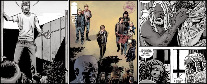
As long-running comic books go “The Walking Dead” has arguably accumulated an intimidating and rich history which would be hard for any new reader to assail without first climbing a mountain of back issues or thick graphic novel reprints. The series’ character death toll alone is simply staggering and so many of these demises continue to haunt and motivate current storylines.

This particular edition however, in being the first edition to celebrate the title’s tenth anniversary and initiating the onset of the twelve-issue “All Out War” story-arc, is also in many ways a potential starting point for those unfamiliar with the franchise. It would certainly seem that publisher “Image Comics” thought so, having invested in no less than sixteen different (variant) covers for the same issue; ten of which connected together to form a tapestry of the series’ defining moments.

However, it really is hard to see why this particular book was the best-selling comic of 2013, and sold over 310,000 copies, as very little actually takes place within its pages. Indeed, Issue 115 is rather notorious for not having a single death, whether alive or zombified, in it. Not exactly the pulse-pounding start a reader might anticipate when embarking upon a six-month bi-weekly plot advertised as depicting Rick Grimes’ army of survivors battling the maniacal Negan and his murderous followers. 

What Robert Kirkman’s script does contain in abundance however, is plenty of character exploration and relationship development; heavily interspersed with some huge boring double-page spreads, which were presumably drawn by Charlie Adlard to help make up the page count. In fact it isn’t until the last couple of pages, when the former police officer arrives at the large factory known as The Sanctuary, that any sort of tension or action occurs; and then it’s essentially all-talk with plenty of profanities thrown in.

There’s also an almost total absence of zombies from this comic… Something which is hard to imagine when the book is called “The Walking Dead”. Admittedly much of the title’s long-running success has been as a result of its co-creator concentrating on people not shambling cadavers. But even so, a comic based within the zombie apocalypse should surely not wait until the penultimate panel before depicting a close-up of one and then it isn’t actually doing anything but lurching about.
The regular cover art of "THE WALKING DEAD" No. 115 by Charlie Adlard & Dave Stewart

Wednesday, 28 January 2015

Moon Knight #5 - Marvel Comics

MOON KNIGHT No. 5, September 2014
There are times when all a comic book collector just wants to do is pick up a title and enjoy a good old-fashioned fist-fight. They don’t need the writer to ‘wax lyrical’ about the lead character overcoming their flaws, weaknesses and personal demons. They simply desire twenty well-illustrated pages, crammed full of action, adventure and frankly, gratuitous violence, as their favourite hero overcomes extreme adversity by throwing more than a few punches and breaking a variety of heads.

With “Scarlet” Warren Ellis and Declan Shalvey deliver just such an experience with ‘Mister Knight’ adopting a seriously no-nonsense approach whilst endeavouring to rescue an adolescent kidnap victim housed within a multi-storey tenement. This story really is as simply straightforward and direct as the masked vigilante’s limousine halting directly outside the boarded up apartment door, and its occupant immediately making his presence known to the helpless goon on guard-duty; courtesy of an ancient Egyptian sword. From then on in there is very little which is actually said, as Shalvey shoulders most of the story-telling burden.

Fortunately it is a task the Irish artist appears to relish as his illustration work is absolutely top notch. Rarely has any “Marvel Worldwide” super-hero, this side of Frank Castle’s Punisher, been so dramatically drawn flagrantly beating down the bad guys. Whether it be a sound jaw-shattering bashing with Moon Knight’s truncheon, a back-breaking tumble over the banister, or having the large flying drone circle and flatten a fleeing felon on the rooftop. It is all pencilled with incredible energy and violent flair.

The 2007 Eagle Award winner also manages to create a couple of quite memorable mini-bosses for Marc Spector to confront, lavishing plenty of extra attention upon both a bald, well-muscled, heavily tattooed ruffian and a meticulously groomed knife-fighter armed with a pair of ornate golden blades. These kidnappers are made all the more striking by colorist Jordie Bellaire momentarily stepping away from her all brown and grey palette and providing the thick-set thug with a wonderfully bright pink pair of combat boots and donning the duellist in a crushed velvet suit.

Indeed the only disappointment with this issue is that once ‘Mister Knight’ has literally discarded his stark bright white suit-jacket and rolled up his shirt sleeves, the abductee is rescued all too quickly and the comic concluded.
Writer: Warren Ellis, Artist: Declan Shalvey, and Color Artist: Jordie Bellaire

Tuesday, 27 January 2015

Powers #1 - Icon Comics (Marvel Comics)

POWERS No. 1, January 2015
Possibly when it comes to reading comics there is an especially strong prudish streak inside me. For within mere seconds of opening this book, and catching sight of just the second panel, I was dishearteningly flipping back to the front cover looking for some sort of ‘Mature Content’ warning and remembering the ‘good old days’ of the Silver and Bronze Age when the Comics Code Authority forbade the use of all colourful metaphors.

Surprisingly there was no such cautionary graphic to be found. But there again “Powers” is part of the “Icon Comics” imprint, a trade name designed by “Marvel Worldwide” to keep certain ‘A-list’ creators working for the American publisher rather than have them take their creator-owned titles to a rival production company. And writer Brian Michael Bendis, winner of five Will Eisner Comic Industry awards, amongst many others, is most definitely an ‘A-list’ author.

Unnecessary profanities and blatant nudity aside however, this first in a new run of crime noir adventures concerning super-powered homicides also has the hurdle of a fourteen year-long backstory to overcome. Fortunately being previously oblivious to the ongoing series is not a barrier as the four-time Wizard Magazine award-winner has crafted an opening issue which requires no prior knowledge of the title’s earlier publications; significantly hefty though they are. Indeed it lands the reader smack bang in the middle of an arrest, as detective Deena Pilgrim repeatedly discharges her firearm into the 'backside' of the fleeing ‘power’ Red Wave.

From there Bendis provides us with a brief insight into the dark, lonely, perturbingly paranoid home life of our heroine before the police specialist, accompanied by her partner Enki Sunrise, faces the formidable challenge of capturing the killer of a yacht-full of rich socialites.

Sadly it doesn’t really matter how intriguing or enticing the plot to a comic is when the artwork is as abysmal as that drawn by co-creator Michael Avon Oeming. Definitely distinctive, the American illustrator can clearly draw extremely well when presumably given the time, as the slightly cartoony but eye-catching cover artwork to Issue One of “Powers” proves. But his interior pencilling is arguably beneath child-like, as his inconsistent characters lurch from panel to panel with stick-like features, over-sized balloon heads, and an awkward ever-evolving grasp of human anatomy. Certainly it is hard to fathom out how previous volumes were able to generate strong enough sales for Oeming to quit his job as a security guard and become a full-time artist.
The variant cover art of "POWERS" No. 1 by David Marquez

Monday, 26 January 2015

Moon Knight #4 - Marvel Comics

MOON KNIGHT No. 4, September 2014
Distinctly disturbing and ultimately quite viciously violent, writer Warren Ellis quite literally takes any reader of “Sleep” on a journey which is both wonderfully wild and yet creepily charismatic. Indeed towards the end of this book even the appearance of Lewis Carroll’s Absolem (the blue caterpillar) would not seem out of place as Marc Spector conducts an investigation into a sinister spore-infested study of some hapless “somnological subjects.” 

Initially the English author’s story is humorously absurd, with a thoroughly bored fast-food cashier, fake eye-patch and plastic Viking horned helmet wearily worn, serving Doctor Skelton an ‘Odinburger’ and robotically enquiring of him “Wouldst thou like Odinfries with that?” However once the good sleep researcher takes his place within the comfortable rear passenger seat of Mister Knight’s limousine, things start getting eerily spooky very very quickly; especially once the pair arrive at the downtown university laboratory and the crime-fighter conducts a brief exploration of its meagre facilities.

Up until this point though despite there being some disquietingly distressing moments, such as a description of a patient eating their own fingers in their sleep, Ellis’ interrogation of the Doctor by Spector is still reasonably standard “Moon Knight” analytical stuff. Perhaps made all the more ‘hum drum’ by the muted blue-blacks, browns and greys chosen by colorist Jordie Bellaire.

But once the masked vigilante falls asleep on the premises both the writing and without doubt Declan Shalvey’s artwork, really ramp up a notch or two. Plateaus of towering mushrooms, fungus formations, mould-mountains and other eukaryotic organisms dominate a human skull-shaped planetary sphere… and are all sumptuously detailed by the Irish artist and captivatingly coloured by Bellaire. There’s even a clever transformation scene as Mister Knight finds himself falling in the dreamscape and thus adopts his Fist of Khonsu persona, complete with flowing cape and cowl, in order to glide down safely to the fungoid infested floor. 

A fortuitous choice, as the super-hero swiftly finds himself having to cut a swathe through a world of sprouting hands, grotesque geysers and ghoulish purple faces. Marvellous stuff, which makes Spector’s sudden waking and subsequent subjugation of Skelton even more stark and shocking, as the reader is snatched away from a multi-hued wonderland and swiftly made to confront the dank rat-infested fungal-infected corpse of the doctor’s first “off the books” patient.
Writer: Warren Ellis, Artist: Declan Shalvey, and Color Artist: Jordie Bellaire

Sunday, 25 January 2015

Image Firsts: The Walking Dead #1 - Image Comics

IMAGE FIRSTS: THE WALKING DEAD No. 1, April 2014
There isn’t really much more that can be said about the comic book phenomenon “The Walking Dead”, a zombie apocalypse series, printed in black and white, and created by Robert Kirkland and Tony Moore. Its first issue was published in 2003 and only had a print run of just 7,300 copies. As a result, such is the magazine’s scarcity and the franchise’s popularity, that a single mint edition can fetch $10,000; at least that was the price tag of a 9.9 graded Certified Guaranty Company issue in 2012.

Fortunately, because of its astounding popularity, “Image Comics” have since made the book available again under its “Image Firsts” label; a $1 reprinting of the first issues of some of its best-selling titles which has been designed to allow unfamiliar readers to try out “a variety of new series without feeling the effects on their wallet.” So now more than ever there is no excuse not to take those first tentative steps through the corridors and wards of Harrison Memorial Hospital with officer Rick Grimes…

And a very personal trip it is too as Kirkland quickly creates a connection between the reader and the man ‘just looking for his wife and kid’. Whether injured in a shoot-out, wandering through deserted and derelict streets or hopelessly searching his marital home, absolutely nothing happens in this first issue without the cop being present and us sharing his confusion, anguish and fear.

Another clever writing technique employed by the “Image Comics” partner is to not actually feature that many zombies in the story. Indeed, even when Grimes inadvertently blunders into the hospital cafeteria, a place filled to the rafters with the living dead, it is only really one of the walking corpses which causes the disorientated policeman any real danger… and so goes the rest of the officer’s ghoulish encounters, whether it be the putrefying cyclist or the ‘walker’ outside the police station. Both confrontations are unnerving but not especially dangerous. Instead the storyline is all about people, their behaviour and reactions to one another, and how, together, they will face the horrifically changed landscape of the world around them.

Fortunately American comic book artist Tony Moore does a superb job of capturing all this emotion with some stunning pencil work, such as when a distraught Grimes breaks down having just taken a gurgling zombie’s pushbike. In addition, in this modern age of colour, the inker’s brave use of just gray tones, nobly assisted by Cliff Rathburn, really helps capture the sombre mood of the weird world the officer has woken up into. It makes everything all that more depressing and wearisome, and emphasises the survivors sense of hopelessness at the possible prospect of having to now just survive living day by day, hour by hour.
Creator, Writer and Letterer: Robert Kirkman, and Artist: Tony Moore

Saturday, 24 January 2015

Moon Knight #3 - Marvel Comics

MOON KNIGHT No. 3, August 2014
For a comic published during the height of the summer-time there’s a real winter holiday feel to “Box”, not least because the majority of the action takes place on a cold New York city street, its pavements clogged with sleet and snow, its icy road predominately hidden beneath a carpet of white. However that isn’t the only reason why a reader may feel a chill as writer Warren Ellis appears to have taken a page straight out of the script for the 1989 motion picture “Ghostbusters 2” and created a haunting festive tale of restless undead spirits preying upon the hapless pedestrians of downtown Manhattan.

These spikey haired phantom punks initially appear simple fare for ‘Mister Knight’, as the hooded, three-piece suit wearing vigilante quickly arrives at the scene of their third manifestation to distribute his own brand of thoroughfare justice. Confident and quick to throw a punch, the Fist of Khonsu is as shocked as the reader to discover he is incapable of hurting the green-hued ghosts. Whilst they on the other hand can inflict some quite considerable damage on the one-time mercenary. Indeed it’s rare to see the co-creation of Doug Moench and Don Perlin take such a sound beating. Not that it in anyway dampens the crime-fighter's determination to best them.

It does however cause Marc Spector to create easily his most bizarre costume yet, as he scours his collection of Ancient Egyptian artefacts looking for both armour and raiment for combating the dead. The ensemble such a search creates is both fantastic and absurd, with Moon Knight wearing an enormous beaked skull and the wrappings of an embalmed mummy. The ensuing fist-fight is superbly drawn by artist Declan Shalvey, with the heavily bandaged super-hero arguably having never looking more imposing and menacing; though some of his renderings of the dismembered spirits are disappointingly poor. Indeed the 2010 Eagle Award nominee’s full-page illustration of the super-hero splitting a ghost's head wide open with a solid punch is appallingly pencilled, as gruesome in its line work as it is in its subject matter.

Indubitably trounced, the ghouls flee to an abandoned tenement where they are found to be the restless remains of a criminal gang long-slain by their leader in a moment of conscience. Somewhat reverently, Ellis has Moon Knight collect the small toy music box within which the spirits reside, and in a final, wordless, somewhat poignant panel, the Fist of Khonsu consigns them to a watery grave deep beneath the silent surface of East River.
The variant cover art of "MOON KNIGHT" No. 3 by Ryan Stegman

Friday, 23 January 2015

Moon Knight #2 - Marvel Comics

MOON KNIGHT No. 2, June 2014
It is quite clear that writer Warren Ellis and artist Declan Shalvey have really tried to do something ‘a little different’ with “Sniper”; a single-issue one-off story which provides both a commentary on the diversity of office work and a body count any serial killer would be proud of.

Indeed the first half of the book is really rather clever, if not increasingly barren, as each page depicts eight former members of a special operations group going about their day-to-day business in ‘civvy street’. As each individual’s working day simultaneously draws to an end they are brutally ‘picked off’ with headshots one by one, page by page, until the last is slain leaving his office building; a somewhat bloody event which is captured within a rather tiny frame, sat upon an otherwise blank page. As I say an ingenious method of creating tension, as you never know who will be shot next, and of telling a story, as it’s certainly captivating stuff.

Somewhat jarringly however the second part of the tale is, in many ways, a somewhat traditional “Moon Knight” affair as Marc Spector, garbed in an enormous white billowing cape that Bob Kane’s Dark Knight would envy, battles the sharp-shooting murderer. Having said that though much of the fist-fight is rather unconventionally told simply through the medium of Shalvey’s illustrations. As Ellis solely relies upon the Irish comic book artist to depict the roof-top confrontation for five straight pages; a bold and challenging storytelling technique. Indeed it isn’t really until the end of the fight, when a downed sniper is cold-bloodily dispatched by a ninth retiree from the global security field, that letterer Chris Eliopoulos actually has something substantial to do.

As a result this comic book is a rather swift read, and much of its success depends upon whether the reader is mesmerised enough by Shalvey’s artwork. Certainly the 2007 Eagle Award winner is capable of composing his pages with some extremely fast-paced panelling, and his sky-lines are both extremely well-designed and technically drawn. But his interpretation of Moon Knight’s symbolic all-white costume is a little too heavy on the carbonadium armour and black body-suit for my liking. Whilst his inconsistency in drawing a detailed face upon the gunman is infuriating, as they inevitably follow a series of exciting well-drawn frames depicting the Fist of Khonsu in the heat of the action, and thus jolt the reader out of the action-packed moment.
The regular cover art of "MOON KNIGHT" No. 2 by Declan Shalvey & Jordie Bellaire

Thursday, 22 January 2015

G.I. Zombie #4 [The New 52] - DC Comics

G.I. ZOMBIE No. 4, January 2015
An unexpected ‘reveal’ as to Carmen King’s past as a sole-surviving military helicopter lieutenant at the start of this comic book is simply not enough to save a rather lack-lustre, somewhat confusing and ultimately disappointing publication. There is a genuine tiredness to both the writing and the artwork for Issue Four of “G.I. Zombie”; almost as if the creative team behind ‘the man who is neither dead or alive’ knew the title was about to be cancelled by “DC Comics” and aware of their estimated sales figure of approximately just 7,500 copies, simply lacked the energy or willpower to produce a half-decent issue.

Whatever the reason “Exit Strategy” contains little passion, ambition or direction and at best appears to be a collection of short stories based upon a handful of characters who are either responsible for or fighting against the zombie outbreak at Sutterville, Tennessee. Quite rightly the title’s lead, Jared Kabe, still gets the lion’s share of attention but co-writers Jimmy Palmiotti and Justin Gray fail to satisfactorily resolve the previous edition’s cliff-hanger of the Sergeant being overrun by a swarm of zombies and disappearing beneath their tearing hands and gnashing teeth. Time has clearly moved on, albeit briefly, since the undead soldier fell beneath his foe through the sheer weight of their numbers. For instead of being ‘flattened’ upon the ground in danger of being crushed by the ravenous hungry horde assailing him, the story picks up with Kabe once again on his feet, simply punching his way to freedom.

Unfortunately with his safety is firmly established atop a local garage, G.I. Zombie’s co-creators suddenly seem lost as to what to do next. We’re introduced to some new characters testing out a bullet-proof full-body suit “at an undisclosed location”, then discover “the infected can drive” as a fuel lorry is driven straight through the military’s contamination recovery centre, and finally shown the Rinaldi Spa, a Roman-inspired hotel complete with togas, where the brain behind the ‘zombie bomb’ resides and dines his guest whilst literally surrounded by numerous missiles. As King states “You’ve got to be kidding!”

Equally as poor is Scot Hampton’s pencilling, which somehow manages to resemble little more than the school-book sketchings of a young child. Many of the figures are indistinct over-coloured figures, whilst others are misshapen distorted parodies of human anatomy… and these aren’t depictions of zombies either.
Writers: Jimmy Palmiotti & Justin Gray, and Artist and Colorist: Scott Hampton

Wednesday, 21 January 2015

The Amazing Spider-Man #1 - Marvel Comics

THE AMAZING SPIDER-MAN No. 1, June 2014
As fresh starts go, Issue One of “The Amazing Spider-Man” undoubtedly proved an incredible read for its 532,586 strong audience, as its contents were clearly tailored to appeal to both long-standing fans of Peter Parker as well as a new generation of "Marvel Worldwide" readers. It certainly should have come as no surprise that such a comprehensive collection of collaborative talent, alongside a phenomenally high page count, would help make it the biggest-selling comic book of April 2014 and outsell its nearest competitor, "Superior Spider-Man", by an incredible four hundred thousand copies.

Despite its girth however, and the fact that it contains multiple short stories featuring Electro, Kaine, Spider-Man 2099 and The Black Cat, the narrative most bibliophiles must surely have focused upon was this mighty tome’s lead tale “Lucky To Be Alive”; an adventure which heralds both the highly-anticipated return of the original web-slinger and also tried to rationalise some of the insane ‘superior’ shenanigans which occurred to the Wall-Crawler's body whilst inhabited by the brain of his greatest enemy, Doctor Octopus.

In order to achieve such a dual goal Dan Slott has quite wisely written a relatively straight-forward piece involving Spidey besting a colourful and bizarrely costumed team of robbers, whilst simultaneously discovering some of the changes to his life Otto Octavius has wrought in his name during his prolonged absence. Rather than tell this story in a linear manner though, the American author instead throws the reader straight into the action with Web-head partially foiling the Menagerie’s thieving caper, and then simply resets the clock back four hours to a time when a disorientated Peter is delivering a press statement outside the partially collapsed remains of Parker Industries.

This ‘pacing gimmick’ both immediately captures the attention and also quickly establishes that the fast-talking smart-mouthed (and unlucky) web-slinger of old is apparently back. In addition it also means that those who missed the thirty-three issue-run of “Superior Spider-Man” can slowly discover, alongside an oblivious Parker, what Octavius actually accomplished when he swapped their brains, without it being necessary to purchase a load of back issues... And there have been alterations aplenty as Peter discovers he is the C.E.O. of his own cybernetics company, Aunt May can walk again unaided, he has a doctorate and… a girlfriend, Anna Maria Marconi.

All of this is stunningly illustrated by Humberto Ramos, whose slightly cartoony but superbly detailed artwork is just perfect for the arachnid’s acrobatic antics; albeit his depiction of Doc Ock’s miniscule girlfriend makes her appear disconcertingly young and child-like, especially when stood beside the much taller Parker.
The regular cover art of "THE AMAZING SPIDER-MAN" No. 1 by Humberto Ramos

Tuesday, 20 January 2015

Guardians 3000 #2 - Marvel Comics

GUARDIANS 3000 No. 2, January 2015
In many ways there is a strong sense of déjà vu with this comic’s storyline, a feeling predominantly due to the fact that “My Aim Is True” starts in an almost identical manner to the previous issue of “Guardians 3000” and continues along very lines for the first couple of pages. However this is not a case of self-plagiarism or lazy writing on behalf of Dan Abnett, nor does it stem from the need to regurgitate an earlier successful plot device in order to make this book an action-packed triumph either. It’s simply a chance for the character Geena Drake to provide any uninitiated reader with more background on the formidable super-powers of Vance Astro and cleverly show how the latest Guardian of the Galaxy is able to manipulate her knowledge of ‘this all happening before’ to positively influence events.

As a result proceedings, initially similar in nature to what Abnett has had occur before, swiftly start to veer away from the old and steer towards the new. For starters ‘Sweetgenes’ now carries a hefty looking firearm with which she noisily dispatches the odd Badoon warrior, and her brief warning to their allies within Parliament of an imminent attack provides the likes of Gladiator, Praetor of the Shi’ar Imperial Guard, and King Peter, the Star-Lord of Spartax, just enough time to establish a defensive perimeter. Something the various delegations were unable to even contemplate when the Badoon originally ambushed them prior to the time-division. Plus the half-human half-alien Starhawk is now female...

This leads to some serious action-packed fire-fights, with all the Guardians ‘dishing out’ some serious destruction upon the invading A-Sentience and its warriors. Ultimately Parliament is still lost, as indeed is the Guardian’s starship The Captain America. But due to the apparent sacrifices of Stormfront and The Supreme Intelligence, the human Drake and her team-mates are still very much alive and where there’s life there’s hope…

Somewhat disconcertingly however all of these intense pitched-battles are inconsistently, yet still competently illustrated by Gerardo Sandoval, whose pencilling seems to have lost much of its discipline from his first contribution to this title. Indeed such is the dramatic and abrupt change in the quality of the artwork that I actually had to check to see whether the Mexican graphic designer had been replaced as penciler. He has not nor has the color artist Edgar Delgado been substituted either.
The variant cover art of "GUARDIANS 3000" No. 2 by Gerardo Sandoval

Monday, 19 January 2015

G.I. Zombie #3 [The New 52] - DC Comics

G.I. ZOMBIE No. 3, December 2014
There have been a number of ‘Zombie’ comic book titles published which address the cause of their respective outbreak or pandemic. Perhaps most well-known and arguably the most outlandish being that of “Marvel Zombies”, where an infected superhero from another dimension infects The Avengers initiating a viral zombie epidemic which spreads throughout the entire Marvel Universe. Others have actually purposely steered away from any explanations, such as “The Walking Dead” by “Image Comics”, preferring instead to simply hint or tease at the possibilities.

The storyline of “G.I. Zombie” is most assuredly in the first camp, as the start to “Small Town Welcome” sees Sergeant Jared Kabe literally clinging on to the contagion’s cause as the biological warhead strikes the Sutterville Animal Hospital in Tennessee. Indeed “DC Comics” have actually published a lengthy build-up to the terrorist attack ‘which started it all’ by exploring the American extremists’ motivations in the previous two issues. With this edition however, whilst co-writers Justin Gray and Jimmy Palmiotti continue to provide more insights behind the fanatics who launched the chemical missile, most of its twenty pages are concerned with the infection’s initial impact upon the local population. And bearing in mind it’s a contagion able to turn “… anything organic into a mindless zombie” you know things are not going to go well for the authorities, despite their prompt presence and intervention. 

However this outbreak is rather novel in that the zombies first encountered by Kabe, and as a result the earliest living creatures to actually be infected, are in fact animals not humans… and quite the menagerie they form as the secret agent faces an attack by an undead python, dog, cat and frog. Slowly though the human victims start to mount up as the animal-loving members of the emergency services fall foul of their rabid pets, and so it isn’t long before G.I. Zombie finds himself confronting a veritable horde of hungry flesh-eating fiends. 

Disappointingly much of this action is poorly illustrated by Scott Hampton, whose unique style and colouring, seems to worsen as the story progresses. His pages depicting Kabe fighting off a ‘spooked’ snake and then the fate of the virus’ first human casualty are competent enough. But as the pace intensifies, and the number of the Undead needed to fill a scene increased, the American comic book artist’s pencilling starts to badly suffer as he leaves out any sort of detail to his figures and simply block colours them in. As a result the issue’s epic conclusion, which sees the Sergeant buried under an army of clawing zombies, is simply illustrated by a page load of featureless, somewhat indistinguishable, coloured blobs pressing upon a single partially submerged monotone arm.
The variant cover art of "G.I. ZOMBIE" No. 3 by Dave Johnson

Sunday, 18 January 2015

Star Wars #1 - Marvel Comics

STAR WARS No. 1, March 2015
For anyone who can remember the immortal words “A long time ago in a galaxy far, far away” emblazoned across the cinema screen for the first time in the late Seventies, this comic will almost certainly have you tingling with anticipation. For that is precisely how the first page reads, whilst the following two will make you catch your breath as the title “Star Wars” is splashed in front of your eyes as a double-page spread. One can actually hear John Williams’ orchestra playing the space opera’s theme music.

“Skywalker Strikes” was always going to have a hard time capturing the excitement and gritty grandeur of George Lucas’ science fiction vision, as Roy Thomas discovered writing “New Planets, New Perils!” for the seventh issue of “Star Wars” way back in January 1978; the first edition following the completed motion picture adaptation. But Jason Aaron has certainly been somewhat successful in his emulation of the franchise’s phenomenal formula. The ‘slightly bickering’ nature of the interplay between the main characters, the overconfidence of Han Solo, and the wretchedness of Threepio to name but a few. There’s even more than a few passing nods to the ‘original trilogy’ with ‘classic cult quotes’ such as “Your eyes can deceive you”, “Run” and of course “May the force be with you…” making an appearance.

Indeed within the space of thirty pages the American comic book writer crams in as much “Star Wars” as anyone could muster; from the Millennium Falcon to Imperial Walkers, from seemingly endless numbers of stormtroopers to more aliens than a cantina could hold, from a light sabre severing a hand to a miraculous display of Darth Vader using the Force… it has is all. Indeed even the ambitious protocol droid 4-LOM and the Skiff Guard disguise (subsequently worn by Lando Calrissian) prominently feature at the start of the story. And unfortunately this is the million-selling issue’s main problem, it is so busy paying homage to the fans and its cinematic history that it starts diluting the impact of events from the films which followed “A New Hope”.

For example, “The Empire Strikes Back” made a huge impact because it provided the official canon with the first look at Imperial Walkers, Bounty Hunters, Han and Chewbacca’s first encounter with Darth Vader as Rebels, but most importantly, Luke Skywalker’s initial confrontation, light sabre in hand, with the Sith Lord who he thought had ‘betrayed and murdered his father’. Aaron has rather spoilt that now by making it all have already happened in this issue.


Equally as ‘hit and miss’ is John Cassaday’s artwork, with the 2006 Eisner Award-winner desperately trying to capture the likenesses of the motion picture actors but only partially succeeding. Once again though, this is in many ways a thankless task, as the features of Harrison Ford, Carrie Fisher and Mark Hamill are embedded in the subconscious of any “Star Wars” fan. The penciller actually does an extremely good job of drawing Luke Skywalker, complete with Alliance-issue yellow flight jacket, and to a lesser extent Han Solo. However his Princess Leia is disappointing at best with the character being predominantly drawn simply having a balloon-shaped head within which Cassaday has drawn his best interpretation of the American actress; irrespective of whether the face actually ties in with what the figure is doing or even where she is looking.
The regular cover art of "STAR WARS" No. 1 by John Cassaday and Laura Martin

Saturday, 17 January 2015

Daredevil #4 - Marvel Comics

DAREDEVIL No. 4, August 2014
Disappointing and disorientating, this lacklustre conclusion to a once promising three-part story arc featuring The Shroud and The Owl, required several partial re-reads, as I really struggled to understand a good deal as to what was going on initially. Indeed even the Chris Samnee cover, a drawing of a battered and bleeding Hornhead within an owl-shaped frame, had me momentarily perplexed as I tried to fathom out what the silhouette's outline actually was...

Much of this mystification is down to the plotting of the story, which starts with the comic’s opening double-page spread and its black panel borders. Cleverly used to indicate dank and dark danger in the past, in this issue they completely masked the fact that the action actually flowed horizontally right across both pages. Something which left me rather puzzled as to how an unarmed Matt's telescopic staff miraculously appeared in his hands and enabled the blind lawyer to evade a fiery demise.

Having discerned the correct reading order of the panels I was then befuddled, perhaps a somewhat petty complaint, by Daredevil's flight from Owlsley's mansion. For one moment Mark Waid has Murdock rushing through the enormous corridors of his archenemy's' home, then suddenly he’s having an evening meal with his partner Kirsten McDuffie, before ‘flash-backing’ to his evading snarling guard dogs, dodging gunfire and leaping security gates at The Owl's residence.

Unfortunately the finale to this piece is sadly even more nonsensical as the former "Boom! Studios" editor has The Shroud and The Owl ‘team-up’ to steal a device capable of delivering data through unfettered photons directly into the human brain. As Daredevil states immediately after Owlsley’s ‘omniscience’ explanation “I really have no idea what you’re yammering about…” To make matters worse and even more unsatisfying, Waid would then have the reader believe that this entire farcical fracas has been ‘engineered’ by Max Coleridge because he wants to commit suicide by super villain!?!

Perhaps himself a little underwhelmed by the quality of this book’s pitiable plot, Chris Samnee’s artwork is uninspired as well; at least until Murdock actually dons his all dark red costume and starts to once again trade blows with The Shroud. In fact their ‘quarrel’ and the dynamic illustration work Waid’s fellow storyteller produces for it, is the highlight of an otherwise disagreeable read.
Storytellers: Mark Waid & Chris Samnee, and Colorist: Javier Rodriguez

Friday, 16 January 2015

Wolf Moon #1 - Vertigo (DC Comics)

WOLF MOON No. 1, February 2015
Whilst the vast majority of comic readers probably partake in this pastime by simply having their feet up or partially listening to some background melody as they turn the pages, those who quietly nibble away at a sandwich or sip a beverage will struggle to do so whilst reading this opening edition of “Wolf Moon”; a sobering slash-fest of a book which firmly lives up to all expectations following the “suggested for mature readers” warning printed on its front cover.

This is serious stuff with writer Cullen Bunn producing all the gore and guts werewolf fans could possibly want. But without the goofiness of the 1981 horror comedy motion picture “An American Werewolf In London”. Indeed, right from the opening pages, readers are confronted with disembowelled half-eaten hunting hounds, useless severed hands still wriggling whilst clutching at rifle triggers and men having their throats ripped out. There is nothing funny going on here at all.

However “Of Wolf and Man” is not just twenty four pages of atrocious gratuitous violence and slaughter. Although the customer massacre at the Dover’s Creek Chauncy Burger Bar may make you think otherwise. Instead the American short story novelist has created something of a new ‘take’ on the lycanthrope curse. One that takes a little getting used to but quickly makes for an exciting heart-pounding read. For starters ‘the werewolf infection’ isn’t transmitted from bite or scratch to a person. It’s a spirit, who revels in bloodlust and carnage and moves from unsuspecting victim to hapless innocent three nights a month. The hybrid wolf-creature is also not the hunter, facially scarred Dillon is, hot for revenge for the loss of the people he loved.

Unfortunately artist Jeremy Haun is not quite up to the challenge of depicting this seemingly endless blood bath. The freelance comic book illustrator’s pencilling is competent enough and actually extremely good when it comes to portraying the ferocity of a clawed slash or the horrific tearing of mortal flesh. But his faces, especially the eyes, lack any sort of consistent acceptable standard; most notably when he draws Dillon, a figure who understandably features prominently throughout the panels and pages. However Huan really can draw a seriously impressive enraged and snarling werewolf, and perhaps for a title such as this, that is all that matters.
The variant cover art of "WOLF MOON" No. 1 by Jeremy Haun

Thursday, 15 January 2015

The Unbeatable Squirrel Girl #1 - Marvel Comics

THE UNBEATABLE SQUIRREL GIRL No. 1, March 2015
The enduring popularity of Squirrel Girl seems to always take "Marvel Worldwide" by surprise and as a result the publisher would appear never to have made up its mind as to what to really do with the mutant super-heroine. One moment Will Murray's creation is part of the roster for John Byrne's quirky super-hero team The Great Lakes Avengers, bringing the zany humour of side-kick Monkey Joe to the group's wacky proceedings. Then in the next Doreen Green features quite prominently in the more mature title “The New Avengers” and the "Fear Itself" saga.

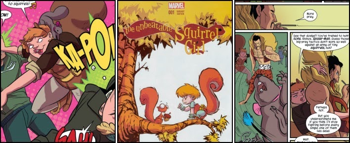
Now the buck-toothed college student has been given her own solo title and appears to have had her character undergo another major overhaul... One which is probably the worst of the lot. Indeed, when the best thing about the opening issue of a brand new comic book series is the Skottie Young variant cover depicting a baby-faced Squirrel Girl about to purloin an astonished squirrel's acorn, then there is surely a problem in its quality and declining circulation sales are likely.

Unfortunately the biggest drawback with "The Unbeatable Squirrel Girl" is the creative team's misguided belief that the entire publication should play out like some ghastly camp Sixties television cartoon, complete with purportedly humorous 'starring' panels and even a theme song; one which is probably more famous for its 'Spider-Pig' parody in the 2007 motion picture "The Simpsons Movie" than its original 1967 version.

Certainly writer Ryan North seems to insist on trying to play practically every page for laughs even to the point of Doreen Green having a full-on "chuk chit chut" argument with Tippy-Toe for two entire pages and the reader collecting 'Deadpool's Official Unofficial Guide To Super Villains' cards. It is utter farcical nonsense and unfortunately made even worse by the Canadian's woeful handling of the usually dangerously charismatic Kraven the Hunter. One of Spider-Man's most long-standing archenemies, the Russian super-villain is portrayed as little more than a figure of fun, irreverently tossed very high into the air by Squirrel Girl whilst she ponders an alternative “most dangerous” foe for him to best. The notion that the big game hunter would then be won over with such a challenge being a multi-limbed giant whale called Gigantos is ludicrous.

Perhaps most unforgiving of all however has to be the atrocious artwork of Erica Henderson, who seems to feel the woman with the proportional speed and strength of a squirrel has put on more than a few pounds in weight since finishing her job as a nanny for Luke Cage’s daughter. So instead of the semi-believable bushy-tailed scrapper previously illustrated so wonderfully by Paul Pelletier, Doreen Green is now a somewhat chubby caricature of her former self complete with squirrel-eared hair-band and acorn earrings.
The regular cover art of "THE UNBEATABLE SQUIRREL GIRL" No. 1 by Erica Henderson