Wednesday, 24 December 2014

Savage Hulk #4 - Marvel Comics

SAVAGE HULK No. 4, November 2014
The somewhat grotesque and distinctly disturbing cover illustration to this issue of “Savage Hulk” unfortunately seems to encapsulate all that is wrong with the conclusion of “The Man Within”; a four-issue story arc written and drawn by Alan Davis which once seemed full of promise in recapturing the late 1960’s exploits of Bruce Banner and the original X-Men.

The portrait of the Hulk is beautifully drawn by the British artist with some genuinely inspirational pencilling. However at the same time Davis’ illustration also plainly depicts an alarming perversion of the green giant’s physiology, with the Hulk suffering ‘brain bulges’ more closely associated with his arch-nemesis The Leader. The book’s interior is equally at odds with one another, as the comic’s pages are both well-drawn and the panels packed full of the ‘almost cartoony’ detail the 1989 Will Eisner Comic Industry award winner is well-known for.

But the storyline is completely unrecognisable as one belonging to the era of writer/editor Stan Lee and Archie Goodwin. Indeed, at one point The Leader, presumably as baffled by the turn of events as the reader, angrily turns upon a captive Charles Xavier and asks him what is going on. The Professor’s response is an unequivocal “I have no idea”; and he is not the only one.

Based upon the premise that Bruce Banner’s relentless suppression of his violent alter-ego has caused the mild-mannered scientist to vastly increase his mental capacity and develop telekinesis blasts equivalent in power to his formidable strength, the Hulk becomes a veritable machine of destruction, laying waste to an entire army of the Leader’s super-strong plastic humanoid henchmen. Luckily for all concerned this brief but cataclysmic rampage results in the Hulk ‘burning off’ the gamma power needed to maintain his telekinetic abilities; though not before the green-skinned behemoth has somehow destroyed his foe’s distant secret base with an earth-shattering psychokinetic charge.

As one can imagine such a super-powered version of Bruce Banner’s ‘greener’ side is totally at variance with the character’s normal routine (of the time) of simply getting angry, pounding a few objects or people or both, and then leaping away to the next adventure. Alan Davis’ ludicrous incarnation is therefore disconcerting and badly jars with normal expectations. As a result it is with some relief that this book’s final panel depicts a ‘normal’ looking Hulk bounding away from the X-Men as it confirms that Stan Lee and Jack Kirby’s co-creation is once again safe from the hands of Davis; an artist who with this particular four-issue run has shown himself to be an infinitely better drawer than writer. Indeed the entire plot of “The Man Within” is best encapsulated by the words of the title’s main antagonist, the Leader… “I have indulged this farce long enough.”
The variant cover art of "SAVAGE HULK" No. 4 by Dale Keown

Saturday, 20 December 2014

All-New Captain America #2 - Marvel Comics

ALL-NEW CAPTAIN AMERICA No. 2, February 2015
It is hard to believe that either Joe Simon or Jack Kirby would recognise much, if anything, of their co-creation, if they were alive to see the cover illustration of “All-New Captain America” Issue Two. For whilst Stuart Immonen’s artwork is well-detailed with copious amounts of shadowy cross-hatching and contains a veritable Rogue’s Gallery of the Sentinel of Liberty’s most famous adversaries eerily floating behind Sam Wilson and Ian Rogers, the title’s two leading, garishly-costumed characters are visually a far cry from the ever-recognisable trappings of Steve Rogers and James “Bucky” Barnes.

Fortunately, Rick Remender’s actual narrative for this twenty-page periodical is far closer to Flag-head’s fist-fighting free-for-alls of the Forties than the magazine’s front page artwork, and in the main actually makes for a darn good read. Admittedly the “punk trying to pass himself off as Captain America” doesn’t have the impressive hand-to-hand combat abilities of his predecessor, nor “operated without backup in a while…” But it’s difficult to think of many heroes in the Marvel Universe who could literally go toe-to-toe against the combined might of Taskmaster, Cobra, Viper, Crossbones, Armadillo, Baron Blood and Baron Zemo even for just a few panels.

What must have perturbed this comic’s 50,077 readers though is the way the former “Uncanny X-Force” writer avoids using the increasingly old and preposterous ‘villains get in the way of one another’ punch-up trick by simply having Wilson unheroically fly to safety and leave the ‘new’ Nomad confronting such insurmountable odds alone; “We have all the blood we need, Ian Rogers. It’s not his blood we’re interested in. It’s yours.” Such a dishonourable tactic is hardly the sort of behaviour this book’s audience would arguably have seen if the World War Two super-soldier was still carrying the star-spangled shield, and it’s not as if the cowardly retreat grants the red-winged ‘Cappy’ any respite, as he soon re-encounters Crossbones for a gruelling slug-fest.

Sadly however, not even a sequence as simple as Sam taking a viciously savage beating from a far more able opponent is entirely safe from Remender’s frustrating interference, as the American author somewhat shockingly resorts to the red, white and blue hero having to point a pistol in the face of his homicidal foe in order to resolve the conflict… At least until Misty Knight inexplicably makes a surprise appearance in her “four-inch heels” and helps “Blue Bird… lose him in the streets.”
The variant cover art of "ALL-NEW CAPTAIN AMERICA" No. 2 by Time Sale & Dave Stewart

Tuesday, 16 December 2014

Rocket Racoon #5 - Marvel Comics

ROCKET RACCOON No. 5, January 2015
There’s a genuine sense of the master handing over the baton to his pupil with Issue Five of “Rocket Raccoon”, and an uneasy sense of foreboding as well. Much of this wariness stems from a single, easily missed change to the credits which top the comic book’s title page. For instead of just ‘Young * Beaulieu’, a pairing which has produced four cracking previous editions and essentially guarantees more of the same, this issue includes the additional name Parker… and it is smack bang in the middle of the line-up where the artist usually sits.

Turning the page, something which is easily done considering the unusually poor Skottie Young cover art, it is all too clear that illustrator Jake Parker is indeed ‘in the chair’ as the penciller for “Storytailer”; albeit Young still gets a co-credit as a result of sketching three pages for the story. In fact the presence of the Inkwell Award winner permeates throughout the book’s twenty pages, and not just because the American is the writer. Parker’s artwork is uncannily similar to Young’s, so much so that when the animator takes over the reins from page three it would be all too easy to miss the transition… for a handful of panels at least. As unfortunately, despite a very brave effort, Parker fails to maintain the zany yet superbly detailed artwork of his predecessor, and quickly degenerates into drawing something more akin to that seen within a Hannah-Barbera magazine than a “Marvel Worldwide” monthly.

It is clear that the Editors were equally as sceptical about the quality of Young’s replacement, despite his style so closely resembling that of the former “New Warriors” (2006) artist. Otherwise it is doubtful that they would have ensured Young’s artwork bookends the comic so cleverly. Although the switch back from Parker, whose final panels look awfully rushed and are frankly appallingly drawn, is far from smooth and inconspicuous. 

Disappointing though the majority of the artwork is, sadly the comic book’s storyline is probably even more substandard despite Young attempting something rather clever and original. Written from the perspective of the anthropomorphic raccoon’s constant companion Groot, the simple plot is based around the Guardians of the Galaxy dispatching Rocket to the ‘four corners of the universe’ in order to spring a surprise party upon him.

However as the Monarch of Planet X is the storyteller, all anyone ever says is “I am Groot.” As a result the comic is a frighteningly fast read, for without Young’s superior illustrations and acute sense for depicting screwball action, there is nothing to hold the reader’s eye as it flits from panel to panel, page after page, faster and faster, as Parker’s artwork appreciatively deteriorates.
The variant cover art of "ROCKET RACCOON" No. 5 by Jason Latour

Saturday, 13 December 2014

The Mercenary Sea #2 - Image Comics

THE MERCENARY SEA No.2, March 2014
There’s a definite early Twentieth Century motion picture feel to Issue 2 of “The Mercenary Sea”. It is not just the fantastically dynamic cover art by Matthew Reynolds which depicts a Japanese Zero Fighter strafing Captain Harper’s submarine; a front page illustration which certainly wouldn’t look out of place plastered to a bill board with the name David Niven or Gregory Peck headlining a war-time thriller. But the artist’s blatant characterisations of some of that cinematic period’s most famous film stars.

The hapless portly padre is instantly recognisable as the actor Robert Morley, presumably fresh from having filmed the 1951 adventure film “The African Queen”. Whilst Captain Tono, grim-faced and stern-looking, is undoubtedly inspired by Toshiro Mifune’s extraordinary performance in “Hell In The Pacific”. There’s even a cameo by Jack Watson as Sergeant Lee, straight from “The Wild Geese”. However perhaps most successful is Reynold’s depiction of Commander Graham, who is a ‘dead ringer’ for actor Vincent Price; something which immediately provides the mysterious military officer with an atmosphere of distrust and suspicion.

Technicolor artwork to one side however “Red Sails At Sunset” also boasts a reasonably successful action-packed storyline; which writer Kel Symons only disappointingly fails to maintain towards the comic book’s final third. Certainly the issue’s opening few pages are especially enjoyable with the tension between the ex-bootlegger and his crew’s would-be Chinese captors being quite palpable before their subsequent battle over the surface of “The Venture”; an action sequence which is not only very well written, but paced and drawn by Reynolds.

Unfortunately once concluded both the plot and speed of the storyline does significantly, and detrimentally, slow down. There’s some nice interplay between Harper and his crew in the aftermath of their ‘gun-fight’ with the Chinese. But the dialogue steadily increases as each page is turned and events finally become unnecessarily bogged down under the sheer weight of words being exchanged between the German U-Boat’s captain and his supporting cast. Only at the book’s very end does Symons turn back up the suspense dial, as Harper is betrayed and the Japanese navy mobilised to intercept him.
Writer: Kel Symons, Art & Colors: Matthew Reynolds and Letterer: Pat Brosseau

Saturday, 6 December 2014

The Mercenary Sea #1 - Image Comics

THE MERCENARY SEA No. 1, February 2014 
Ordinarily I am not really that much of a fan of any comic book artwork which approximates ‘cel shading’ or purveys an atmosphere of storyboard-like animation. But frankly Mathew Reynolds’ front page illustration alone is worth this “Image Comics” cover price. It is truly eye-catching and despite being quite minimalistic in its composition, that is a lone tall standing stone protruding out of the sea, there is plenty to excite the reader’s imagination. Whether that be the shadowy shape of a submarine dodging sea mines in shark-infested waters, or the single Japanese sentry about to be shot by a scuba-gear wearing assassin who would not look out of place plastered over an old “Rolling Thunder” arcade game cabinet.

It is perhaps therefore understandable that Kel Symons’ story “Nice Work if You Can Get It” does not quite live up to such heady expectations but the plot to Issue 1 of “The Mercenary Sea” still has plenty of surprises within it, and really does establish the central character, Captain Jack Harper as a cross between pulp fiction luminaries Doc Savage and Indiana Jones. There are some nice nods to other cult classics as well such as Toby’s knife point removal of a venomous crawler from the neck of the Frenchman, Jarreau (a la “Predator”) and the submariner’s notable book collection which contains such adventurous novels as “Treasure Island”, “Robinson Crusoe”, “Tarzan” and “20,000 Leagues Under The Sea”; not forgetting his prized “King Kong” film print.

Admittedly the writing is though a little clunky in places. Perhaps most notably when the spy Mister Taylor usefully provides the reader with a brief synopsis of each of the comic’s main cast members when he starts reciting from their dossiers whilst in a night club.

Reynolds’ artwork is equally as ‘hit and miss’ at times when it comes to his interior artwork. One moment illustrating a fantastically atmospheric jungle beach landing, complete with palm tree silhouettes and fading sun. The next depicting an exchange between fellow crew members with a series of panels within which the line art becomes increasingly thick and ugly. Almost as if far smaller drawings have simply been manipulated and enlarged electronically. Indeed the artist’s work seems to be at its most impressive when he resists the temptation to provide his drawings with a black outline and simply uses the various colours and shapes of his characters’ faces and bodies to depict the action.
The variant cover art of "THE MERCENARY SEA" No. 1 by Mathew Reynolds

Saturday, 29 November 2014

Arkham Manor #2 [The New 52] - DC Comics

ARKHAM MANOR No. 2, January 2015
There’s a seriously claustrophobic treat waiting in store for any reader who can somehow get past the appallingly bad Shawn Crystal cover to Issue 2 of “Arkham Manor” and actually take a ‘step inside’ the comic book. Even then writer Gerry Duggan’s tense and nervy thriller isn’t immediately obvious, as the first few pages of the plot primarily focus’ upon an inmate discussion group held by Doctor Arkham.

However once the banter-like dialogue between the mansion’s Administrator, the Scarecrow and Mister Freeze has come to an end, all attention turns to the machinations of the prisoner, Jack Straw… also known as The Batman. It is at this point that Duggan’s promise of depicting the Dark knight wearing an altogether different mask really starts to materialise and the speed of the plot to “A Home For The Criminally Insane” begins to move at an increasingly frantic pace.

There’s a killer lose amongst the killers, and a heavily disguised Bruce Wayne needs to move undetected between both his ‘fellow’ inmates and the security staff who now patrol his former home. Ever confident, Batman believes the murderer to be the missing serial-killer Zsasz. But all his well-laid plans for solving the deaths using stealth and subterfuge quickly unravel and have to be cast aside as ‘Jack Straw’ witnesses another attack and has to rush to the scene if he is to save the victim’s life. Thus follows a headlong dash through Wayne Manor’s corridors as the ‘apparent escapee’ battles both asylum guards as well as the shadowy mutilator himself.

Fortunately, having presumably shaken off their woes with their terrible sketchy cover illustration, Shawn Crystal and colorist Dave McCaig appear increasingly on form as the tension mounts. The former ‘exclusive’ “Marvel Comics” artist’s pencilling is still not the best there is, but the composition of his panels and the viewpoints of the action he provides the reader with, are simply second to none when it comes to creating a dark tense and atmospheric world full of sudden dangers and the promise of a truly horrible death. A hand-held power-drill boring into the forehead of a tightly bound prisoner being one such example.
The variant cover art of "ARKHAM MANOR" No. 2 by Chris Brunner & Rico Renzi

Friday, 28 November 2014

Devil Dinosaur #3 - Marvel Comics

DEVIL DINOSAUR No. 3, June 1978
If ever there was a title which shows just how important an artist Jack “King” Kirby was during his third tenure at “Marvel Comics Group” (1975-1978) then it arguably has to be “Devil Dinosaur”. Published in the hope that it would tap into the popularity the writer/artist enjoyed with his “Kamandi” series at “DC Comics”, this book’s opening page alone declares just how much influence the American penciller had over his creations’ periodical. For atop the typical single-panel full-page illustration for which he was famous for, are the words “Edited, Written and Drawn by Jack Kirby”. In other words, with the exception of embellishments by Mike Rover and colours by P. Goldberg, this was essentially Kirby’s very own book – a position of power which was unheard of for an artist during the preceding Silver Age of Comics.

Sadly the quality of the storyline to “Giant” does demonstrate precisely why the series chronicling the adventures of Moon-Boy and his Tyrannosaurus Rex, Devil, only lasted nine months. Admittedly the title was targeted at a young audience, hence its inclusion of the ever-popular dinosaurs, but even so the sheer simplicity of this issue’s seventeen-page plot is disappointingly dreadful.

After a rather strong build-up, where the young Dawn-man finds himself following a trail of badly beaten great lizards through the length of the Valley of Flame, the tale abruptly comes to an end with the revelation that the dinosaur-crushing giant man, known only as Sire, has caused the carnage simply in order to help him find a missing child from his tribe. Once reunited, the triceratops skull-wearing warrior soberly stomps off, youth under one arm, and declares a truce with Devil Dinosaur.

As one might expect however, this story does contain some rather impressive drawings by one of the inaugural inductees of the Will Eisner Comic Book Hall of Fame. These include a wonderfully ‘busy’ two-pager depicting Sire causing a stampede of Pterosaurs and Dimetrodons, and a series of panels illustrating a one-sided battle between the giant man and a Stegosaurus. Best of all though has to be the fight through the jungle between Devil Dinosaur and Sire, as Kirby goes through most of his composition repertoire, even showing the great lizard kicking off his assailant with a heavy “Bam!”
Edited, Written and Drawn: Jack Kirby and Colored: P. Goldberg

Thursday, 27 November 2014

Deathstroke #1 [The New 52] - DC Comics

DEATHSTROKE No.1, December 2014
The character of Deathstroke has always proved to be something of an enigma. Originally created in 1980 by Marv Wolfman and George Perez as a villain for the Teen Titans, Slade Joseph Wilson has evolved into one of the most popular anti-heroes in the “DC Comics” universe; actually attaining the 2009 title of Imagine Games Network’s 32nd greatest comic book character of all time. However even his publisher has struggled to work out any lasting direction for ‘the Terminator’, having rewritten his origin not once but twice in recent years as part of their ‘The New 52’ line-up.

This latest attempt to create a sustainable “Deathstroke” solo series comes just a year after the cancellation of the mercenary’s last title, and already looks set to be ‘ringing in the change’ for the assassin once again. As opening issues go, the first few pages of writer/artist Tony S. Daniel’s “Gods of War” storyline is pretty good, and certainly sees the former metahuman super-soldier at his contract killing best, dispatching a number of targets simultaneously whilst sparing one “lucky b*stard” who is “…not on my list.” However once the ‘hit’ on the self-regenerating criminal Possum goes awry the plot starts to take something of a bizarre twist for the worse.

To begin with Slade’s healing factor suddenly appears to have taken on Wolverine-like proportions, as the anti-hero survives being sliced and diced repeatedly by Possum with his own katanas; which presumably can penetrate Slade’s full Nth metal suit? A few bandages later and ‘the Terminator’ not only survives repeated bombings and being flamed alive but having half his brain blown away as well. Clearly the long established limitations of Slade not being able to heal significant physical trauma such as his missing eye would get in the way of Daniel’s writing.

Ultimately however the conclusion to this story reveals just how fatal the assassin’s injuries actually are… and that this title could well take Deathstroke in an entirely different direction from what has ever gone before. For no longer is Slade shown as a white-haired, bearded one-eyed mercenary, but through the ‘magic’ of the mysterious old man I-Ching, he has been transformed into a much younger, brown-haired blue-eyed specimen of manhood.
Variant covers to "DEATHSTROKE" Issue 1 by Andrea Sorrentino and Kevil O’Neill

Saturday, 22 November 2014

All-New Captain America #1 - Marvel Comics

ALL-NEW CAPTAIN AMERICA No. 1, January 2015
In many ways this ‘All-New, Spy-Fi, highflying adventure’ comic book must have been something of a conundrum for many of its 120,500 purchasers in November 2014. On the one hand it brought a completely new spin on the New York-based publisher’s second most popular superhero (at least according to “Imagine Games Network”), and on the other this particular title wouldn’t actually be focussing upon the exploits of ‘The First Avenger’ Steve Rogers. But instead feature storylines involving mainstream comics’ first African-American superhero and Cappy’s “longtime friend and colleague” Samuel Wilson; upon whom the elderly Sentinel of Liberty had “passed [on] the mantle of Captain America” following the removal of his super-soldier serum by Iron Nail…

Such a debatably contentious amalgamation of the Seventies era partners is immediately evident with Stuart Immonen’s dreadful-looking design for the twenty-two page periodical’s cover. This “All-New Captain America” is a horribly colourful concoction of both The Falcon’s red wings and eye-shades, coupled with the vividly bright red, white and blue of Flag-head’s patriotic costume. Indeed the new uniform simply smacks of the sort of garish raiment that A.I.M.’s Super Adaptoid would prominently display, if the artificial construct had copied the physical abilities of both heroes simultaneously.

Unfortunately writer Rick Remender’s narrative would equally appear to be just as much of a clash of ‘both worlds’ as the new titular character’s attire. Based upon the reasonably straightforward plot of the star-spangled super-hero penetrating a hidden, albeit heavily-armed, Hydra base. The pulse-pounding action is potentially ruined by Wilson repeatedly referring to his use of Captain America’s shield, and querying just “How did I ever get by without one of these?” Such repeated doubts as to Sam’s previous crime-fighting record become increasingly annoying, especially when one considers that the prominent minister’s son hadn’t carried such a defensive device before and been successful since 1969 when he was co-created by Stan Lee and Gene Colan.

Perhaps even more irritating however, is this latest incarnation’s inability to utilise the shield as well as his predecessor. On a couple of occasions the former ‘Hero For Hire’ demonstrates a complete inability to throw the shield accurately and would even have lost the trademark piece of equipment in a river of lava if it wasn’t for his accompanying “brother”, Redwing, flying to its rescue. As a result every time Remender’s Sentinel of Liberty uses the device there is a genuine sense of it ‘being forced’ into the action, and that cannot be a good sign of things to come for a superhero whose name is synonymous with just such a ‘weapon’.
The variant cover art of "ALL-NEW CAPTAIN AMERICA" No. 1 by Paul Pope

Tuesday, 18 November 2014

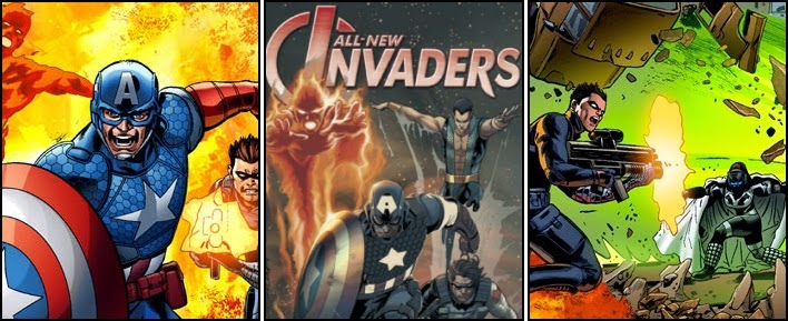
All-New Invaders #2 - Marvel Comics

ALL NEW INVADERS No. 2, April 2014
There’s something vaguely unsatisfying about Issue 2 of “All New Invaders”; a sense that none of the expectations generated by this title’s exciting opening edition are actually met. Indeed in many ways there’s a real ‘step backwards’ feel to the book, as a lot of its content actually concentrates on events which took place before those of the previous issue.

This aura of disappointment frankly starts with the comic’s cover by Mukesh Singh, which is a disconcertingly awkward looking illustration of the bombastic Tanalth standing in triumph over the broken bodies of Captain America, the Winter Soldier and the original Human Torch; the latter of which seems to have obtained arms the length of which would rival an orang-utan. Any artwork depicting a book’s titular super-heroes being both so brutally bowed and beaten is going to be a depressing sight. But it is the composition of Singh’s artwork, such as the bright red boot of ‘Cappy’ oddly jutting out from beneath the dark green cape of the Kree High-Elite, which jars the eye.

In fact there’s a good deal of this comic book’s artwork which appears somewhat off key and as such actually caused me to believe that the title’s main artist had changed between issues. Certainly the opening few pages capturing the action of a night-time fire-fight between James Barnes and the Kree in the streets of Vienna are below the usual standard of Steve Pugh. Bizarrely the British artist’s illustration work during the Invaders battle against the Pursuer in Blaketon, Illinois isn’t all that much of an improvement either, with the eight-page action-sequence containing poorly detailed figures, oddly exaggerated limbs and an increasingly podgy Tanalth.

Perhaps most displeasing though is the outcome to the comic’s climatic confrontation between the former World War Two freedom fighters and the arrogant, overbearing and overconfident leader of the Kree Purser Corps. Writer James Robinson has Captain America describe Tanalth as being “…on a par with Ronan from the look of [her] powers and invulnerability” so defeating the Kree High-Elite was always going to be a tough challenge for a trio armed with just a shield, a bionic arm and the ability to produce some seemingly non-effective flames. But to have a battle which has technically spanned two issues, suddenly just end with Tanalth simply flying off for no other reason than she can is extremely disappointing; especially as moments before the aloof Kree warrior was threatening the heroes with a slow painful death after they finally caused her some momentary discomfort.
The variant cover art of "ALL-NEW INVADERS" No. 2 by Salvador Larocca

Thursday, 13 November 2014

The Thing #5 - Marvel Comics

THE THING No. 5, May 2008
As build ups towards a climatic confrontation go, “Give Til It Hurts…” is probably one of slowest comic book storylines ever as absolutely nothing happens of any notoriety until the issue’s very last page. Up until this cliff hanger ending with the Sandman Dan Slott’s dreary plot focuses on Benjamin Grimm’s debt to Yancy Street Pawn Shop owner Mister Sheckerberg and his own personal angst over the death of his older brother, Danny Grimm.

Admittedly there is a very worthwhile message behind this particular issue of “The Thing”; that money cannot be used to simply right all of a person’s past wrongs and that pride, alongside a person’s word and physical commitment to correct their mistakes, is far more important than prosperity and can’t simply be bought outright.

Unfortunately the American comic book writer’s script delivers this lesson in morality in such a heavy-handed 'schmaltzy' manner that it soon loses any conviction whatsoever. Instead all the reader gets to experience is what a complete loser, despite having “…a bazillion dollars in the bank”, Ben Grimm apparently is. Indeed literally everything he tries to attempt within this comic book, no matter how pure of heart his motivation is to do the right thing, the former test-pilot pathetically fails at. Whether that be giving the local pawn broker a hundred grand to pay back a long standing debt, offering money to pay for a woman’s hospital operation or simply sitting on a bench waiting for a bus. It all goes depressingly wrong for the founding member of the Fantastic Four.

Fortunately the excellent pencil work of artist Andrea Divito provides some light in this woefully disheartening yarn. His characterisation of The Thing proving a notable high point to the issue as the illustrator manages to convey all kinds of expressions to the ‘brick-like’ monster’s face. Such as annoyance at Mister Sheckerberg’s refusal to accept a cheque, surprise at being made to “clean the stoop” or fright when he inadvertently speaks to ex-lover Alicia Masters over the phone.

Sadly though even Divito’s great artwork is somewhat mired in darkness throughout the book, courtesy of colorist Laura Villari and her dismally gloomy choice of shadowy dark browns, deep blues and pitch black backgrounds.
Writer: Dan Slott, Penciler: Andrea Divito and Inker: Laura Villari

Wednesday, 12 November 2014

G.I. Zombie #2 [The New 52] - DC Comics

G.I. ZOMBIE No. 2, October 2014
Anyone buying Issue 2 of “G.I.Zombie” based solely upon the imagery of the comic book’s Darwyn Cooke cover illustration is going to be rather disappointed by its contents. For despite there being plenty of action within its twenty pages, there is nothing which bears even a passing resemblance to front page’s depiction of an Undead paratrooper landing amidst a hail of enemy fire and being shot to pieces as a result. Slightly bizarrely though, the variant cover by Howard Porter, is taken straight from the storyline’s climax, and actually easily upstages the uninspiring sketchings of the book’s artist and colorist Scott Hampton. 

Fortunately for this title however, the main selling point would not seem to be the American’s rather dire and lack-lustre painted artwork. It is the plot by co-writers and co-creators Jimmy Palmiotti and Justin Gray, as well as the seemingly popular ‘zombie armed with an AK-47’ sales pitch. Certainly the title hero, Sergeant Jared Kabe, gets an awful lot of ‘screen time’ within this comic as he goes from being a stealthy killer and torturer of terrorist sentries at the start through to a literal one-man army gunning down numerous foes in a firefight at the end.

As a result there’s plenty of opportunities for the reader to gauge just what super-powers the walking corpse actually possesses. Clearly Kabe is good with a blade or “pig sticker” as he casually dispatches one gunman with a nonchalant back-handed throw of a knife. He’s also not unskilled with firearms, swapping from silenced handgun to assault rifle without pause… except perhaps to bite out the throat of the odd startled terrorist. Interestingly there is however no sense that G.I. Zombie is impervious to harm. Indeed the ‘good soldier’ has to literally throw himself into a freezer unit to survive a flurry of grenades and later simply manages to remark “That’s no good” in anticipation of being blown up by a grenade launcher.

This vulnerability to excessive physical damage makes Kabe’s vain attempt to prematurely detonate a chemical missile whilst he’s ‘riding it’ a genuine act of bravery and all the more impactive and impressive as a result. So whilst Hampton’s poorly drawn scratchy pencils appear frighteningly amateurish, the actual writing and characterisation within this comic book makes it a reasonably worthwhile read.
The variant cover art of "G.I. ZOMBIE" No. 2 by Howard Porter

Saturday, 8 November 2014

Doctor Who: The Eleventh Doctor #1 - Titan Comics

DOCTOR WHO: THE ELEVENTH DOCTOR No. 1, August 2014
Capturing the excitement, look, flavour and feel of a popular television series and placing it within a comic book format can be no easy task, especially when the subject matter is one that is as internationally well-known and loved as the British Broadcasting Company’s science fiction programme “Doctor Who”. However, “2000 A.D.” co-writers Al Ewing and Rob Williams would seem to have succeeded in doing just that with this initial instalment of a “stunning new era” for the Eleventh Doctor, and perhaps even more impressively, have additionally managed to specifically depict the awkwardly odd physical and vocal eccentricities of actor Matt Smith.

Admittedly, the title’s architects were never going to win any prizes for “After Life”, as it’s rather preposterous narrative somewhat haphazardly deals with both a “grieving young woman”, and a supposedly “terrifying cosmic threat”, as well as what the Timelord “gets up to when Amy and Rory aren’t around” following “the second Big Bang.” But as ‘companion introductory stories’ go Issue One of “Doctor Who: The Eleventh Doctor” should have amply entertained the vast majority of its 41,068-strong readership in July 2014, with its obligatory ‘bigger on the inside than the out’ interior TARDIS scene and a story depicting a depressed, self-doubting ‘new assistant’ who finally digs deep within herself and finds the strength, courage and resolve to find “a solution” which is “not just -- blowing things up!”; there’s even some nice panels featuring the modern-day inept U.N.I.T. who seem disconcertingly keen to disintegrate all and sundry.

All of these moments, whether they be dispiritingly sorrowful, or laugh out loud, are zanily illustrated by Simon Fraser and magnificently coloured by Gary Caldwell. In fact, a lot of the success of this ‘one-shot’ story has to do with just how well the characters are pencilled and the differing palettes used with which to appropriately colour them.

Devastated by the death of her mother, the misery and anguish of Alice Obiefune's loss is perturbingly magnified by the comic’s opening being predominantly populated by grey-scale pictures. Indeed, the only semblance of colour seen during the adventure’s early stages is the fleeting glimpse of a certain blue English Police box. This demoralising bleakness however, is then thrown into full vibrant life with the very sudden arrival of a “Rainbow Dog” and the Doctor sprinting after it; “Excuse me! Coming through!”
The regular cover art of "DOCTOR WHO: THE ELEVENTH DOCTOR" No. 1 by Alice X. Zhang

Monday, 3 November 2014

Amazing X-Men #4 - Marvel Comics

AMAZING X-MEN No. 4, April 2014
There is something slightly uninspiring about Issue Four of “Amazing X-Men”. A palatable sense that the book’s creative team may well have simply ‘gone through the motions’ when creating a comic that despite shifting 48,161 copies in February 2014, still sold more than three thousand less magazines than its predecessor. This palpable, disconcertingly apathetic aura arguably starts with the twenty-page periodical’s rather bland, monochrome cover illustration which, despite competently depicting an icily frozen Wolverine crouched low in the snow with the svelte figure of Northstar stood shivering some distance in the background, contains so much ‘empty-space’ that it appears both decidedly unfinished and rather rushed.

This sense of haste does not unfortunately dissipate with the publication’s interior artwork either, as Ed McGuiness’ ordinarily most pleasing pencilling worryingly appears slightly ‘out of kilter’ courtesy of some bizarrely amateurish-looking depictions of a heavily-fatigued Jean-Paul Beaubier or an abnormally well-endowed Firestar heating up hell via the mutant’s “ambient electromagnetic energy”. The American’s layouts also seem to contain an unusually high number of large-sized panels and splash pages. Something which invariably suggests there isn’t really all that much going on within the comic’s script to keep the former “Superman/Batman” sketcher fully occupied. Why else would the Beast’s battle with Kurt Wagner take an astonishing five pages just for Storm to remove a demon-possessed sword from Hank McCoy’s back, or it then require an equally lengthy sequence for the fuzzy elf to locate Angelica Jones and Bobby Drake, and subsequently teleport them to safety?

Ultimately Jason Aaron’s substandard storyline would appear to be based solely upon depicting the various X-Men finding one another in the Underworld and forming a rather jovial crew for Captain Nightcrawler, so Dave Cockrum’s swashbuckling co-creation can ready his ship and set sail to do battle with his demonic father’s fleet in the story-arc’s concluding instalment; “I dare say… I was born for this. Raise the flag, X-Men. And let’s go be amazing.” Such an indolent placement of his playing pieces means there’s little, if any, real substance to the contents of the Alabama-born writer’s narrative and all this fourth chapter in “The Quest For Nightcrawler” is noteworthy for is its collection of drawings portraying one of “the most recognisable and successful intellectual properties of Marvel Comics” reacquainting themselves with their former fallen member.
Writer: Jason Aaron, Penciler: Ed McGuiness and Inker: Dexter Vines

Friday, 31 October 2014

Arkham Manor #1 [The New 52] - DC Comics

ARKHAM MANOR No. 1, December 2014
As far as ideas for (yet) another “Batman” title goes, the decision by “DC Comics” to merge two of Gotham City’s most iconic landmark institutions together within a single comic book has got to be one of their most intriguing. Few who have encountered the exploits of the Dark Knight, irrespective of the medium with which they’ve followed him, will not have heard of the Elizabeth Arkham Asylum for the Criminally Insane or the family home of the Caped Crusader himself, Wayne Manor. But the thought of Bruce Wayne’s mansion actually becoming the fictional psychiatric hospital and housing the super-hero’s Rogue Gallery is unthinkable...

Enter author Gerry Duggan, who with this startling first issue, not only portrays a Gotham City devoid of any Arkham Asylum, following the building’s total demise in the events of Issue Thirty of “Batman Eternal”, but consigns Wayne Manor to become its replacement with the stroke of Mayor Hady’s pen. What follows is an insightful look into Batman’s psyche and just how dear to his heart his parent’s home actually is to him. Throw in a couple of mysterious murders at the freshly opened ‘Arkham Manor’ and Bruce Wayne going deep undercover as an inmate himself, and this title has all the hallmarks of being a very gritty, deep dark look into what really makes The Batman tick.

Unfortunately the comic’s interior art has been drawn by Shawn Crystal, who despite producing a compelling piece for the main cover, fails to deliver the goods for the majority of the pages inside. The former “Marvel Comics” “Deadpool” inker and penciler certainly provides the book’s illustrations with a unique look, and one that is not dissimilar to the awkward-looking ‘trademark’ style of popular “The League Of Extraordinary Gentlemen” artist Kevin O’Neill. But that simply makes it quite hard to differentiate between some of the main characters within the storyline, including Bruce Wayne.

Worse, the Americana rtist seems perfectly capable of drawing some very nice looking well-proportioned scenery around his figures, which makes his characters’ elongated limbs, square-looking edges and rectangular heads look all the more bizarre and amateurish. Although his depiction of a somewhat dishevelled Dark Knight is actually rather good and fits in well with the storyline's eerie atmosphere; even if the inconsistent grizzled look of Batman’s chin, one panel slightly whiskery and the next sporting a full beard, is somewhat disconcerting.
The variant cover art of "ARKHAM MANOR" No. 1 by Eric Canete

Thursday, 30 October 2014

Rogue Trooper Classics #1 - IDW Publishing

ROGUE TROOPER CLASSICS No. 1, May 2014
Created by Gerry Finley-Day and Dave Gibbons back in 1981 for the British science fiction comic “2000 A.D.” the adventures of the Genetic Infantryman called Rogue have been repeatedly reprinted over the decades. As a result the decision by “IDW Publishing” to just recolour the old issues and simply republish them seems a rather controversial one for the American comic book publisher to have made. Although considering the company also decided to print a new "Rogue Trooper" title depicting fresh original adventures simultaneously perhaps makes it a more understandable choice. Regardless it is perhaps not unsurprising that what started out as a planned twelve-issue limited series was curtailed to only eight issues, following “lower-than-expected-sales.”

However there is still a lot to be gleaned from Issue One of “Rogue Trooper Classics”. It certainly isn't just a simple alternative source of these stories than Volume One of “Rebellion Developments” “Tales of Nu-Earth”. To begin with this edition has been published with two rather nice alternative covers, including a new illustration of the sole survivor of the Quartz Zone Massacre by artist John McCrea and colorist Andrew Elder. However the subscription cover, a colourful micro-version of Dave Gibbon’s cover art to Programme 228 of “2000 A.D.” is especially eye-catching and as such probably the better of the two when it comes to attracting potential collectors of the series.

Indeed it is probably the actual colouring of the old black and white comic strips which makes this periodical such a worthwhile purchase. Admittedly at times Adrian Salmon’s choice of colour tone is rather dark and heavy-handed, but it is great to see Gibbons’ excellent pencils resplendent in blues, reds, browns and greens. For once you can really see the swirling soup of Nu-Earth’s poisonous atmosphere and the seemingly perpetual claustrophobic inkiness which surrounds the action. In addition the sheer quality of the printing on thick paper really makes the illustrations ‘pop from the page’ and a joy to behold. 

Unfortunately the arrangement of each page is a major disappointment as a result of the original panels being quite significantly reduced in size in order to better fit within the smaller American comic book format. As the drawings have been proportionally de-scaled it essentially means that a quarter of every page is just blank space and although “IDW Publishing” have utilised much of it to display a greyed-out ‘Rogue Trooper Classics’ banner, it still distinctly gives an amateurish feel to the comic book’s composition.
The regular cover art of "ROGUE TROOPER CLASSICS" No. 1 by John McCrea and Andrew Elder

Wednesday, 29 October 2014

Savage Hulk #3 - Marvel Comics

SAVAGE HULK No. 3, October 2014
Presumably on paper the plot to Issue Three of “Savage Hulk” seemed like a reasonably good idea. Take one of the Marvel Universe’s most popular and powerful telekinetic super-heroines and imbue her with the near limitless strength of one of the comic book industry’s strongest anti-heroes. Certainly such a staggeringly formidable combination of super-powers within one individual provides writer and penciller Alan Davis with the opportunity to illustrate a ‘hulked up’ Marvel Girl towering over a defeated (original) X-Men for the edition’s front cover.

Unfortunately though, once the English author actually starts to explore the creation of such a “jade giantess” and begins to move his storyline forward things frankly start to get very silly and extremely confusing rather quickly. Indeed by the end of this comic book, having lost my way on several occasions with the numerous and seemingly random plot twists and turns, it came as a massive relief that the entire twenty pages are actually nothing more than ‘just a dream’. The entire concept being a simple ploy by The Leader to distract Professor Xavier whilst his robot army ambushes and defeats the X-Men.

In fact, if a regular reader of this title was on an especially tight financial budget, I strongly doubt their enjoyment of entire “The Man Within” story-arc would be in any way impinged if they gave this third and penultimate instalment a miss entirely.

Unfortunately Davis’ artwork for this edition is almost just as much of a mess as the plot, and seems almost rushed as his figures’ facial features appear slightly distorted from the norm. Now this could be due to the artist wanting to hint at the ‘dreamscape’ nature of the adventure, or emphasise the mutant super-heroes strange almost bestial aggressiveness towards their mentor when Jean Grey takes command of the team. But that seems doubtful.

"The ClanDestine" creator's design for the new-look Marvel Girl is also sadly disappointing though arguably fitting bearing in mind the story is attempting to emulate the sexist Late Sixties and Early Seventies. Relieving Lorna Dane of her headgear, as Polaris coos “My headdress looks so much better on you”, Marvel Girl transforms her costume into a bizarre bikini-like assemble with leggings. A move which clearly meets the approval of her eager male team-mates who whoop “Hhhot… with a capital sizzle!” and “I’ve always had a thing for tall women.”

The English artist does however still manage to impress with a series of panels towards the back of the book, which depicts a ‘Professor Hulk’ battling a horde of Marvel characters; both friend and foe. The Rhino, Sandman, Absorbing Man, Abomination, Sub-Mariner and even the Silver Surfer all make brief appearances as a result. But the ‘battle in Bruce Banner’s mind’ is a fleeting one and is quickly replaced by (even) more pages of “supercharged” and “wildly escalating…” explanatory dialogue.
Writer & Penciler: Alan Davis, Inker: Mark Farmer and Colorist: Matt Hollingsworth

Monday, 27 October 2014

Rocket Racoon #4 - Marvel Comics

ROCKET RACCOON No. 4, December 2014
Issue 4 of “Rocket Raccoon” surely comes with some of the strangest variant covers “Marvel Worldwide Incorporated” has ever published. For none of them encapsulate the raw energy of the concluding action to Skottie Young’s “A Chasing Tale” and only one of the three illustrations actually portrays the title character. Indeed if you didn’t know what you were looking for then the Hasbro variant cover by Alex Kropinak, complete with action figure photographs, would have you firmly believing you held an issue of “Captain America” in your hands. Whilst the retailer incentive Deadpool 75th Anniversary cover by Kalman Andrasofszky, which depicts a wonderful homage to “Tales To Astonish” issue 13, would easily fool you into thinking that Groot was the star of the show; something particularly difficult to achieve considering that the Monarch of Planet X is blown to pieces on page three.

However, having read the first quarter of this edition, anyone purchasing the ‘Stomp Out Bullying’ variant by Pascal Campion, which shows an uninspiring illustration of Rocket and Groot chatting over lunch in a school canteen, will probably think they’ve picked the cover most representative of the comic book’s contents – as its easily the wordiest and talkiest I’ve seen writer and artist Skottie Young be. Obviously there had to be some build-up for the big reveal as to who was behind Rocket’s framing for murder, but six pages worth… and then it turns out to be “… just a rabbit.”

Fortunately the inclusion of Blackjack O’Hare, first seen in issue 271 (1982) of “Incredible Hulk”, really sparks this comic back to life as laser beams fizz, fists crack and the fur really flies. Throw in the mightily miffed Amalya, and a horde of Rocket’s other ex-girlfriends, and it is panel after panel of endless fisticuffs. All of which are zanily illustrated by Young and his unique and cartoony drawings. Indeed this has to be one of the best ‘punch-ups’ seen in a comic book, with combatants exchanging everything from double-punches and ear-jabs to ‘lite’ pokes as they literally beat one another unconscious.

Surprisingly though this fun story does end with a real sting in its tail, and one that swiftly wiped the smile from my face as I guffawed at the sheer comical carnage taking place. There’s a genuine sensitive side to the wise-cracking raccoon not often seen and Young’s portrayal of a sad lonely tearful Rocket, upset at the fact that it now appears certain he is the only one of his kind is a poignant conclusion. At least until the very last few panels that is…
Numerous variant covers to "ROCKET RACCOON" Issue 4 by Pascal Campion, Kalman Andrasofszky and Alex Kropinak