Tuesday, 30 September 2014

Kings Watch #3 - Dynamite Entertainment

KINGS WATCH No. 3, November 2013
I am not entirely sure why I ended up purchasing this particular edition of “Kings Watch” as it has a Ramon K. Perez exclusive subscription cover and I am not a fan of his artwork, despite him being a multi-award winning cartoonist. Indeed the regular comic’s front page illustration by Marc Laming and Jordan Boyd is infinitely better and actually conveys a real sense of foreboding as to the magical and mystical forces that are to come to play within the book’s pages. Certainly if I was a fan of this “Dynamite Entertainment” series, and had signed up ahead of time with my local comic shop to reserve this particular issue I’d have been forcefully arguing that I did not deserve the “super special subscription variant” by Perez, even if it was “limited to initial orders only”.

Uninspiring cover art aside this third part in the five-issue mini-series finally provides Mandrake the Magician with some serious ‘screen time’ as Lee Falk’s creation faces his most evil and dangerous foe, The Cobra. Jeff Parker makes an especially good job of scripting this confrontation, embedding a memory of Flash Gordon’s childhood into the mix, so having watched the hypnotist as a young boy, the science fiction hero can assist him and distract the Cobra’s men in the present. Mandrake’s role continues to grow throughout the issue as the Portland-based writer uses him to explain the Cobra’s plans to Gordon, Dale Arden and Zarkov. Indeed the Magician not only seems well-versed in the mysterious quantum crystal-powered gateway to unknown worlds but also knows of Ming the Merciless and what the ruthless tyrant of the planet Mongo will do once he gains access to Earth.

Marc Laming’s illustrations continue to be an inconsistent affair, one minute perfectly capturing the raw dynamism of The Phantom blazing away with pistols upon horseback and the next filling a panel with a rather showy quantum energy formation whose pencilling looks amateurish at best. However I think colorist Jordan Boyd needs to take some responsibility for this rather average look to Laming’s layouts and inking, as the majority of his work seems to be disappointingly two-dimensional; a main colour with a single darker shade for shadowing.

What is not to be missed though is the excellent special script-to-page process presentation at the rear of this book, which takes the reader from Jeff Parker’s script for pages two and three, through Marc Laming’s initial panel sketches and ends with the lettering of Simon Bowland. This provides a fascinating insight into the creation of a modern-day comic and sadly is probably the highlight of the issue.
The regular cover art of "KINGS WATCH" No. 3 by Marc Laming

Monday, 29 September 2014

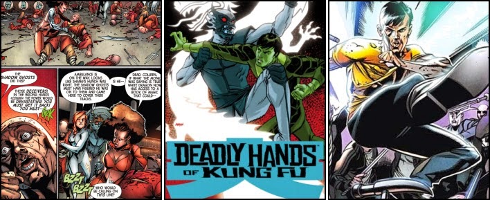
Deadly Hands of Kung Fu #3 - Marvel Comics

DEADLY HANDS OF KUNG FU No. 3, September 2014
Best known for his cover art on numerous titles, Dave “The Reverend” Johnson continues to prove somewhat hit’n’miss with his artwork on “Deadly Hands of Kung Fu”. Though apart from the bizarre greenish hued colouring making Shang-Chi simply look like Doctor Bruce Banner mid-way through his transformation into the incredible Hulk, there isn’t anything especially wrong with this edition’s front page illustration.

However it did make me momentarily rethink that perhaps the interior pencils of Tan Eng Huat weren’t all that bad. A few pages into the comic I quickly changed my mind back, especially as Johnson’s superb cover for the first issue is reutilised almost in full as part of the book’s opening recap; providing an excellent opportunity to compare the officially ordained Methodist Deacon’s artwork with that of Huat.

Certainly there is something distinctly unnatural with some of the poses the 2002 Will Eisner Comic Industry Awards winner creates for both Shang-Chi and his opponents in this book. This is especially noticeable in the larger panels or crowd scenes, where some of the White Dragon’s henchmen are 'cursed' with the incredible arm length of an orang-utan. The pencil work suggesting the motion of Fu Manchu’s son frog-hopping from one minion’s head to another also brings a ridiculous new meaning to the legendary martial arts name of ‘grasshopper’. But it is Huat’s drawing of the main protagonists, the White Dragon and particularly Midnight Sun, which truly stands out as disappointingly poor pencilling. The clan leader’s dragon-mask looks like the head of a child’s cuddly animal as opposed to that of a fearsome martial artist. Whilst the Master of Kung Fu's brother appears like a cross between the Black Panther and a fedora wearing Indiana Jones.

Unfortunately the writing of Mike Benson does not get any better from the previous issues either as Shang-Chi, single-handedly takes on and beats the teeming occupants of a packed out nightclub. This is despite co-creators Steve Englehart and Jim Starlin never having bestowed any special superpowers upon him. An extraordinarily skilled martial artist indeed therefore...

However it is at the climax of “Blood Brother” that the writer once again decides, presumably for shock value, to dispatch another of this titles’ long-established characters, the Chinese mercenary Skull Crusher. Following on from his first appearance in “Master of Kung Fu” issue 61, the murderous martial arts expert would hound Shang-Chi in all but one publication during 1978, pushing the son of Fu Manchu to his limits as Skull Crusher attempted to slay him for payment. Almost forty years later Benson would have us believe this self-same character would meekly bow his head in total subjugation and allow his opponent Midnight Sun to simply chop his head off saying “It is all right, Shang-Chi. Everything is going to be alright…” Well it’s certainly not going to be if the writer continues to kill off memorable characters from the Master of Kung Fu’s past.
Writer: Mike Benson, Pencils: Tan Eng Huat, Inks: Craig Yeung, and Colors: Jesus Aburtov

Sunday, 28 September 2014

Amazing X-Men #2 - Marvel Comics

AMAZING X-MEN No. 2, February 2014
In many ways this second issue of the “Amazing X-Men” probably reminded many of its 60,870 readers of either an old Silver Age anthology comic composed of two or more different stories, or a Nineties Annual which repeatedly reprinted an old tale from the previous century alongside an all-new adventure. Obviously this particular instalment of “The Quest for Nightcrawler” is neither of those but it is arguably rare to see such an obvious separation of two plot threads running through the same storyline within a single comic book. Indeed, even this magazine’s regular cover, extremely well rendered by Ed McGuinness, depicts the exploits of two small groups of X-Men, clearly divided from one another by a hefty arrow shaft running down the centre of the front page.

As a result of this curious approach to his storytelling, Jason Aaron appears to concentrate solely upon Storm, Iceman and Firestar battling a seemingly endless torrent of black-hearted devils in the first third of the book, followed by Northstar and Wolverine, “elsewhere in the Afterlife”, desperately fighting all manner of armed cut-throats in the second. It is only then, towards the end of the twenty-page periodical that panels depicting the dimensionally divorced demonic combatants start to become interlaced with one another until they quite literally alternate at the publication’s conclusion.

This distance between the Alabama-born writer’s two separate, somewhat distinctive narratives is additionally emphasised courtesy of some simply superb shading by Marte Gracia. The Mexican colorist utilises a claustrophobically-hot red-hued palette for the X-Men’s fist-fight in the fiery depths of Hell and then contrastingly pigments Wolverine’s open-aired opposition against the phantom-like Captain Jack and his villainous crew with lots of subtle light greens, whites and pinks in order to give the sequence a significantly cooler, roomier atmosphere.

Needless to say that where-ever the action does take place within this magazine it is also beautifully illustrated by Ed McGuinness. The American comic book artist is especially good at depicting the physical challenges Iceman has to withstand whilst being almost baked alive in the fiery Underworld. Initially somewhat steamy, Bobby Drake literally melts away before the eyes during the course of the battle, panel by panel, to the point where “ice cream boy” is actually in danger of being eaten by demons as dessert. All of this wonderful sketching is however little more than an artistic set-up for the former “Superman/Batman” penciller to produce an impressive double-page sequence of pictures showing the Omega-level mutant ultimately freezing Hell over under sheets of thick ice; “Bobby Drake. Iceman. The X-Man you want by your side when you need a good laugh.”
The variant cover art of "AMAZING X-MEN" No. 2 by Dale Keown

Saturday, 27 September 2014

Superman #34 [The New 52] - DC Comics

SUPERMAN No. 34, October 2014
It’s probably never a good sign for a comic that the most imaginative and captivating page within the first half of the book is an advertisement for the forty-one one-shot titles making up “DC Comics” New 52 Futures End initiative. But credit where credit is due as Amanda Conner’s 3D lenticular motion cover art for Issue One of “Harley Quinn: Future’s End” is superb. Certainly it convinced me to immediately order the title.
Distractions aside writer Geoff Johns’ storyline doesn’t really get going in this edition of “Superman” until the reader is a considerable way through the book. Up until this time events unfortunately progress little from where the previous issue’s lack-lustre meanderings finished.

But at least artist John Romita Junior would appear to be back on form drawing some simply lovely emotionally touching scenes with Ulysses and his (new found biological) parents. The quality of the line work with his character’s faces is first-rate, though the colouring of Laura Martin also makes a strong contribution to the artwork’s success.
Once the action does speed up Johns’ writing quickly sets up the confrontation I’ve certainly been highly anticipating since the last son of Earth first showed up – Ulysses verses Superman. Unfortunately it’s a very short-lived affair and one that contains a rather disappointing Jack “King” Kirby-like double-pager that although impressive, doesn’t really captivate the reader for more than a few moments. Certainly, rather than see Ulysses laser Superman’s chest with his eye beams, I would have preferred half a dozen or more panels showing the pair properly ‘duking it out’.

Fortunately things definitely raise a gear with the appearance of the (re-imagined) Machinist and his mechanical merchandise. The super-villain’s design, a long brown leather coat and skull-like head hood, is simple yet disconcertingly eerie and well-drawn by John Romita Junior. Indeed when the Man of Steel is engulfed in the mysterious machinist’s mind-ticks there’s actually a moment when one can imagine the sheer panic felt by the Man of Steel when facing such a swarm of thought-controlling bugs. Such vulnerability is rarely seen in Superman.

Sadly another large two-page panel showing Ulysses dispatching the villain with his eye beams (yet again) appears to bring another potentially exciting confrontation to an all-too sudden conclusion. Although this time Geoff Johns gives the moment a serious sting in the tail as the super-hero has actually killed “an innocent man”, a simple stooge who was being mind-controlled by the Machinist, much as Ulysses had been moments earlier. But where as ‘Big Blue’ had (rather easily) knocked him cold, the traveller from the Fourth Dimension has taken the person's life, and presumably there’ll be repercussions for such an act…

Friday, 26 September 2014

Deadpool #1 - Marvel Comics

DEADPOOL No. 1, January 2013
For some reason I have never taken to Wade Winston Wilson, despite being there right at the very start with Deadpool’s first appearance in “New Mutants” issue 98, way back in February 1991. I guess I am simply not a big fan of his seemingly senseless gratuitous violence, insane banter (which frankly puts the spectacular Spider-Man to shame) and supposedly humorous breaking of the ‘fourth wall’. But this didn’t stop me buying this particular comic book after I had glanced past the rather lack-lustre cover by Geof Darrow and Peter Doherty and saw the wonderful artwork by Tony Moore inside.

Fortunately being a good twenty years behind the various ‘goings-on’ with the anti-hero is not much of an issue as writers, Gerry Duggan and Brian Posehn, quickly get any such reader up to speed by having the 'Merc with a Mouth' explain all about his super-powered origin to an astonished fireman within the comic's first few pages. Indeed the pace of “In Wade We Trust” is frantic as the non-stop action effectively starts in Manhattan as Deadpool (not teaming up with Thor) eviscerates a walking dinosaur, spilling prehistoric intestines all over the street and doesn't then finish until the zombie of Abraham Lincoln ‘pops’ the disfigured mercenary in the back of the head with a revolver in Liberty Hall. In between which we have more “Bam”, “Brakka Brakka” and “Rattatat Brattatatt” sound effect filled scenes to sate even the most committed of adrenalin junkies.

All of this is sumptuously illustrated by Tony Moore and wonderfully coloured by Val Staples. The creative team have captured Deadpool’s zany antics absolutely perfectly, with some splendidly animated panels showing the mentally unstable human mutate battling the Undead Presidents of the United States using his signature firearms and katana swords. A particular highlight has to be the sense of terrific speed the pencil work conveys upon the wheelchair of (zombie) Franklin D. Roosevelt, as its velocity would clearly hard push super-speedster The Flash from rival publishers "DC Comics".

There are also some very nice and thoroughly entertaining moments to be found throughout this book when the action does momentarily recede, such as the humorous cameos of The Avengers Captain America and Thor, or SHIELD Agent Preston trying to help Deadpool stand up only to pull the mercenary’s half-torn hand off.
The variant cover art of "DEADPOOL" No. 1 by Skottie Young

Thursday, 25 September 2014

The Thing #2 - Marvel Comics

THE THING No. 2, February 2006
Right from the very cover, a superb illustration by Andrea Divito of Ben Grimm shoulder-to-shoulder alongside the Constrictor and Nighthawk, you know this issue of “The Thing” is going to be another successful attempt by writer Dan Slott to emulate the highly popular formula of the Fantastic Four founding member’s “Marvel-Two-In-One” glory days. And like so many of those issues from the Seventies and early Eighties, “Fun’n’Games” is action-packed throughout as the American comic book writer has our beloved blue-eyed Benjamin besting minefields, runaway rollercoasters, rampaging Ferris wheels and terrifyingly cute large toy tanks before the book is even two-thirds finished.

Indeed Slott’s storyline provides Arcade, usually a somewhat derisory and ineffective X-Men adversary, some serious hardware with which to menace our heroes with and, although the super-villain is still played for laughs, the evil mastermind is actually portrayed as a genuinely deadly threat for a change; at least for the plethora of innocent party-goers the hitman has abducted along with the Thing.

There is also plenty for a rather large supporting cast to do in order to contribute to the plot’s progression and so rationalize their inclusion in this book. Even Ben Grimm’s current movie actress girlfriend, Carlotta Larosa, isn’t just present in order to be rescued, but proves her worth by distracting the super-villain in order to allow Tony Stark to escape unnoticed into the very workings of the 'Abusement Park'. Slott even manages to somehow cram in a lovely nod to one of the older gold and yellow versions of the Iron Man armour as well as restage a classic “Marvel Comics” slugfest – The Thing verses The Hulk. Admittedly one of the combatants is only a robot but it is still “…about as strong as the genuine article!”

All this adventure is simply superbly drawn by Italian artist Andrea Divito, with his depictions of The Thing, numerous facial expressions of the usually simply jolly-looking Arcade, and dynamic points-of-view panelling being particular highlights. Laura Villari on 'Colors' also does a first-rate job, not only bringing to life Ben Grimm’s rocky hide with some stunning mottled muted oranges and browns, but also on the various shades of dark blue applied to the costumes worn by Constrictor and Nighthawk. The lovely pinkish-red glow to all the ‘goings-on’ within Arcade’s control room are also very impressive.

This is a quality comic book, with the clear pencilling of the artist, combined with gorgeous colour work, readily capturing the dynamism of Dan Slott’s action-packed writing. The best thing about this issue though is that there is still a third part to this adventure yet to come…
Story: Dan Slott, Artist: Andrea DiVito, and Colors: Laura Villari

Wednesday, 24 September 2014

Batman: Futures End #1 - DC Comics

BATMAN: FUTURES END No. 1, November 2014
Lured into buying this particular one-shot “Batman” comic because of the excellent Jason Fabok and Brad Anderson cover, it is still hard to fathom out just why this issue succeeded in becoming the highest-selling “DC Comics” title of September 2014. Though doubtless the extra gimmicky 3-D motion cover variant edition contributed substantially towards Diamond Comic Distributor’s estimated sales of 127,823 copies; a figure only bested that month by the first two issues of “Death Of Wolverine” by “Marvel Worldwide”.

However any purchaser who went so far as to open the clear polypropylene bag and check the artwork inside would have found that the interior drawings were infinitely inferior to that of the Canadian artist’s front page illustration. Having previously worked on the 2013 “Constantine” title for the American publishing company, the pencilling of Aco within this book is indistinct, poorly drawn and simply shoddy; possibly some of the worst most incomprehensible artwork witnessed in a comic. Indeed even the quality of drawing from some of those first super-hero strips of the Forties and Fifties is superior to this, and it is actually hard to shake the feeling that the artist knows it too; why else would Bruce Wayne be walking around the Batcave in a white T-Shirt with the Batman logo emblazoned across the chest if it wasn’t to help the reader recognise who the sketchily drawn poorly-animated figure was meant to be?

Fortunately things do get a little easier on the eye when Aco uses an entire page to pencil a panel, an early drawing of The Batman swinging across the rooftops of Gotham City being a strong case in point. But even then the drawing leaves an awful lot to be desired, and these larger illustrations only make the awful two-dimensional colouring of Fco Plascencia all the more obvious.

Grotesque artwork aside, “Futures End – Remains” has little going for it in the plot department either. Fellow “Constantine” collaborator Ray Fawkes (with Scott Snyder) has penned a simple and admittedly action-packed plot which dwells upon one of Bruce Wayne’s most deep-rooted fears – what happens to The Batman after he dies? Who will continue his legacy? The solution, at least according to these writers, is simple… break into Lexcorps impenetrable priority biolab and steal Luthor’s cloning technology so he can create a new Batman with all of his memories ‘up to the night in his father’s study’. Throw in some ED-209 security robot rejects, Bizarro and a wizened, goatee-wearing bespectacled Alfred, all appalling rendered by Aco, and give The Batman forty minutes with which to do it…
Writer: Ray Fawkes & Scott Snyder, Artist: Aco, and Colors: Fco Plascencia

Tuesday, 23 September 2014

Rocket Racoon #2 - Marvel Comics

ROCKET RACCOON No.2, October 2014
Whilst possibly not quite as action-packed throughout as the first issue, this second comic book by the superbly talented Skottie Young, easily contains far more energy-packed explosions and zany mayhem than its predecessor when it does finally get going; and it’s not as if the first few pages aren’t entertainingly fun in their own right anyway as Rocket Raccoon is interrogated by the Police before being incarcerated on Devin-9. Certainly there’s a few film/television quotes thrown about that most should recognise… or perhaps “you can’t handle the truth”?

To be honest there is little if anything to fault with Skottie Young’s storyline or pacing for this edition of “Rocket Raccoon”. There’s some genuine ‘laugh out loud moments’ as the “innocent, foul-mouthed, gun-toting, bipedal woodland creature” leads an extraordinary prison break with the help of Groot.
 The American illustrator’s artwork is equally as perfect as his writing, and exquisitely coloured by Jean-Francois Beaulieu. The highlight being the two Guardians’ “prison break montage”, a centre-pages spread that is absolutely crammed full of action, adventure and utter destruction. One can only imagine the thought that went into composing such an aMAZEing piece of art.
 
Note must once again be made of the terrific sound effects used throughout the panels depicting this adventure. Whilst there’s still the now obligatory “Zz-zap!”, “Kaa-Boom!”, “Blam” and “Zigy zapp” on display, where else can you hear “Face”, “Boom Biddy Bye Bye”, “Hold up! Wait a minute” and “They came to drop bombs”?
 
But such creativity and imagination are clearly some of Young’s strengths as he finishes the book by conjuring up the most bizarrely diverse and strangely colourful space fleet I’ve ever seen; that of the Women of the Ex-Terminators. The promise of the ensuing space battle should have any reader pre-ordering the following issue in an instant, especially as the final panel depicts a space-borne Rocket complete with bloater fish space helmet and piscine mini-gun!?!

Monday, 22 September 2014

Superman #33 - DC Comics

SUPERMAN No. 33, September 2014
After the action experienced in the first chapter of "The Men of Tomorrow", I suppose Geoff Johns inevitably would have to slow things down in his second issue writing for the Man of Steel. But there is slow, where pieces of the puzzle are placed together across a series of pages in order to draw the reader towards an earth-shattering climax or conclusion and then there is tediously slow, where little plot progression is actually made before a seemingly random piece of action takes place. Unfortunately Issue Thirty Three of “DC Comics” “Superman” most definitely falls into the second category.
 
Indeed there is even an attempt by Johns, with artist John Romita Junior, to emulate the now legendary first three pages of Issue One of “Nick Fury: Agent of S.H.I.E.L.D.” by Jim Steranko. But whilst the ‘Moment of Silence’ by “Marvel Comics Group” is seen as an iconic breakthrough in the storytelling medium, full of atmosphere, tension and excitement, the four pages in this edition of “Superman”, are boring, containing uninteresting panels, some of which are simply based upon Ulysses deciding which of Clark Kent’s street clothes to wear. The creative team can’t even quite pull off the ‘silence’ aspect anyway as the series of pages still requires six words of dialogue to make total sense. Only Superman’s excursion underground into the remains of the Ulysses Research Laboratory provides any lasting hold on the reader’s eye, and that’s not because there’s any particular suspense, simply that Romita Junior produces some wonderfully detailed panels; one of which is an almost identical replica of the book’s cover.
 
Even when the action finally does pick up, with a bizarre attack on a Metropolis street full of civilians by robot American soldiers, the flow of the fight is spoiled by some serious hit and miss artwork by John Romita Junior. For starters Ulysses really does look suspiciously similar in appearance to the artist’s incarnation of the Sentry from the Marvel Comics Universe. But it’s the New Yorker’s inconsistent pencil work that is the biggest disappointment. In some frames the long-haired super-hero is well defined and clearly drawn, yet in others his features are indistinct and ruined with simply too much line work. Now I appreciate Romita Junior is famous for this stylised line shadowing technique, but for me its presence increasingly muddies the action taking place within a panel. Unfortunately the artist seems to rely upon this technique more and more as the comic progresses, to the point where at the end of the battle, Ulysses eye-beams an android in half and the entire frame is literally filled with hundreds of these distinctive yet distracting straight lines. Doubtless such panels also give inker Klaus Janson a ton of extra work to do to boot.
 
Geoff Johns ending to the issue is also bitterly disappointing, as Superman easily reunites the supposed last son of Earth with his (now middle-aged) parents, having discovered that they weren’t actually killed in the research laboratory at all.

Sunday, 21 September 2014

The Flash #1 - DC Comics

THE FLASH No. 1, November 2011
Still reeling from the previous issue’s New 52 revelation that my thirty year collection of “The Flash” is now utterly worthless as “DC Comics” have decided to completely erase the third Scarlet Speedster Wally West from their universe, I was rather desperate to latch on to anything positive about Francis Manapul’s second contribution to this series as both writer and artist. Unfortunately when I put the book down I could not help but feel even more disheartened and disappointed with what was taking place within the boundaries of Central City.
 
For starters what has happened to the wonderful artwork which Manapul and Brian Buccellato have produced previously? Admittedly the majority of the story’s action takes place during the night, but the choice of drab colours throughout gives the whole comic a dour washed out look that is depressing to the eye. Even the panels set during the daytime, such as those within the Central City Police CSI laboratory, seem to lack any real strength of colour.
 
Manapul’s pencils also seem far less impressive than his earlier work, especially in his panels featuring a team of robbers. There’s something sketchy, hazy with the quality of his drawing that makes his artwork appear slightly indistinct, almost unfinished. This is particularly noticeable whenever a page is placed alongside an advertisement for another “DC Comics” title, such as “Superman” drawn by legendary George Perez.
 
Unfortunately Manapul’s storytelling skills appear as equally befuddling as some of his drawings. Indeed I was utterly confused when Barry Allen discovers his flat intruder is actually his old friend Manuel, as moments before we'd seen the character die. Foolishly I thought we were returning to the flashback montage of the two friends running together that had appeared a couple of pages earlier, so was totally perplexed when Barry suddenly changes into his Flash costume. It was only when the Scarlet Speedster encounters multiple Manuel clones, in the comic's final panel, that I realised we hadn't gone back in time again but were actually in the here and now.

I'm also rather dubious about the writer's interpretation of the Flash’s super-powers. I fully realise that in order to race vertically up the side of a tall building or dash across an ocean that Barry Allen must have a pretty elastic relationship with gravity. But how does having super-speed help him survive a fall from a helicopter by allowing him to plummet straight through a road surface into the sewer beneath without going splat? He even now seems capable of creating vortexes, similar to the Weather Wizard, which the Flash can use to throw people to safety...

N.B. In "The Flash" #3, January 2012, Francis Manapul and Brian Buccellato rattle off a list of Barry Allen's superpowers during an early two-page spread. Of relevance to my above moan these include his "... ability to vibrate through solid objects" and to create "vortexes." I remain unconvinced however as they also apparently include "...invisibility." 

Saturday, 20 September 2014

Superman #32 - DC Comics

SUPERMAN No. 32, August 2014
I must confess I have never been a big fan of “DC Comics” ‘Big Blue’. He’s simply too powerful and as a result usually requires a seriously omega-class super-villain to cause him much consternation. I must also admit that I am not the greatest of admirers of John Romita Junior’s artwork either, much preferring the pencils of his father from his legendary run as artist on “The Amazing Spider-Man” for “Marvel Comics Group”. However there was something about the cover art to Issue 32 of “Superman” which really captured my attention, and realising that is was the first in a series of issues to be drawn by the American comic book artist I quickly bought it along with the following two most recent editions of the title. Even the fact the cover boldly displayed “The New 52” logo in bright red ink wasn’t enough to put me off.
 
It is clear that as a creative team John Romita JR, Klaus Janson on inks and Laura Martin as colorist are going to produce some sublime pieces of artwork for “Superman”. Almost straight away the artists have the Smallville Boy Scout duking it out with an incredibly well-drawn cybernetic King Kong, which is superbly detailed and given a ghostly green hue which immediately reminded me of the old Man of Steel villains Metallo and Brainiac. Sadly the fight is over all too quickly but Romita Junior’s outstanding line work continues unabated with some lovely clear depictions of Clark Kent and his usual supporting cast at the Daily Planet. I was especially pleased to see writer Geoff Johns give newspaper editor Perry White some considerable coverage in the early panels. But it’s then quickly back off to the action and one can almost hear the immortal Seventies motion picture Da Dadada Da as the reporter unbuttons his shirt to reveal the red and gold ‘S’.
 
Unfortunately this issue is still not without the odd flaw. As I feared the last son of Krypton isn’t particularly tested until he encounters an alien invader, and whilst I really like the way Romita Junior draws Superman, his illustrations of Ulysses reminded me of why I stopped buying his issues of “The Uncanny X-Men” and “Daredevil” in the Eighties. Indeed to be honest I couldn’t help but feel this ‘last son of Earth’ looked nothing more than a long-haired version of “Star Brand”; one of the better super-heroes from “Marvel Comics Group” New Universe imprint of the late Eighties and who was drawn by none other than John Romita Junior.
 
These minor quibbles however do little to spoil what “DC Comics” are clearly advertising as one of the best things to happen to “Superman” in ages. I certainly don’t remember such excitement around a new creative team for this particular book since the days of Jack “King” Kirby and later John Byrne doing the artwork. I plan to be in this for the whole ride, though I actually don’t have any real choice anyway as I’ve already bought the next couple of issues.

Friday, 19 September 2014

Deadly Hands of Kung Fu #2 - Marvel Comics

DEADLY HANDS OF KUNG FU No. 2, August 2014
Still uncomfortable with the sudden, simple and seemingly ‘pointless’ murder of such a major supporting cast member as Leiko Wu in his first outing as this title's writer, I found myself utterly horrified at Mark Benson’s backstory to the Chinese-British MI-6 agent's dismemberment in this second issue of “Deadly Hands of Kung Fu”.

Shang Chi’s former love interest, though not always faithful to the martial artist, at least seemed torn when facing moral dilemmas, and felt guilty when her conscience indicated she had erred. In "No More Warnings" however, all that motivational depth built up during the Bronze Age of Comics has been erased with Leiko Wu apparently being nothing more than a basic thieving killing machine for Chao Sina a.k.a. Skull Crusher; a long-time opponent of Shang Chi. Indeed to add salt to the wound, she had even become the assassin’s lover, and had betrayed all of MI6’s secrets to the criminal gang leader upon joining his clan.

Upon hearing this nonsensical narrative, the son of Fu Manchu simply walks away commenting that such “ridiculous lies” are “vulgarities”. I quite agree and feel that Mike Benson just has absolutely no idea of the history to this comic’s characters or how to write for them.

Unfortunately the artwork of both Dave Johnson and Tan Eng Huat does little to help this edition either. The gaudy and garishly coloured cover by The Reverend, so impressive on the previous issue, would appear to be little more than a homage to the motion picture poster art of the Austin Powers film “Goldmember” and in my opinion that is not a good thing.

Huat’s rendition of Skull Crusher is also a severe disappointment. Instead of the mercenary’s infamous metal spheres attached to chains and powerful armoured physique, the Malaysian artist portrays Doug Moench and Jim Craig's co-creation as a small, somewhat timid-looking smartly dressed Chinese businessman. True, when they first meet, the man who had once sworn to end Shang-Chi's life, is depicted hurling a fist full of ninja stars in the Master of Kung Fu's general direction and then swiftly adopts a powerful Kung Fu stance as if in readiness for battle. But Benson's writing then quickly has him joyfully throwing a handful of loose change to a gaggle of young children and offering his former-nemesis "two chrysanthemum teas with wolfberry..."

Fortunately the issue’s climactic battle between Razorfist and Shang Chi is very competently drawn and also well-coloured by Jesus Aburtov. Indeed coupled with the surprise appearance of the Daughters of the Dragon, Misty Knight and Colleen Wing, both former supporting cast members in “Power-Man and Iron Fist”, and their subsequent battle with the Shadow Ghosts, the impressive artwork creates a great conclusion to this book.
Writer: Mike Benson, Pencils: Tan Eng Huat, Inks: Craig Yeung, and Colors: Jesus Aburtov

Thursday, 18 September 2014

Kings Watch #2 - Dynamite Entertainment

KINGS WATCH No. 2, October 2013
I actually found the pulp fiction punchy Marc Laming cover to this second issue of “Kings Watch” rather disconcerting for three reasons. Firstly, despite the artist once again superbly capturing the naked knuckle-fighting aggression of The Phantom, the African hero doesn’t actually square-up, shoulder-to-shoulder with Flash Gordon, against the Cobra’s soldiers within the comic book. Secondly, it depicts a level of exhilarating action and adventure that is sadly missing within the entire twenty-two pages of panels which follows it; Doctor Zarkov smashing a bottle of booze over a head of a Cobra minion aside. And thirdly, in being a superior piece of art to the exclusive subscription cover by Ramon Perez, it’s probably the best thing about the entire edition.

Whilst the first of this five-issue limited series by “Dynamite Entertainment” had some slow moments, it interspersed them with some breath-taking action sequences set deep within the lush jungle of Africa. Jeff Parker’s plotting in this next instalment is nowhere near as good as the narrative plods from Manhatten, Connecticut, West Tanzania, the Cobra’s hideaway and then Gordon’s stables (returning to New Haven) and later his aircraft hangar without much happening at all. Pacing is always important in long multi-issue stories, and sadly all this flitting from scene to scene, character to character, conversation to conversation, simply smacks of Parker seriously having to pad out the storyline to fill this particular chapter in the adventure.

Only in the final handful of pages does the action finally heat up as Cobra’s men attack Gordon, Arden and Doctor Zarkov in order to steal the quantum crystal but disappointingly artist Marc Laming’s pencil work is surprisingly not up to the task. Indeed the quality of his drawing, especially after the issue’s impressive cover, seriously declines as the page count increases. The illustrator really seems to struggle with any sort of consistency whilst pencilling Dale, and unfortunately for his second outing on this title you can add his depictions of Flash and Hans to name but two, to that mix.

In fact the UK based artist's artwork showing Cobra's agents getting soundly thrashed by Alex Raymond’s creation from the early Thirties do not only not look quite right, but an especially large double-page panel of Gordon kicking an assassin appears to simply be a an uninspired lazy ‘blow up’ of a far smaller less-detailed drawing.
The variant cover art of "KINGS MEN" No. 2 by Ramon Perez

Wednesday, 17 September 2014

Doctor Strange [1968] #172 - Marvel Comics

DOCTOR STRANGE No. 172, September 1968
“Another legend-laden landmark ripped untimely from the talented tentacles of… Roy Thomas”, Issue One Hundred and Seventy Two of “Doctor Strange” (formerly titled “Strange Tales”) provides a classic “Master of the Mystic Arts” verses Dormammu sorcerous shoot-out, with plenty of grandiose chatter taking place between the two magical combatants before both are plunged headlong into the usual Silver Age gobbledygook adventure of supernatural firestorms, doleful demons of Denak and the “all-seeing” Eye of Agamotto. In fact the twenty-page periodical is so full of “snarling, sinister spell[s]”, “all-conquering [demonic] hordes” and consignments “to oblivion unending” that it is easy to see just why the Alley Award-winner reportedly said in 1971 that readers of this series “thought people at Marvel must be heads [i.e. drug users] because they had similar experiences high on mushrooms.”

This vast array of innovatively-named incantations, enchantments and doorways to other dimensions does however, also regrettably cause the Missouri-born author’s narrative to become rather unfollowable in places. Especially when the action-packed plot flits from present, past and then present again in order for Master of the Mindless Ones to incomprehensibly regale his incarcerated adversary with “the story of Dormammu’s sole defeat” against “the unfathomable entity known as… Eternity”.

Indeed such is the prominence of the Great Enigma’s character throughout this comic book, and the detail to which Thomas goes in order to relay the protagonist’s “blasphemous attack” upon Eternity, “as is deathlessly recorded in the Book of the Vishanti”, that one could argue the American author partially penned “…I, Dormammu!” as a solo mini-adventure for the bombastic ruler of an alternate dimension. It is certainly evident that the “perennial foe of [the] sorcerer supreme” has the lion’s share of ‘screen time’ due to his eventual banishment to “the Realm Unknown”, and subsequent battles with the “most grotesque of demons in all the Cosmos!” Not to mention his menace-laced reunion with “the Unspeakable Umar”; the Dread One’s own “treacherous” sister who had once “rejoiced” at his “apparent death!”   

Perhaps this “Marvel Comics Group” publication’s most notable feature though, besides the odd editorial notation from “Sorcerer Stan”, is its introduction of Gene Colan as the title’s “new regular artist”. Famous for a flair to create realistic “shadowy, moody textures”, the Bronx-born New Yorker pencils some incredible-looking mythical backgrounds teeming with stars, planets, mists and asteroids. Whilst the sheer variety of Dykkor demons he populates his later panels with are quite simply phenomenal.
Writer: Roy Thomas, Artist: Gene Colan, and Inker: Tom Palmer

Tuesday, 16 September 2014

Rocket Racoon #1 - Marvel Comics

ROCKET RACOON No. 1, September 2014
I’m something of a long-time fan of the Guardians of the Galaxy, having first encountered them back during the late Seventies when they teamed-up with the Mighty Avengers. Of course that was when I was reading the old British monthly black and white reprint magazine “Marvel Superheroes” and the Guardians consisted of the likes of Vance Astro, Captain Charlie-27, Yonda Udonta, Martinex T’Naga and Starhawk. These days the roster for the spacefaring superhero team, reimagined a few years ago by Dan Abnett and Andy Lanning, are somewhat different… very different in point of fact.
 
Rocket Racoon and Groot appear to be the most popular of the new Guardians, and both feature prominently in this first issue of “Rocket Racoon”, despite the comic book only being titled after the medium-sized mammal. First impressions are really good if you like the cartoony zany artwork of Skottie Young, and I do. The American comic book artist’s pencils are absolutely perfect for the animated capers of the captain of the starship Rack ’n’ Ruin and the insane gun battles the furry fellow gets involved in.
 
Equally as compelling is the beautiful ‘color art’ of Jean-Francois Beaulieu, whose red-purple hues used for the wrestling match contrast wonderfully with the green-blue colour scheme used as Rocket escapes down “a pipe full of #$@%.” The sheer amount of sound effects used in this book are both staggering and worthy of note too, as panels are packed to the point of bursting with “Bigidy! Blam!”, “Thud”, “Chud”, “Ting” and “Splosh”. There’s even the odd “Smooch”, “Fragaboom” and “Pinky Out Click”!?!
 
Skottie Young’s plot is also a good bouncing romp to begin a comic series with, and manages to include all the other Guardians in some way shape or form, whether it be avoiding “death by evil spaceships” or ‘zigapping’ a giant alien monster. The writer even seems to throw a nod to the Unlimited Class Wrestling Federation days of Mike Carlin’s time writing “The Thing” in the early Eighties, by having Groot grapple in the Bonavaglia Arena.

Monday, 15 September 2014

The Thing #1 - Marvel Comics

THE THING No. 1, January 2006
As far as my favourite comic book characters go Benjamin Jacob Grimm is up there with Captain America, Conan the Barbarian and Howard the Duck. His hundred issue run with “Marvel Two-In-One”, spanning the Seventies and early Eighties, contains some of my favourite storylines as well as showcases many of the most popular heroes and villains “Marvel Comics Group” has ever created.

However its 1983 replacement title “The Thing”, which arguably depicted the first 'proper' solo adventures of Aunt Petunia’s darling nephew, proved far less of a commercial success despite initially being written by John Byrne and pencilled almost throughout its entirety by Ron Wilson. However the series’ cancellation after just three years still came as something of a surprise, especially as at the time Ben Grimm’s popularity seemed such that he appeared upon the threshold of joining the recently created spin-off super-team called “West Coast Avengers”.

Roll forward twenty years to 2006 and the former test pilot has become a millionaire following his entitlement to a share of the Fantastic Four fortune and been once again awarded his own title comic book series. Superbly drawn by Andrea Divito and coloured by Laura Villari, Issue One of “The Thing” is a visual feast for the eyes, with a stunning opening fist-fight against Cauldron, the scalding man, being followed by some simply sumptuously detailed panels depicting the murderous machinations of the super-villain Arcade. Writer 

Dan Slott also starts to deliver the goods right from the first page, clearly tapping into the success of “Marvel-Two-In-One” and learning from the mistakes of Ben Grimm’s previous unaccompanied adventures; that is The Thing needs to be a team-player. Whilst the former Yancy Streeter’s newfound wealth is a somewhat unusual and uncomfortable plot-twist, the American comic book author’s inclusion of old ally (Black) Goliath Bill Foster and his subsequent partnering up of Ben with the lesser known characters Nighthawk and Constrictor, really is reminiscent of those adventures from the Late Seventies.

Indeed Slott also manages to cram in an incredible number of familiar supporting cast members as well, with Alicia Masters, Reed Richards and Johnny Storm all having something to say, plus other Marvel luminaries like Mary Jane Watson, Peter Parker, Tony Stark, Jarvis the butler, Wonder Man and Ms. Marvel likewise making cameo appearances.
Story: Dan Slott, Artist: Andrea DiVito, and Colors: Laura Villari

Sunday, 14 September 2014

The Flash #0 - DC Comics

THE FLASH No. 0, November 2012
A big fan of Wally West, the fastest man alive, since the late Eighties, I’ve bought many an issue of “The Flash” in my time. But lately, like the handful of other “DC Comics” titles I collect monthly, I’ve been buying the book out of habit not through any particular desire to read them. To make matters slightly worse I am not a big fan of the publisher’s cancellation of its entire line of superhero books in 2011 and the New 52 re-launch that followed it. Such a “soft reboot” event may entice new readers with more modern characters but I’m still confused as to which stories remain part of the new continuity for the regular titles and which have been lost.
 
Reservations aside though, Issue 0 of “The Flash” seemed an obvious edition for me to once again return and read about the dangers of Central City… whilst the cover art by Francis Manapul is rather captivatingly good as well. As origin stories go co-authors Brian Buccellato and Manapul have put together a rather impressive read, albeit the plot revolves more around the murder of the Scarlet Speedster’s mother than the laboratory accident which doused him in a strange mixture of chemicals. Clearly a man of many talents Francis Manapul’s pencils are also excellent, and beautifully coloured by Ian Herring and (writer) Buccellato.
 
Unfortunately what this comic book does not contain are the exploits of the character ranked eighth on IGN’s 2011 list of the “Top 100 Super Heroes of All Time”; the third Flash, Wally West. Instead “DC Comics” have decided to both bring back Barry Allen, the CSI scientist who has been dead since 1985 in “Crisis on Infinite Earths” and erase the past twenty odd years worth of “The Flash” storylines… and that’s hard to assimilate in the time it takes to read a single comic book.

Saturday, 13 September 2014

Kings Watch #1 - Dynamite Entertainment

KINGS WATCH No. 1, September 2013
I am a little new to the American comic book publisher “Dynamite Entertainment”, having only previously encountered their “Project Superpowers” and “Lord of the Jungle” titles; the first being art directed by the awesome Alex Ross, and the second, an adaptation of the original Tarzan story by Edgar Rice Burroughs, coming to a somewhat sudden and ultimately disappointing end after just fifteen issues.

However despite the fledgling force in the comic book industry only having been in existence for less than a decade, its latest array of publications have a very strong place in my heart… as they’re based around the exploits of the original pulp-fiction ‘heroes’ from the Thirties and Forties. The characters of Mandrake, The Phantom and Flash Gordon from “Kings Watch” being cases in point, but having the extra pull, to my mind at least, of being the central figures to some of the first adventures I can ever recall reading about.

Unfortunately in many ways, the combining of three such flamboyant heroes within a single title, and the outstanding cover by Marc Laming and Chris Sotomayor, are probably the best thing about this first issue. The writing of Jeff Parker is good, especially as he really gives The Phantom some serious ‘screen time’, and colorist Jordan Boyd does some lovely work bringing out all the greens of the jungle. But for some reason Laming’s artwork when depicting non-action events, such as those set in an office in Midtown Manhattan, simply don’t always work, with some awkward articulation of his figures. In particular the artist’s pencilling of Dale Arden seems somewhat odd with her face appearing strangely non-symmetrical in some panels.

Arguably though this is nit-picking as the eight pages depicting The Phantom, tag-teamed with an elephant, fighting a large dinosaur, is superbly drawn and alone makes the comic worth its cover price. For a title containing three such action-orientated heroes, there are some surprisingly slow moments within this book but considering the grandeur of the tale before us, this is an understandable build-up to the arrival of the Emperor Ming of the planet Mongo…
The variant cover art of "KINGS WATCH" No. 1 by Ramon Perez

Friday, 12 September 2014

Amazing X-Men #1 - Marvel Comics

AMAZING X-MEN No. 1, January 2014
Any followers of the X-Men from the Late Eighties bored by Chris Claremont’s increasingly destitute plot surrounding the mutant team’s exile in Australia and confrontation with the mutant-hating cyborgs known as the Reavers, must surely have found their interest reawakened by the stunningly colourful swashbuckling cover illustration for Issue One of “Amazing X-Men” by Ed McGuinness. Certainly the twenty-four page “Marvel Worldwide” periodical sold incredibly well upon its release in November 2013, shifting an astonishing 112,337 copies and becoming its publisher’s best-selling book of the month; an especially impressive feat considering some of the negativity a portion of its fanbase voiced at the time concerning the comic’s title incorporating the word ‘Amazing’.

Admittedly much of this magazine’s success was undoubtedly due to its first story-arc promising the return of the ever-popular Nightcrawler, “who had been dead since the 2010 storyline X-Men Second Coming.” But Jason Aaron’s rather bizarre narrative involving wicked sword-carrying devils invading heaven in giant sky-ships, the long awaited return of Kurt Wager’s red-skinned pater, Azazel and the arrival at The Jean Grey School for Higher Learning of the microwave radiation manipulator Firestar, must all surely have played their part as well.

Indeed, the Alabama-born writer’s jolly humorous script, despite some serious moments such as the fencing dual between ‘fuzzy elf’ father and son, genuinely delivers a thoroughly entertaining and upbeat adventure which bubbles along until its cliff-hanger conclusion. The Eisner Award-nominee even manages to imbue the usually seriously penned Wolverine, Beast and Warbird with some authentic (adult) laugh-out-loud moments as they set about their various teaching assignments; “I will murder them all where they sleep! Firestar! Perfect! You shoot blasts of deadly microwave energy, do you not?”

Perhaps the biggest draw for this opening instalment to “The Quest For Nightcrawler” however is the astonishingly attractive artwork of McGuinness. The Massachusetts-born penciller depicts all the demonic pirates, blue and red devil Bamfs and even the somewhat stern-faced X-Men themselves, with his usual slightly cute cartoony style, and as such provides proceedings with a palpable sense of fun which compliments the merrily amusing script perfectly. In fact, the illustrations are so animated as to be reminiscent of the light-hearted tone found within the early issues of “Excalibur” by Chris Claremont and Alan Davis.
The variant cover art of "AMAZING X-MEN" No. 1 by Skottie Young