Monday, 14 March 2016

Injection #6 - Image Comics

INJECTION No. 6, January 2016
“The next chapter in the series”, Issue Six of “Injection” exclusively focuses upon Vivek Headland, one of the “five actual geniuses… [who] created an alien artificial intelligence in order to make the 21st Century better and stranger” and undoubtedly unsettled it’s 13,153 strong audience in January 2016 with its disconcerting depiction of “a case involving money, ghosts, sex and the correct kitchen preparation of human meat.” Indeed despite positively believing that “any reader could come in at” this particular edition “and come away with an ‘issue one’-like reading experience”, Warren Ellis seems to have been equally as determined to make this twenty-page periodical’s narrative as disquieting as possible by starting it with the Anglo-Indian consulting detective undergoing an eccentric morning routine of having his tea in an antechamber walled with nothing but television screens displaying world news.

Having established that the New York-based private investigator is idiosyncratic in his daily habits, as well as utterly “bored”, the graphic novelist then provides an equally alarming insight into the background of the rich man’s butler, Red. This rather hard-nosed ex-mercenary, who rather rudely gesticulates at his well-spoken employer behind closed doors just because he’d threatened to blow the servant up if he got the contents of a sandwich wrong, was supposedly rescued from a former affiliation intent upon murdering him “just for staying alive this long after the failure of your client’s business” and strangely seems to feature quite prominently on account of being the ‘gag man’ of the script.

Household staff expositions aside the majority of this comic book’s storyline is actually taken up with Headland’s initial interview of his latest client, wealthy investor John Van Der Zee, and then an unnerving investigation into how someone from a local eatery managed to send Vivek “a sliced human bicep” which formerly belonged to the son of the “giant of corporate finance.” This sudden and ghoulish plot-twist is made all the more disagreeably unpalatable by the protagonist’s nonchalant admission to his cook that he immediately recognised the taste of the ham in his sandwich on account of already “know[ing] what human meat tastes like.”; “A full education is crucial to a complete life, Chef.”

Quite delightfully Declan Shalvey’s artwork for this cannibalistic chronicle proves just as captivating as Ellis’ writing, for the Irish illustrator not only depicts the recipient of “the criminal food order” as an authoritative Sherlock Holmes lookalike. But populates some of his well-rendered, oft-times detailed panels, with surreal touches such as having Headland walking through a plan of the investigator’s own home in order to help orientate the reader or depicting all the world's tiny details which Vivek notices via a series of small-framed negative images.
The regular cover art of "INJECTION" No. 6 by Declan Shalvey

Sunday, 13 March 2016

The Walking Dead #132 - Image Comics

THE WALKING DEAD No. 132, October 2014
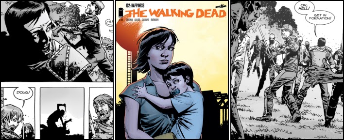
Initially it is easy to believe that the vast majority of this comic’s 326,334 readers entirely agreed with young Carl when Rick’s son declares, within the first dozen or so panels of “Happiness”, that “this is boring.” For not only does the cover to Issue One Hundred and Thirty Two of “The Walking Dead” consist of a rather uninspiring, lack-lustre portrait of Maggie Greene holding her child Hershel. But Robert Kirkman’s mind-numbing narrative simply spends the opening quarter of the book concentrating upon Grimes and the leader of the Hilltop Colony admiringly just “watching the sunset”…

However for those comic collectors who stuck with the Kentucky-born writer’s storyline, and incidentally helped make this edition by far the best-selling title of October 2014, the twenty-two page periodical’s script suddenly becomes a whole lot more exciting as Dante and the small search party out looking for an abandoned Ken, decide to fight their way out of a barn surrounded by shockingly judicious zombies. Such an explosive pulse-pounding change in pace, as unexpected as it is grisly, genuinely grabs the attention and those 250,000 subscribers to “the online pop culture sales club Loot Crate” who received a copy of this magazine as part of their subscription must certainly have given a sigh of relief that their monthly delivery contained at least one entertaining item...

Indeed the lengthy all-action fight sequence, as the three guards “get in formation”, “stop complaining and start hacking” at their shuffling opposition, becomes increasingly tense as the roamers’ intelligence disconcertingly increases as their numbers dwindle and the putrefying ghouls suddenly start talking to one another. This terrifyingly disturbing plot twist is then made all the more enthralling by Kirkman additionally bestowing upon the walkers the ability to attack Dante’s group with knives and hack them to death; “We can kill.”

After the disappointment of his front page illustration, and frankly an early double splash pointlessly portraying Rick and Maggie looking out across the sedentary settlement they fought to keep alive, penciller Charlie Adlard really brings his best game to the rest of this publication. In fact the British artist’s dynamically-charged drawings of Greene’s ‘right-hand man’ sword-fighting with a fully lucid and reasoning living corpse makes for incredible viewing, and really conveys the sense of adrenalin-lead fright the ‘human’ combatant must have had during his unnerving ordeal.
Writer: Robert Kirkman, Penciller: Charlie Adlard, and Inker: Stefano Gaudiano

Saturday, 12 March 2016

The Amazing Spider-Man [1963] #38 - Marvel Comics

THE AMAZING SPIDER-MAN No. 38, July 1966
“Sturdy” Steve Ditko’s last issue as “plotter, penciller and inker for Spider-Man”, this twenty-page periodical arguably demonstrates the best and worst aspects of this “Marvel Comics Group” title during the medium’s Silver Age by featuring an instantly forgettable “off-beat super-villain”, complete with a hokey origin story, as well some incredibly well-drawn action sequences pencilled by the web-spinner’s co-creator. Indeed in many ways it is hard to believe that from such inconsistent beginnings, one in which Peter Parker’s alter-ego is beaten by “the prize pussycat of the year”, emerged “one of the most popular and commercially successful superheroes” of all time.

True “Just A Guy Named Joe!” isn’t simply a magazine-long tale of Webhead battling the “not overly-bright” day-dreamer Smith within “a crowded neighbourhood gym”, as editor Stan Lee somehow manages to still provide plenty of developing dialogue for the likes of Ned Leeds, Gwen Stacey and even the somewhat derisively disguised Norman Osborn. But it is hard to take the “’nuff said” narrative seriously when it revolves around an inept film extra who is inadvertently electrocuted having fallen “in a puddle of spilled chemicals from the previous scene” and miraculously awakes with both the super-strength to snap Spidey’s webbing, as well as an angry obsession to beat up all those who have wronged him in the past; “All I want to do is strike back at everybody!! Make them all sorry they laughed at me!! I’ll show them! I’ll show them all!”

Equally as painful as the Manhattan-born writer’s 'villainous “stumblebum” turns “long-term” actor' central plot are some of the Will Eisner Award Hall of Famer’s cringingly corny interludes. Just how a pair of green glasses and a Diablo-like goatee beard prevents the New York criminal underworld from recognising someone as famous as Harry’s Oscorp-owning father is anyone's guess, especially when the wealthy businessman is willing “to pay handsomely to insure that Spider-Man never interferes with me again!” And just what is the “student protest” at Empire State University’s campus actually about? Lazily explained as a demonstration against “tonight’s protest meeting” it is hard to see why any reader would be interested in a march which is simultaneously about “saving the world”, “cut[ting] classes” and ‘protesting about nothing’.

Disconcertingly Ditko’s artwork for this comic appears a little inconsistent and substandard in certain places too, almost as if Jerry Robinson’s protégé was working himself into a ‘fuming fervour’ before infamously quitting the New York publishing company “for personal reasons.” It’s certainly debatable whether, as has been rumoured, the grinning mannequin “the poor man’s Sir Lancelot” punches at the end of the comic is actually a likeness of Stan Lee, and tragic that this “mildly terrific tale” required it's cover to be composed “of four different images from within the comic itself” on account of its artist’s abrupt departure.
Written & Edited: Stan Lee, Plotted & Drawn: Steve Ditko, and Lettered: Artie Simek

Friday, 11 March 2016

James Bond #2 - Dynamite Entertainment

JAMES BOND No. 2, December 2015
In many ways this second instalment of a “brand new six-issue arc” “created by Warren Ellis and Jason Masters for Dynamic Comics” follows the exact same formula as that employed by the vast majority of the early “James Bond” motion pictures produced by Albert “Cubby” Broccoli and Harry Saltzman. To begin with its narrative starts with the secret agent being met in Berlin by what initially he believes to be “other people in our company” yet who predictably turn out to be deadly enemy assassins, and ends with the British Intelligence Officer besting his opponents by using his brawn and fighting savvy, as opposed to the overused technical gadgetry of the latter-day films. The storyline even includes 007 ‘allowing’ a strikingly attractive femme fatale to escape (presumably so as to allow a future rematch), as well as him partaking in a polite professional meeting with the very chap who's actually just tried to have the serviceman cold-bloodedly slain.

So many similarities to past adventures must arguably have given many of this publication’s 21,254 readers an ominous feeling of déjà vu with the Essex-born writer’s script and this sense of dread probably could only have been heightened when the murderous Dharma Reach, supposedly a child of “Eighties hippie parents in Vermont”, displays the classic hallmarks of Ian Fleming’s first fictional villain, Doctor Julius No, by having metal prosthetic hands. Fortunately however, in spite of such foreboding familiarity, the plot to “Vargr” does still contain just enough innovativity, such as the “bad batch” of drugs which quickly turns its users into decomposing corpses, to make it a somewhat fresh, entertaining read.

Indeed Ellis’ ‘modernisation’ of the secret agent’s world, a place where “an actual OO officer… [is] like some rare species you only learned of from fairy tales”, is rather reassuring and amply demonstrates that the Sidewise Award-winner, “himself a fan of 007” and “no stranger to spy-thriller stories”, intends to pen a version of the “iconic British spy” which is faithful to Bond being little more than a “blunt instrument” as opposed to some sort of super-hero “bristling with guns and covered in scars.”

Sadly this comic is let down, somewhat badly in places too, by Jason Masters’ occasionally dynamic but oft-times awkward-looking one-dimensional artwork. Admittedly the former “Batman: The Dark Knight” penciller can clearly draw an incredibly frantic, action-packed scrap in the back of a moving car and imbues this fast-paced sequence with all the desperation one would expect as the agent is slowing being choked to death. But his subsequent illustrations, such as the well-dressed agent's appointment with Slaven Kurjak and Cal's grisly demise back in his London flat look amateurishly sketched at best. 
The variant cover art of "JAMES BOND" No. 2 by Francesco Francavilla

Thursday, 10 March 2016

Planet Hulk #5 - Marvel Comics

PLANET HULK No. 5, November 2015
As concluding instalments go, “The Chronicle” must surely have proved a bitter disappointment to the 39,277 collectors who bought the comic in September 2015. For whilst the “Marvel Worldwide” pre-publication advertising for Issue Five of “Planet Hulk” promised a cataclysmic conclusion where its heroes Steve Rogers and Devil Dinosaur are “branded by battle” and “absolved by blood”, Sam Humphries' dialogue-heavily narrative instead probably had the vast majority of its audience hoping that “the claws of death [would actually] reach your throat” and prevent them from having to finish a woefully disheartening read.

Admittedly the twenty-page periodical does contain a little action as Captain America declines an offer to “strike back against God Doom” and instead dispatches “the vicious Red King” by repeatedly bludgeoning Greenland’s leader with his famous star-spangled shield. But this confrontation between the “Secret Wars” tie-in’s two main antagonists is so shockingly short-lived, lasting just seven pitiful panels, that it is over and done with before the reader realises it has even started… So much for the heavily feared ruler of “one of the most dangerous of the Battleworld dominions, a forbidden zone full of rampaging Hulks.”

Lamentably the final showdown concerning Bucky Barnes’ “brother-in-arms” and Doc Green is equally as direly penned, with the Annapolis-born writer somehow managing to imbue the green-skinned behemoth with an even more thoroughly annoying holier-than-thou attitude than the guide had when he first appeared to chaperon Devil Dinosaur and his warbound to the patchwork planet's Mud Kingdom; "Captain, if Hulk is not within us, then we are as hollow as the void in the sky."

However, just why the ‘embracer of his inner Hulk” decides to goad a clearly distraught and emotional gladiator for the 'umpteenth' time is inexplicable, especially when the obnoxiously ambitious gamma-irradiated experiment has deliberately transformed himself back into an (all-too vulnerable) alternate version of Steve Rogers and admitted that he knew “the domain’s despot” had already murdered the man Captain America was desperately trying to rescue. Such utter insanity on behalf of the manipulative deceiver clearly borders on the suicidal and it therefore comes as no great surprise that Humphries’ story ends with Doc Green stone dead on the castle’s cobbled floor having almost been cleaved in two by an enormous double-headed axe.
Writer: Sam Humphries, Artist: Marc Laming, and Colors: Jordan Boyd

Wednesday, 9 March 2016

Age Of Ultron Vs. Marvel Zombies #2 - Marvel Comics

AGE OF ULTRON VS. MARVEL ZOMBIES No. 2, September 2015
It is entirely plausible that James Robinson didn’t read the “Marvel Worldwide” pre-publication advertisement for this “Secret Wars” tie-in mini-series, as the plot to Issue Two of “Age Of Ultron Vs. Marvel Zombies” disconcertingly differs quite substantially from the claim that “in the southern wastes of Battleworld, two unholy factions wage never-ending war” with one another. Indeed the Eisner-award winner’s narrative actually goes so far as to depict “the genocidal robotic armies of Ultron” agreeing a peaceful alliance with the “rotting, flesh-eating corpses that lies just to the East” and even ends with a splash page of the adamantium armoured automaton shaking hands with a zombified Magneto; “In that case, I think I speak for all of us when I say… You have a deal.”

Such a stupefying cessation of the “unending war” inevitably means that the vast majority of this twenty-page periodical instead focuses upon Hank Pym’s arrival at the nirvana Salvation, and an incredibly lengthy exposition by Wonderman, Jim Hammond and the Vision as to how they built the settlement using the “ionic energy that we extract from Simon Williams and then synthesize”. The Manchester-born writer even finds the time to rather clumsily script a rather uncomfortable scene which unsubtly portrays the prejudiced attitude of America’s Old West by having the Human Torch’s oriental partner Ryoko challenge Ultron's three-piece suited inventor when he refers to her a Celestial…

So tedious a storyline doubtless distressed many of this comic’s 40,483 readers, especially when the first dozen or so promising panels of “Strange Bedfellows” depicts a puritan Punisher dancing “a merry jig” against a horde of “flesh-eating, super-powered living dead” whilst lopping off their heads and limbs indiscriminately. This marvellous sequence, full of bloody carnage, biblical rhetoric, and plenty of swordplay is as adventurously action-packed as any “Marvel Zombies” devotee could wish for, and it truly comes as an almighty blow that the black-garbed Protestant swashbuckler is sizzlingly silenced mid-sentence by “Ultron Unit 432.622A, designated communicator conduit for Lord Ultron.”

This comic’s artwork is also somewhat agitating in its composition. For whilst “critically-acclaimed artist Steve Pugh” competently draws the bulk of its content, Tom Grummett, Drew Hennessy and Jesus Aburtov provide all of the artificially-aged flashback illustrations, and arguably demonstrate just how lifeless and rather monotone the British penciller’s work appears when coloured using modern-day techniques.
The variant cover art of "AGE OF ULTRON VS. MARVEL ZOMBIES" No. 2 by Alex Maleev

Tuesday, 8 March 2016

Uber #24 - Avatar Press

UBER No. 24, April 2015
Described by creator Kieron Gillen as “a strange issue” and one which even made him ‘raise an eyebrow’ this "singular statement" heavily focus’s upon Field Marshal Montgomery’s preparations to (finally) deploy “strength-specialised British Uber HMH Churchill” in the field, and simultaneously inject “some honest-to-god comedy” into the series’ increasingly dark depressing narrative. Sadly however such a ‘contentious combination’ doesn’t arguably really work within a narrative already infamous for its large-scale bodily mutilations, massive body count and gratuitous violence, and instead simply results in the former computer games journalist causing Leah to appear as little more than a clumsy, “hysterical”, oversized buffoon rather than the “Hero” her fellow Destroyer-Class colleague HMH Dunkirk quite rightly views her as.    

Admittedly most of this comic’s 5,687 readers probably enjoyed witnessing the full extent of Cohen’s super-strength and mind-blowing toughness, especially as it’s so very well illustrated by the pencil of Daniel Gete. The scene within which she lifts up a forty-ton heavy infantry tank and hurls it effortlessly twenty miles away into a hapless farmer’s cattle barn is frighteningly impressive, as is HMH Churchill’s resilience to a fall from an aircraft having reached “terminal velocity”. But the woman’s phobia of heights, and the fact it reduces her to little more than an enormous heavily-armoured pudding sat like a distraught child on an airfield's runway arguably belittles these achievements, even when it does allow a genuinely touching moment between the one-eyed Howard and Stephanie’s creation; “I’ll jump with you. I’ll hold your hands as long as I can, then parachute.”

Equally as irritating is Gillen’s attempt to make both Duncan and Maria ‘figures of fun’. The bearded British scientist has always been depicted as an insensitive buffoon whose enthusiasm for success seemingly outweighs his ability to be professionally polite and civil. Yet even he and his infuriatingly crass comment as to using Leah’s “skeleton for anti-Uber armour” should she die in training arguably crosses the line of acceptability. Whilst the GLAAD Media Award-winner’s portrayal of "the manic sniper" as a ‘god-like’ “being mad with power” and lording it over her “brave trainees of the Soviet union” on a throne situated in the centre of Kiev comes across as a rather sudden, dramatic change in the character's (up until now) likeable though clearly damaged personality.
The regular cover art of "UBER" No. 24 by Daniel Gete